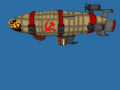
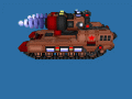
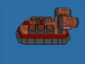
Command & Conquer Timeline452 Is an alternative future of Red alert 3. Factions: 1) United States 2) Soviet Union 3) Empire of the Rising Sun 4) Third Reich 5) Arab League 6) Peoples Republic of China 7) European Commonwealth 8) New World Order


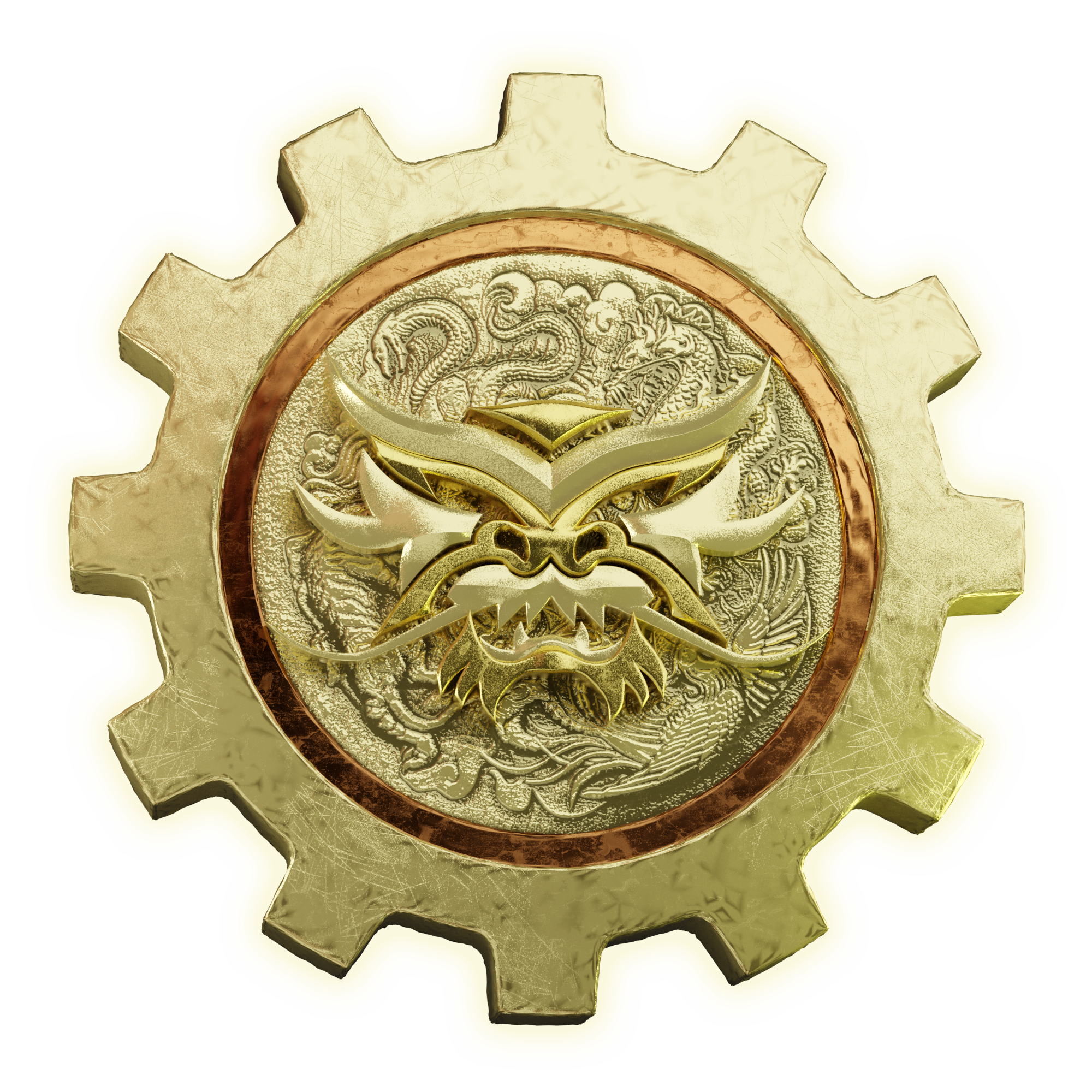
dragon logo v2 5
(view original)
Post a comment
Description
New PRC Logo
Not sure I like this design, it's too busy and the Dragon's face is hard to see.
I'd go with the original China logo:
Cnc.fandom.com
Or something entirely different, like a Dragon facing sideways, sort of like a "Coat of Arms":
Img.freepik.com
Shutterstock.com
My recommendation: Try the crown (the edge of the circle) from the last picture in my post here, with a Chinese Dragon facing sideways, either over a star, or facing a star to its left, inside the circle.
Ok, here is a quick, 10-second mockup I made, to illustrate my idea:
Imgur.com
ok I'll think about this, ty
If I may also chime in, perhaps change the gear shape into an octagon. The octagon is an important symbol in Chinese culture (the bagua), and you can see its prominence in this very mod's Chinese structures. I also agree that the background makes the dragon head hard to see.
But if I'm totally honest, I don't really see what's wrong with the old China logo. The dragon and star are integral parts of the Chinese faction's identity because of course they are important symbols of China IRL, like the hammer and sickle of the Soviets. Westwood Studios didn't pluck Chinese iconography out of thin air, after all. I strongly suggest keeping those from the old logo and then add your own designs to it. Again, personally, I'd choose the octagon.
I'll try to remodify this, the old logo has to much issue that it's better to just change it with my own design.