Thib
Thib joined
Because you love games and so do I. Managing & helping communities is my jam. Feel free to contact me for any question, suggestion or request. Working at @[mod.io](groups:modio:26012) (brand lead).


ModDB/IndieDB User profile work
(view original)

Post a comment
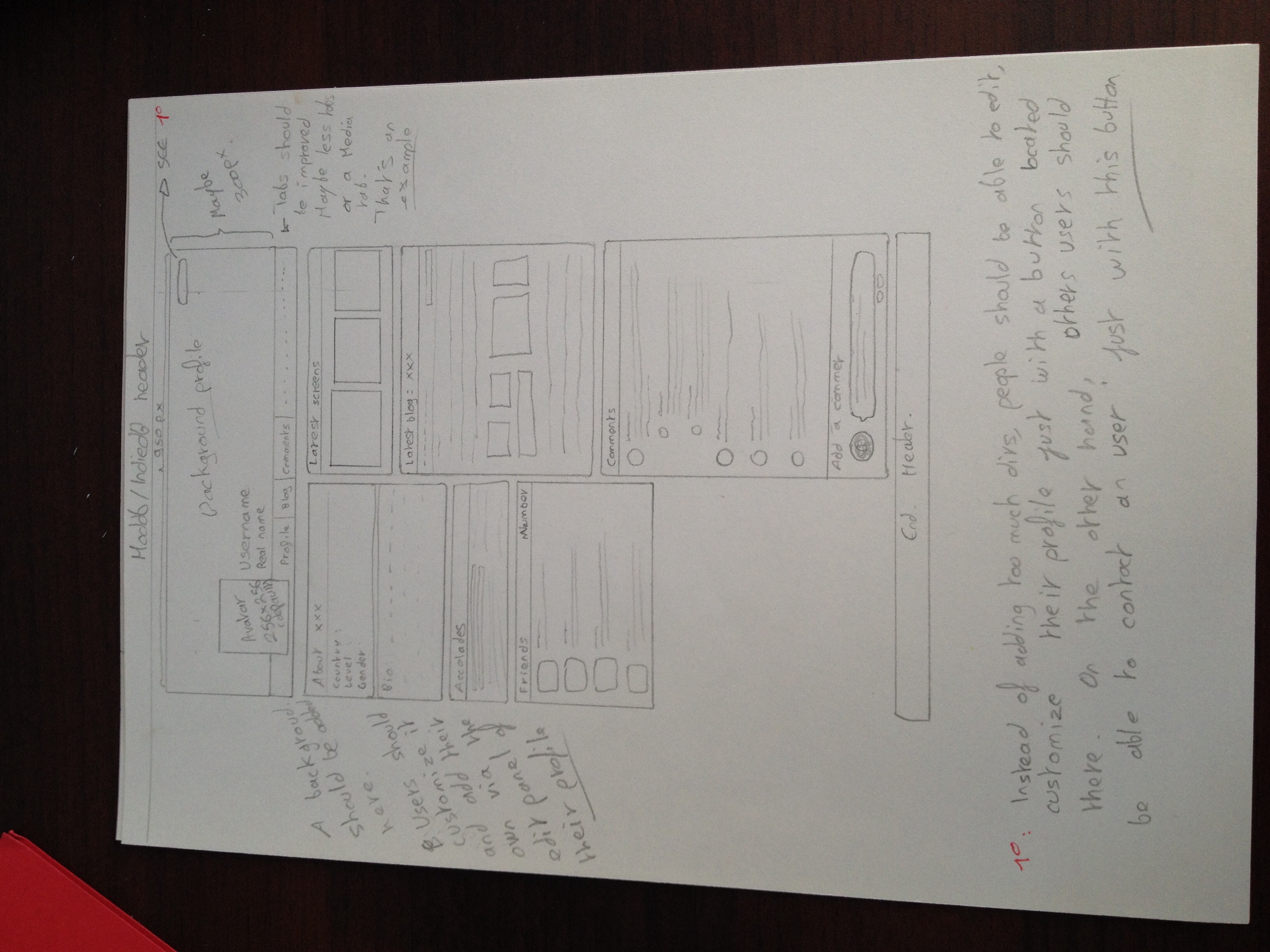
Description
Not finished.
Maybe there should be a contact section like how we originally have in Moddb ? and let that button be for the user to edit their profile ? or possibly the button for the user will be for editing and the button for the visitor will be for sending a message ?
Of course the contact info should be added between friends and Accolades. IMO of course.
What would really be interesting to know, is the colors Black and red and white fits well and look great.
The black borders are not supposed to exist anymore in the upcoming version because we consider that that they are representative of something really old... However, the red borders for example will be used but differently and grey colors as well, which can reflect the old black design.
Anyway, your suggestion is noted and maybe we should add just a button like Contact.
I won't make a complete feedback now, because there is stuff that's missing (At least I think it's missing, the description says it's not finished and I don't see Groups, 'Track this member' button and other things (I don't think you will take these things out. xD)), and I would like to analyse a more complete version.
So I'll just say that I dislike the Facebook-like top, I like the fact the avatar is bigger and it's on the top, but I think it should not be too similar. (And you can't remove the 'joined in DATE' after the name, too many people make clever jokes there. :P)
And are you sure the Bio should be just a box in a corner? It feels to me that it fits under the tabs. There is our name, the real one, the tabs that takes you to the many things we can have, and then there is our bio. I don't know, it just seems to make sense to me.
This is what I can say for now, I'll track you in case you post more of these. :)
Track this member and things like that are included. It's just that I wasn't going to write down every possibilities because it's a conceptual work which represents the most important things. Same for the date, it will be included into the About tab. By the way, do you see anything that should be added into this div ?
About the groups, we may plan to reduce the size of them and add them on the left. It's not like ModDB is going to look like FB because ModDB used to have this design before Facebook. If you're talking about the tab links, I don't see where we are going to display them. Same for the background behind your avatar. Anyway do you like the possibility for you to have a customized background for the whole page ?
But this is only the user profile page. Not the page for mods.
We want to improve the user pages, like they were a bit more social. You don't need a profile bio with hundreds of lines, isn't it ? Nevertheless you can't have spaces between your lines so having a 950px div just for a small profile bio is not that useful for the user experience.
We think that users, when they visit a profile, want to get the information they're looking for and we believe that this presentation should be at least better. For example, you can notice that we want to improve the user's blogs. Anyway your ideas are noted. This is the very first version so do not think that this will look absolutely like this ;)
Moddb.com
Hope you like it :-P
I really like this design m8. :D