
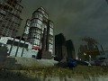
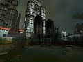
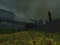
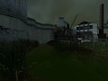
This is the second area of the map, apparently located in now-swamped former factory area. As Gordon gets his direct path rendered unavailable due to Combine shutting their asymmetrical massive dark-blue metal gates before the player's face, he must now dwell a bit through this area, have a bit of a fun with bullsquids and houndeye packs, and then further infiltrate the Combine industrial compound. This part of the chapter should be compared to the final maps of Route Canals.
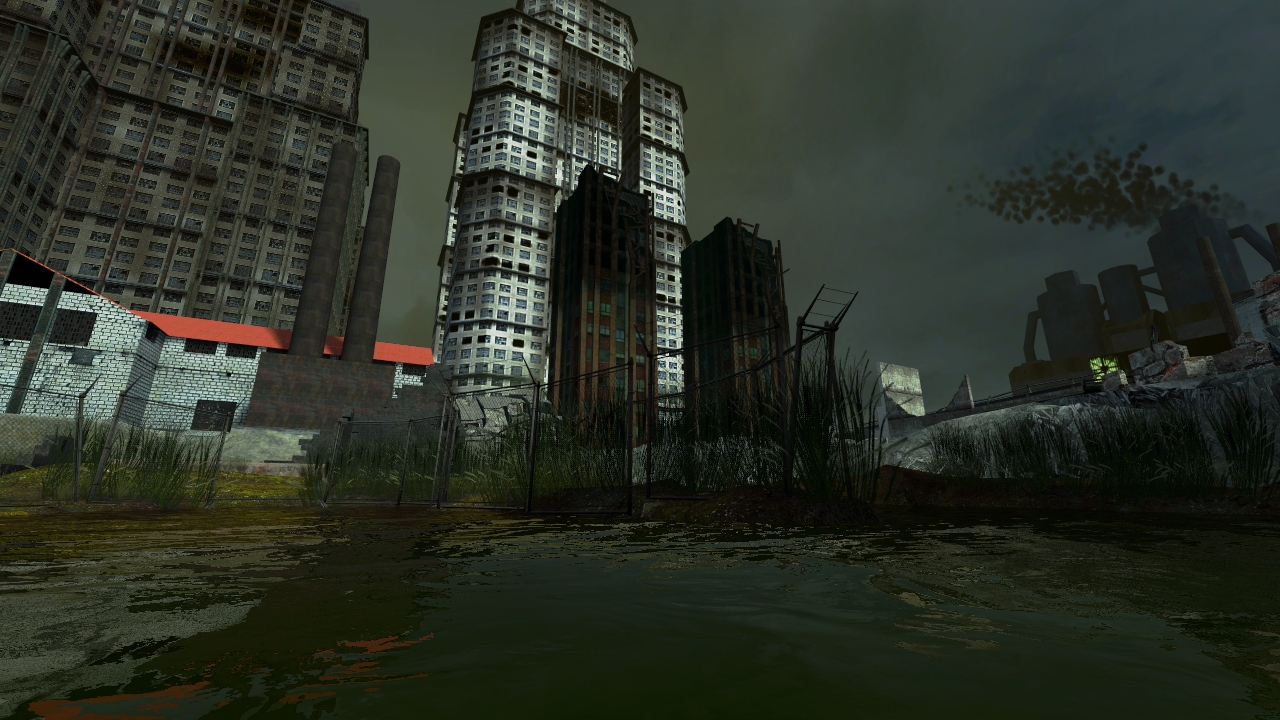
This is a non-HDR version (takes a bit too long time to compile), but that shouldn't be difficult to imagine the picture with some more brightness.
THE IMPORTANT QUESTION IS:
Does this feel canonical enough for you? 'Half-Life' enough?
Any thoughts on map's atmosphere will be appreciated. Not that I have some problems or that I stuck, I'd just like to share the current work with you guys, so it won't be unpleasantly surprising to have too much grass or too much sunlight or whatnot.
P.S. I planned making the map abot 50-60% bigger, but I already reached a 98.9 score on planes limit lol. My first time actually. And that is with some brushes->props optimization already applied.
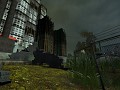
This ain't bad! I don't think I've seen anyone use the composite building textures so effectively. I just have a few bits of constructive criticism, some of which you might already realize.
The smoke plume in the background could stand to have larger sprites, it just looks a bit bubbly the way it is right now.
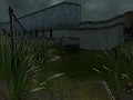
In the middle of this screenshot you have a chainlink fence surrounding a muddy outcrop in the water. For the sake of having a believable environment I would rethink this approach, as it seems unlikely that anyone would go through the trouble of fencing off such a slim section of mud. For a more plausible run-down look I would say lay a stretch of fence out the way you'd imagine someone actually would and have the raised sections of mud be incidental, and even have parts of the fence submerged in water. Make it look like the fence was always there, but now is at the mercy of the mud and changing water levels... hope that makes sense.
One other thing is that the environment lighting in this map looks a bit white, I would suggest you pick a color for an accent and maybe even go so far as to use color correction. Diluted green is a good "leak" feel, or blue (cold lighting) creates a sense of mystery, but I'll leave that up to you. Play around with color until you settle on something, but just remember that less is more. Speaking of white, I'm not a huge fan of the white brick building textures, but that's your call.
I would also clean up the displacement map of the debris on the right side, it just seems a bit steep of a slope for a texture that is supposed to be building rubble.
Hope this helps
Thanks for this reply!
1) The smoke is kinda hard to make good looking outright since it's in the 3d skybox and I have to tweak the numbers in 0.1 fractions, but I'll get it done.
2) Yeah, thought about it myself. It would make sense if the fence was here before, presumably enclosing a waste storage area that is now sunk, after 10+ years.
3) But I am using a CC here…
3) Oh, my bad.