Basically, an interface has two functions, the first is related to the flow and interactions the user (this means you!) will have, how do we get the info across to the players and how they react to it.
The second and equally important, is the ambiance of the player inside the game, the UI must guide the player inside the universe of Skydome, where champions defend their tribe, compete summoning troops and much more.
Starting by the beginning
We’ll begin by the changes we have made, and nothing better than to start with the main menu. Last time we showed you this screen it was inconsistent within its elements design.
On the new menu these problems were solved with an overall simplification of all the forms. Talking usability, the main structure remains the same. Besides that, with a complete top menu bar, we nod to the usual widescreen bar, which allows us to have more prime, screen real state to showcase the champion at the center.
In addition, by having a modular approach to all the elements and splitting them in little blocks, we can re-use these patterns in different scenarios while also having a better in-game performance and visual unity.

Comparison between versions of the main menu,
the old menu on the left and the current menu on the right.
The new UI runs technically better, it is as well more visually pleasant than the one we had before, but if there’s one thing we can be sure of, is that there is always room for improvement.
Everything you’re gonna see here is still work in progress. The best thing in having a close relation with the users, is that we can easily gather info and feedback to make any required changes as to always put the player experience first.

A sneak peek on the Champions screen.
Skydome is a game with a lot of stuff going on at the same time, you got to spawn your troops, the enemy troops invading, adapt your defenses to any enemy change in strategy, besides being always in the move as to avoid an enemy intervention from getting you. It is a very dynamic and fast-paced game, and inspired by that we also chose to make use of many diagonal lines.
What about the in-game UI?

Even with so many screens and menus, the biggest change so far was made in the in-match HUD as you can see above. The HUD is the interface the player is shown during gameplay, which needs to inform the player of everything that’s happening in the match.
Basically we changed everything, and it wasn’t all for nothing. Our first try validated (and revoked) many of our points regarding user experience during gameplay. Taking into account all that knowledge and already considering some new systems we have in development, quite an overhaul was needed.
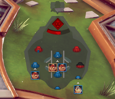
The minimap has been upgraded.
Even the minimap, which was the least altered part of the interface had some new elements added, like a clearer indication of the troops you and your team are spawning.

The old UI placed in one crowded place all the info about the champion, the skill bar and troops.
The main feeling we got with the first version, is that we had too many important elements fighting with each other for space and for the players attention.

The current UI, with the champion and troop info, split from the skill bar for more readability.
To solve that we opted to split it into two, one element on the bottom left provides info on the player’s champion and its troops. It’s now separated in a different block from the skill bar, making it all more accessible and more importantly, improving its readability.

The UI in the top of the screen shows info about both teams and the progress of the match.
General info about the current match and your team were combined in the top of the screen, which makes it easier to contrast your team’s choices and the actual momentum of the match.
The colors
One of the most frequent questions we get about the interface, is why we chose certain colors. To answer that we have to go back to the Skydome arena itself, which has light tones with a lot of yellow and orange, specially on the metallic details.
The interface must be easily readable at all times, with that in mind we were pretty quick to arrive on our current solution, which was to pick blue in darker tones to be the main color of the visual identity. In addition, our pick was validated by the usual meaning behind the color, usually associated with the blue sky, royalty and power, characteristics that fit really well with the Skydome itself.

An example of the contrasting colors between the arena floor and the interface.
Feedbacks!
Today we went through some of the changes we made on the interface side of things and we would like very much to know what you think about it! This is still work in progress so do not forget to leave us a comment on ALL of it! We take your opinion to the heart and it will be used on any future changes that we might undertake. We are always working on new stuff, so stay tuned for next week’s update!
Thanks and talk to you on the comment section!