Feeding Time centers on a unique but intuitive eating mechanic where players match various animals with their favourite snacks. Compete against friends and global leaderboards, or enjoy a more casual experience as you unlock new areas and powerups. With the proper attention, no critter will ever go hungry again!
AppStore Link: Itunes.apple.com
Although a game's branding rarely has much to do with its gameplay, it's still a very important forward-facing aspect to consider.
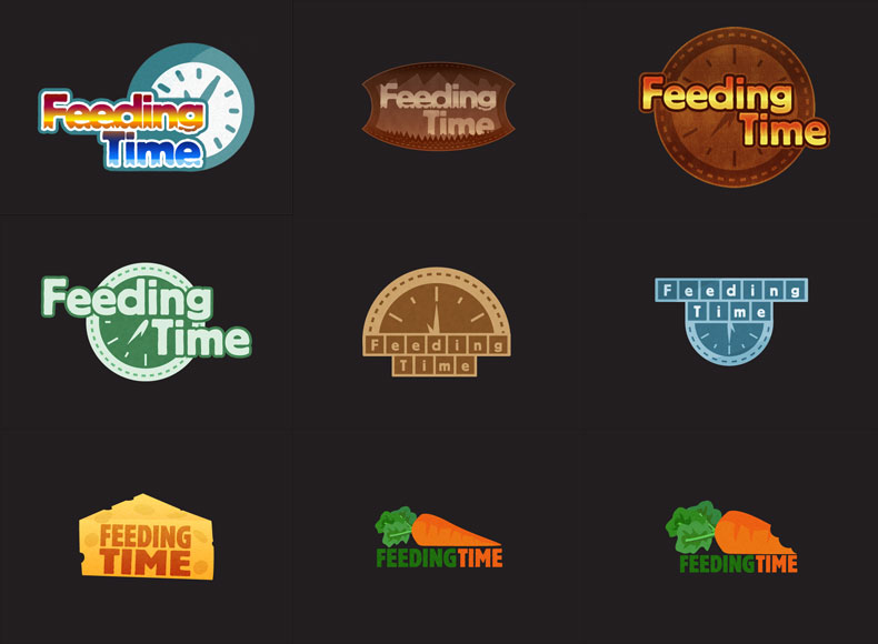
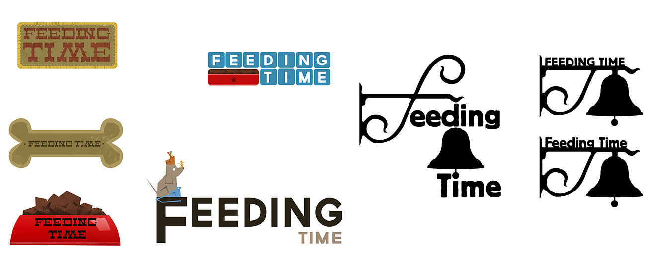
For Feeding Time's logo, we decided to create numerous designs and get some feedback before committing to a single concept.
Our early mockups featured both a clock and various types of food. Despite seeming like a perfect fit, the analog clock caused quite a bit of confusion in-game. We wanted a numerical timer to clearly indicate a level's duration, but this was criticized when placed on an analog clock background. Since the concept already prompted some misunderstandings -- and a digital watch was too high-tech for the game's rustic ambiance -- we decided to avoid it for the logo.
The food concepts were more readable than the clock, but Feeding Time was meant to be a game where any type of animal could make an appearance. Consequently we decided to avoid single food-types to prevent the logo from being associated with just one animal.
A few more variations included a placemat and a dinner bell, but we didn't feel like these really captured the look of the game. We were trying to be clever, but the end results weren't quite there.
We felt that the designs came across as somewhat sterile, resembling the perfect vector logos of large conglomerates that looked bland compared to the in-game visuals.
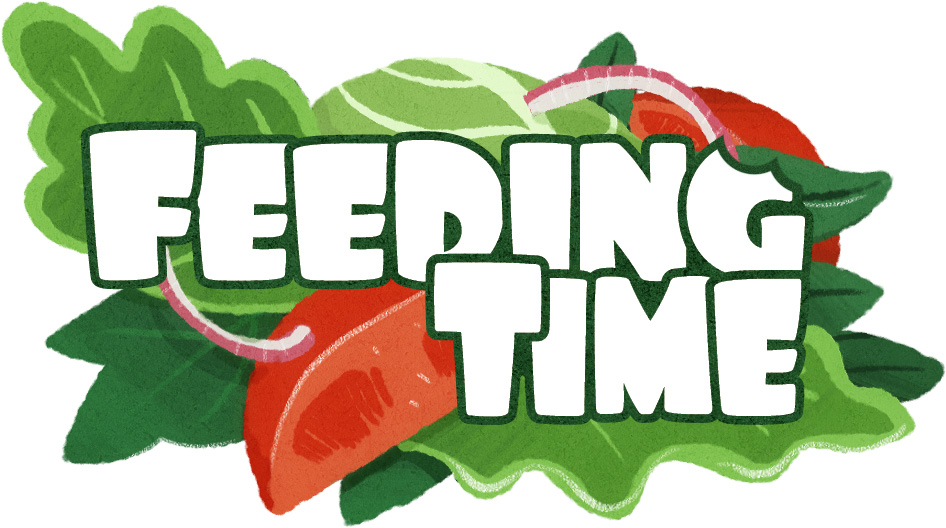
Ultimately we decided to go with big, bubbly letters on top of a simple apéritif salad. It was bright and colourful, and fit right in with the restaurant-themed UI we were pursuing at the time. We even used the cloche-unveiling motif in the trailer!
One final extra touch was a bite mark on the top-right letter. We liked the idea in the early carrot-logo concept, and felt that it added an extra bit of playfulness.
The app-icon was a bit easier to nail down as we decided not to avoid specific foods and animals due to the small amount of space. We still tried out a few different sketches, but the dog-and-bone was easily the winner. It matched the in-game art, represented the core of the gameplay, and was fairly readable at all resolutions.
To help us gauge the clarity of the icon, we used the App Icon Template.
This package contains a large Photoshop file with a Smart Object embedded in various portholes and device screenshots. The Smart Object can be replaced with any logo to quickly get a feel for how it appears in different resolutions and how it is framed within the AppStore. This was particularly helpful with the bordering as iOS 7 increased the corner radius making the icons appear rounder.
Despite a lot of vibrant aesthetics, we still felt that Feeding Time was missing a face; a central identifying character.
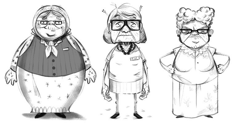
Our first shot at a "mascot" was a grandmother that sent the player to various parts of the world in order to feed its hungry animals. A grandmother fretting over everyone having enough to eat is a fairly identifiable concept, and it nicely fit in with the stall-delivery motif.
However, there was one problem: the introductory animation showed the grandmother tossing various types of food into her basket and random animals periodically snatching 'em away.
We thought this sequence did a good job of previewing the gameplay in a fairly cute and innocuous fashion, but the feedback was quite negative. People were very displeased that all the nasty animals were stealing from the poor old woman!
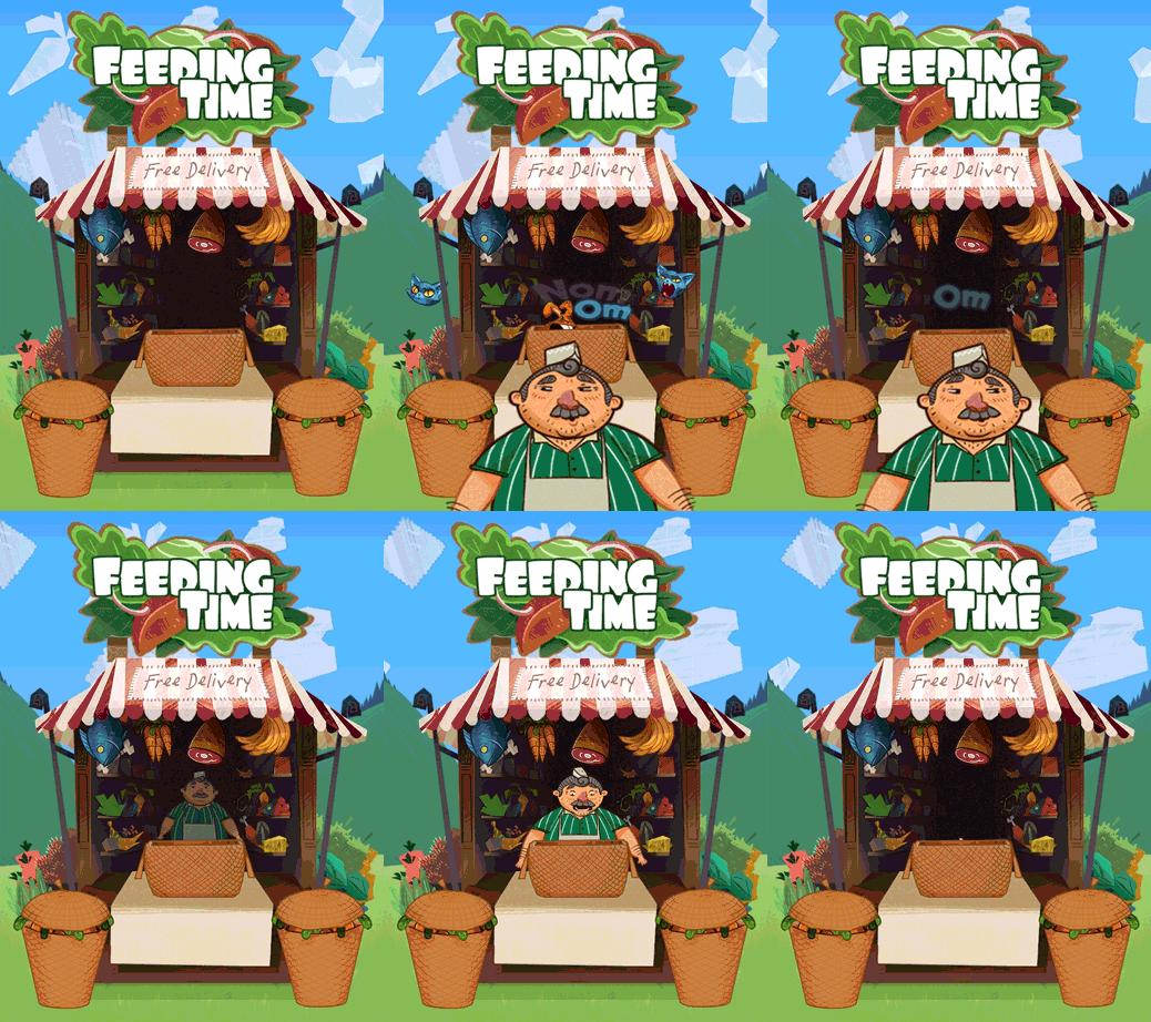
People were quite appalled by the rapscallion animals when the clerk was played by a kindly grandma.
It was a big letdown as we really liked the animation, but much to our surprise we were told it'd still work OK with a slightly younger male clerk. A quick mockup later, and everyone was pleased with the now seemingly playful shenanigans of the animals!
Having substituted the kindly babushka for a jolly uncle archetype, we also shrunk down the in-game menus and inserted the character above them to add an extra dash of personality.

The clerk as he appears over two pause menus, a bonus game in which the player gets a low score, and a bonus game in which the player gets a high score.
The clerk made a substantial impact keeping the player company on their journey, so we decided to illustrate a few more expressions. We also made these reflect the player's performance helping to link it with in-game events such as bonus-goal completion and minigames scores.
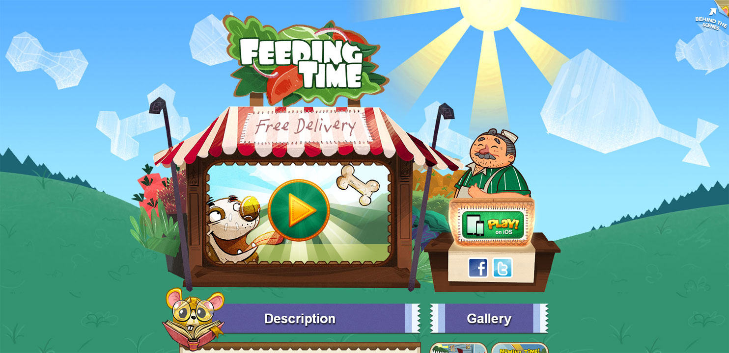
The official Feeding Time website complete with our logo, title-screen stall and background, a happy clerk, and a bunch of dressed up animals.
Finally, we used the clerk and various game assets for the Feeding Time website and other Incubator Games outlets. We made sure to support 3rd generation iPads with a resolution of 2048x1536, which came in handy for creating various backgrounds, banners, and icons used on our Twitter, Facebook, YouTube, tumblr, IndieDB, etc.
Although branding all these sites wasn't a must, it helped to unify our key message: Feeding Time is now available!

The Art of Feeding Time, Part 4
NewsHand-drawn frames aren't the most popular approach to animation these days, but here's how we went about minimizing their cost.

The Art of Feeding Time, Part 3
NewsUI tends to be much less exciting than other game aesthetics, but finding a style that works in both form and function can be quite challenging.

The Art of Feeding Time, Part 2
NewsTackling the perspective-breaking backgrounds of old Hanna Barbera cartoons and Zelda - A Link to the Past.

The Art of Feeding Time, Part 1
NewsThe evolution of the art style in Feeding Time, and what we did to take it beyond the typical match-3 aesthetic.





Beautiful designs
Thank you, although we have to give full props to George Bletsis who freelanced for us developing Feeding Time's look: Monstertreeart.tumblr.com
Nice game.
Thank you!