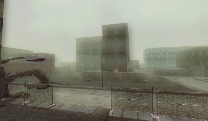
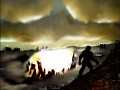
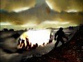
I last brought up a few concept maps and some plans to re-arrange Gull City to something more playable. After some countless hours of work, we've successfully fixed up the map and I've already began to add some basic details.
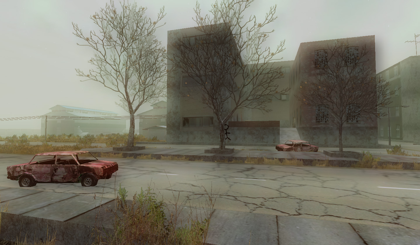
Naturally I already got a few comments about the bloom/fog, that makes the area look almost...smoky.
Comparing these screen shots to the previous Gull City, this is more towards the morning, compared to a darker pale blue that was previously being used.
After our last play-testing alpha match, we've planned on making some MAJOR character revisions as well. Not to mention weapons, movements, map fixes, vehicle fixes, and more.
In this respect, I'm glad we don't have any videos of game-play up since they might majorly change like this.
On that note, I have been trying to get some video here on Moddb, but I keep running into snags.
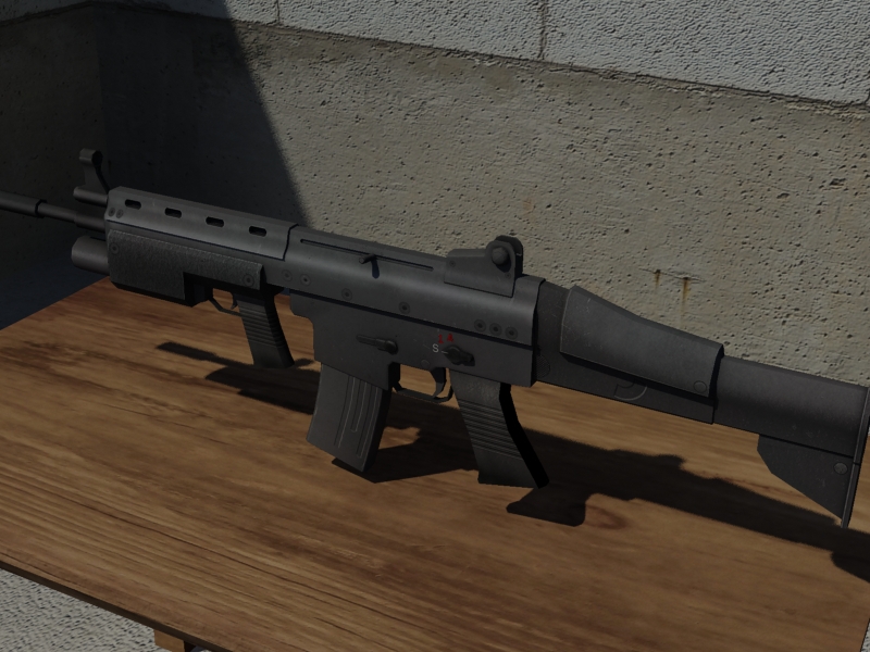
Another small complaint was the choice of weapons. Our play-test gave you choice of the scar rifle and... well thats about it. So I took a step up on this one and got a skin on the T-9.
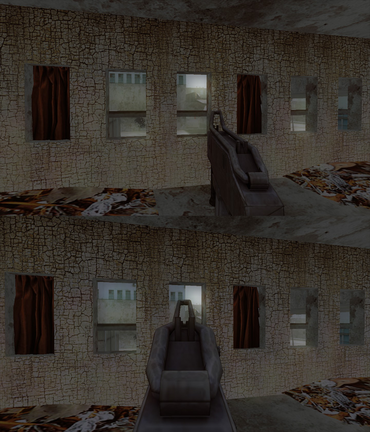
Ok, its not 'at all' the best skin, but its a good temp while we work on getting it all shined up.
'mistermoo' commented on the stock awhile back so I made sure it was fixed for the first skin.
With the cover system to be 'fully' implemented in within a few weeks (Thats the plan anyways), we've been trying to wrap up a player model we've been working on.
We have several other designs, including older ones, that are all being re-considered for re-design.
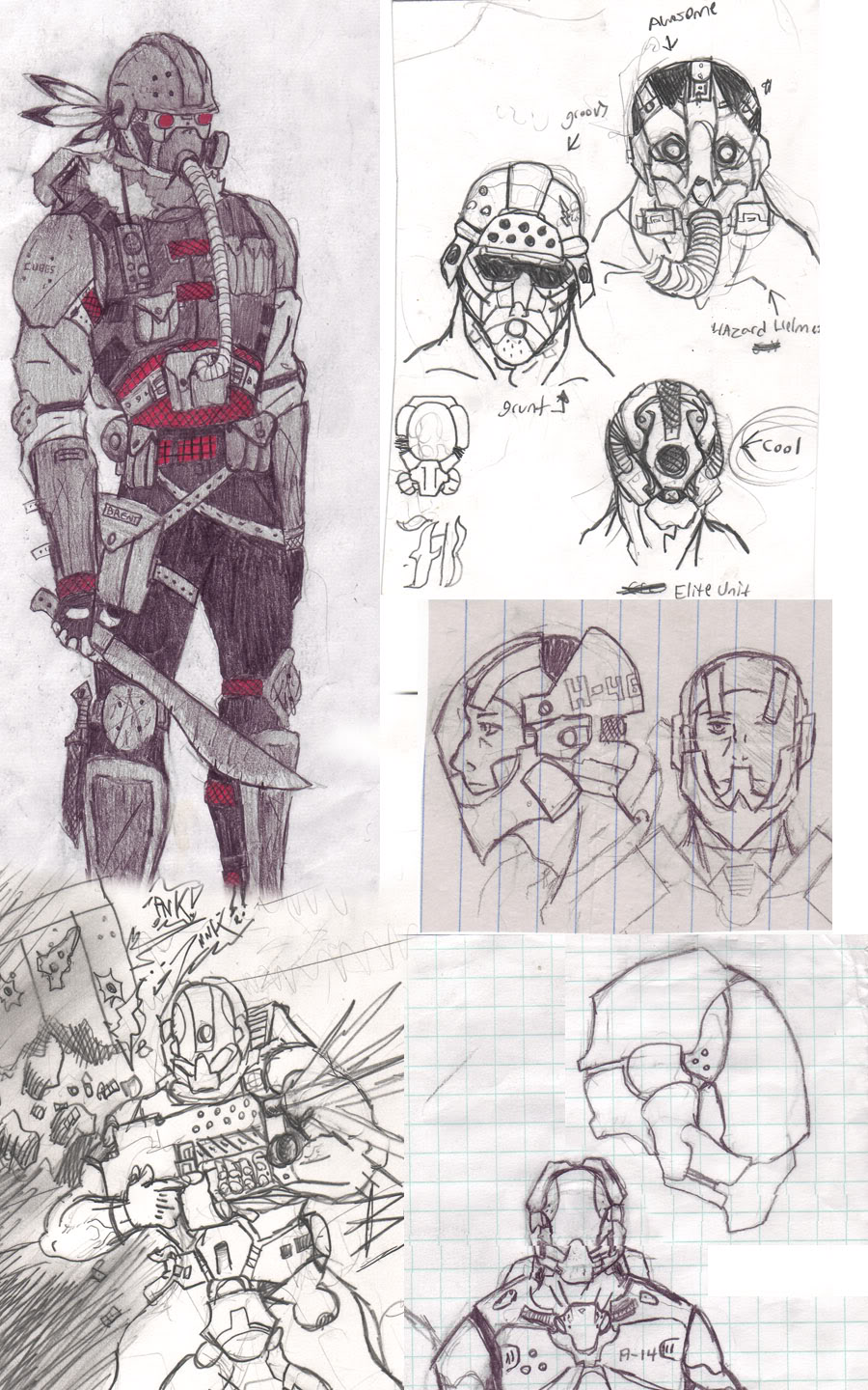
(Concept art by Brent Washington "A-14")
The different designs are for the character customizing plans we have.
If I was to do this entire development project all over again, I think focusing on the characters should have been a priority.
Thats not at all how it turned out though, and since we can't fix mistakes, we'll have to just work with what we have.
Last but no least, I scanned a copy of the original 3rd comic. Its a poor scan and in the re-sizing of the image to make it work for upload, it came out too small. Its a shame, but there it is.
Not to mention its very old now.
Some slides/pages have been censored out for plot and character issues.
Much of the Crimson Crow game is based on sections of the third comic, so you'll see very relevant scenes in the comic. For example, the mech that was shot down on page 3 looks similar to a certain mech in one of the above map scenes.
In fact, 95% of whats in the comic is in-game.
As for certain characters/scenes/ships/technologies/weapons that are seen in the comic, questions might arise about them.
All I have to say is..."No comment!" :D


Comic is a very good idea for a previs(ualization), I am thinking of doing the same for all scenes of Mech Override, now.
The new colors and stronger saturation work a lot better for me than the dull looks from before, even though the city has always had its own style and charme. How about making some landmarks, which really stand out and add diversion to places? It's also nice finding such things, and I can still remember my screams of joy when I found "World biggest ****" in San Andreas :) (you will want something else, though, but it definately will add some feel of its own).
The bloom turns this into very dream-like scenes. It enhances the bad world feeling, but I'm bothered by it's dreamy fluffy-ness. Perhaps some particles in form of blowing mist or low animated cloud textures could break up the monotony a bit.
I like those new images best from what I have seen so far and I must say you are really pushing the limits of the engine, and I know no better looking indie-game for Torque Advanced. Garage should give you a medal for making this game, seriously!
We've been experimenting with colors and tones.
Instead of the 'dreamy' fog, we've pushed the layer of fog back so things are not as foggy up close.
I'm also thinking of making the sky a cloudy dark blue so it can harshly contrast against the buildings.
Lastly, I've been trying to work something out for the shadows..
man get me testing this i got layed of am am ******* board! :)))
keep it up looking great loving your art work
Like the foggy effect. Keep up the good work :)
Looking good, as Omar said, keep up the good work!
Btw, I commented you at GG too.
Yeah, I remember you were creating forests in your GG blog.
Thanks, and keep up your good work as well.
HouHOUUUUUUUUUUUUUUUUUUUUU ;^)
Elite unit I love this draw (this remember a soldier in sword of mana or in soldier combine in HL2) and wazard(?) head looks like a killzone head
Glad you like the concepts, and yeah, they do have some similarities.
The real trick is going to be modeling them and getting it to mount correctly 'or' option B with our character system.
Its all kind of coming together. I think it will be nice to see these concepts in 3D and working in-game.
'twas a nice read dave. And some very nice concepts. He kinda looks like KZ grunt, but there is a difference, but overall, its design is from that KZ guy. Also good work on that new wep model. What is that, around 82 more to texture and model? jk, but GL dude
P.S. mentioning that forum post of mine? sweet :D
Comparing this concept to the Helghast Grunt, it does have some striking similarities. Its mostly the mask that looks pretty similar.
I think once its a 3D model, it'll look much less similar.
Yea, that could be. Must be its just a little dark, and the red doesnt show much. Be nice to see it textured :)