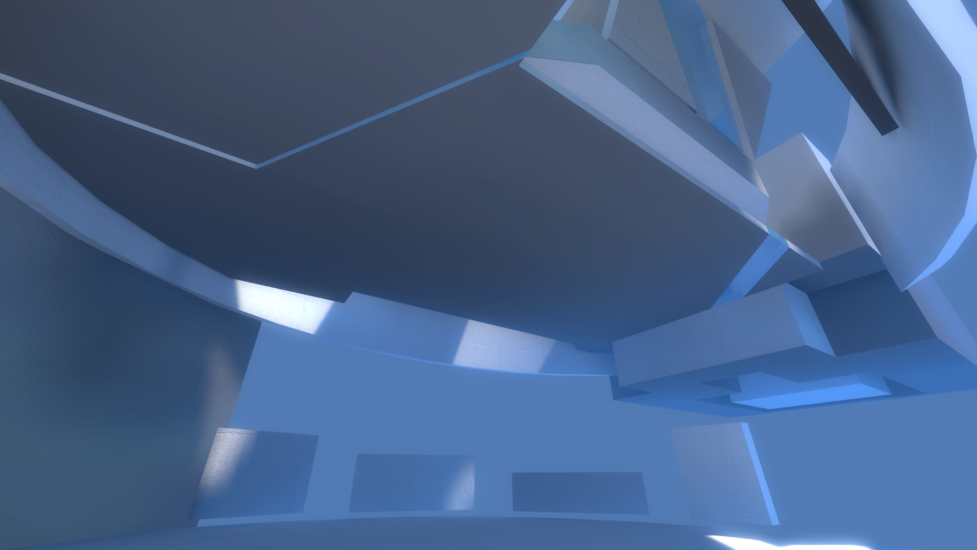
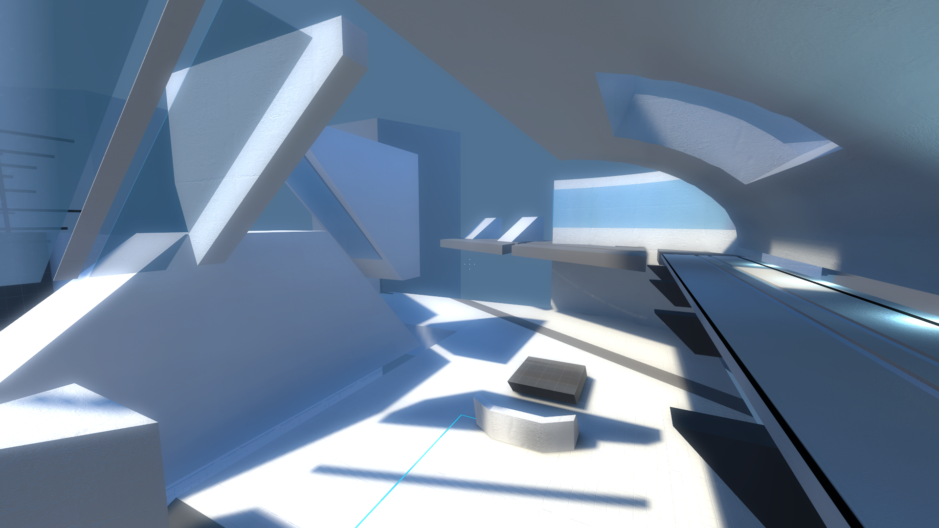
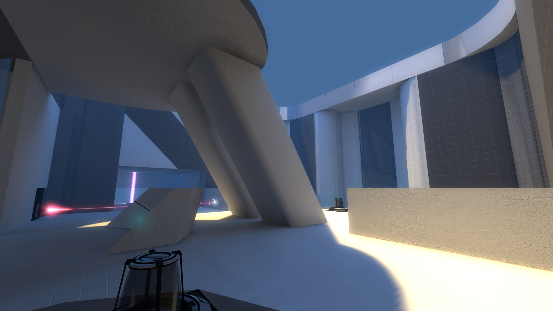
Eidolon is nearly a year old; here are some thoughts about the process of making the mod and of how it turned out.
In the Beginning
I started the mod with a single map to go with previously-composed music. Just for fun, I didn't use the traditional cube-on-grid shape of Portal levels. Solving a five-layer laser puzzle off the bat is taxing at best, so the game builds up to the moment with a series of largely improvised puzzles, each teaching a portion of the solution to the larger puzzle at the end.
I see Portal touted fairly frequently as a good introduction to level design, but I may have been using the existing assets as a bit of a crutch, remixing established bits of design without knowing what they meant. By the time I was finished, I'd found a few patterns in my work, and abandoning some of Valve's established methods meant reinventing the wheel- for cues, teaching, and the shape of the world itself. These are a few of the ways that Eidolon differed from Portal.
Cues
A Portal level is chock full of bits to direct the player throughout the world. Anybody who's played knows what a panel jutting from a wall means, or (in Portal 2) to shoot through a circular hole they find in glass dividers. In Eidolon's abstract floating space world, I had to find new cues to show the player what they needed to solve a puzzle, but also to train the player in what they meant.
- Flings were replaced with a "doorstop" wedge shape.
- Grating hanging over edges became glass strips on the floor that point towards the edge you're supposed to look down.
![[left: Portal 2 uses translucent overhangs to encourage the player to look down. right: Eidolon uses glass floor strips to similar effect] [left: Portal 2 uses translucent overhangs to encourage the player to look down. right: Eidolon uses glass floor strips to similar effect]](https://media.moddb.com/images/members/1/710/709530/profile/overhang.png) (This one actually worked without "training" the player at all and it looked very cool in the environment.)
(This one actually worked without "training" the player at all and it looked very cool in the environment.)
- Portal used grates to make walls you could shoot through but not cross. In a few spaces, I used solid glass with bits cut away
In total, there were 7 cues that got replaced or created, but only the fling wedges were properly introduced on their own terms; some players after release sent demos of themselves having difficulty with the other cues. An obvious lesson painfully learned- you need to introduce the player to their tools before requiring them to do anything with them.
Geometry and The World
To further separate myself from Portal, I set the entire level in an empty void populated with some simple solids and decorating. Where Portal was enclosed in box-shaped rooms, escaping or even seeing a peek of the outside world was a big deal, and an important moment in the story. On the other hand, players in Eidolon can walk outside the play area at any time (but only after solving it can they move on)! This wasn't anywhere near as much trouble as I expected it to be; even with portalable surfaces on the outside, placing the levels in the void meant there wasn't much the player could escape to, but allowing the player to explore at their leisure meant they could still sate their curiosity or get a better view of the task at hand. Along the same lines, there was no need to kill the player when they went out of bounds. Portal uses poisonous goo and deep pits to mark out of bounds zones; these require a forced reset that takes time to reload from and potentially sets the player's progress back. Eidolon's void saves the day again- players far enough in the fog are simply teleported back into the game zone with a fade effect and the satisfying "thunk" of landing on solid ground.
Unfortunately, empty space brought its own problems. Detailing large spaces with fanciful shapes brought a huge hit in both compile times and runtime performance, and complicated skyboxes drew attention away from the level. But leaving the skies empty was even worse than the most claustrophobic Portal test chamber. The void is oppressive.
The best maps compromised; the style worked best somewhere in between enclosed rooms and floating spaces. Funk_Detail and Slantedlasers used floating geometry to create grounded, mostly-enclosed areas that felt believably solid when you stood anywhere inside them.
Hindsight is pretty clear on this: keep the detail inside the player bounds, where they should be interested.
Creating Spaces
Portal's levels are almost exclusively built from rectangular prisms. Moving away from established design meant again reinventing the wheel and opened up all kinds of room shapes, even (non-portalable) curves and pitching the walls. A cuboid room is easier to navigate, but ignoring them made for fresher puzzles and for prettier environments.
Most puzzle rooms had mostly evenly-distributed elements with most density in the center of the map and were often symmetrical. Transition spaces tended to be asymmetric by comparison. Some of the transition areas used lots of height differences to give a good feeling of progression.
Central to eidolon is the hub, which has a single puzzle that's solved in a different way each time you return to it. While testing didn't reveal any obvious problems, upon release players would skip the map when returning to the hub, thinking they had encountered a bug that forced them to replay a level! Central to their confusion may be the core design of the room, which is laid out like the rest of the puzzle rooms - mostly symmetrical with all the density in the middle - and uses fairly weak cues like lights and colored lines on the floor to compensate for the lack of clarity. Additionally, there was only a single exit, which probably only amplified the frustration of encountering the same space again and again. A better hub might be laid out more like the transition spaces, with multiple exits all visible in the main area that have an obvious physical progression (like differences in height) to show the player both that they'll need to return to the area in order to visit all of them and also that they'll need to visit them in a particular order.
Parting Thoughts
I was particularly surprised in that the visuals in the mod were fairly unique for Portal 2 mods. The floating geometry in Eidolon is not its own style, or even a particularly new one. Many level designers build "space" or "abstract" maps in games like Quake 3 or even Half-Life's Deathmatch games to explore the mechanics directly. But Portal's released maps already use a style that's been boiled down essentially to its simplest form- a box with a textured grid. Using new styles and new shapes was a particularly effective way in learning about the often fairly subtle ways Portal leads players around by forcing me to come up with new ones.
![[left, Portal fling panels. right, Eidolon wedges] [left, Portal fling panels. right, Eidolon wedges]](https://media.moddb.com/images/members/1/710/709530/profile/fling.png)
![[left: Portal 2's squarebeams block the player, but still allow portals. right: Eidolon's attempts at replicating the effect with brushwork] [left: Portal 2's squarebeams block the player, but still allow portals. right: Eidolon's attempts at replicating the effect with brushwork]](https://media.moddb.com/images/members/1/710/709530/profile/grate.png)


why do you hate portal
its in my blood
I remember playing this and the end puzzle took me so long. It's not your fault, though. I'm just slow like that :D
Really liked the different atmosphere of your mod, alhough I don't hate Portal's setting like you do :P
The end puzzle was pretty difficult for a lot of people; glad you were able to finish it.
[i don't hate portal thanks colossal]