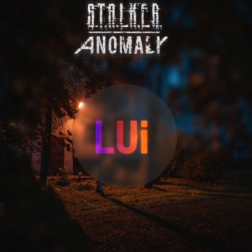
Description
Redrawing the texture of the inventory/UI is a test version Replacing the standard grey and replacing the rusty alternative.


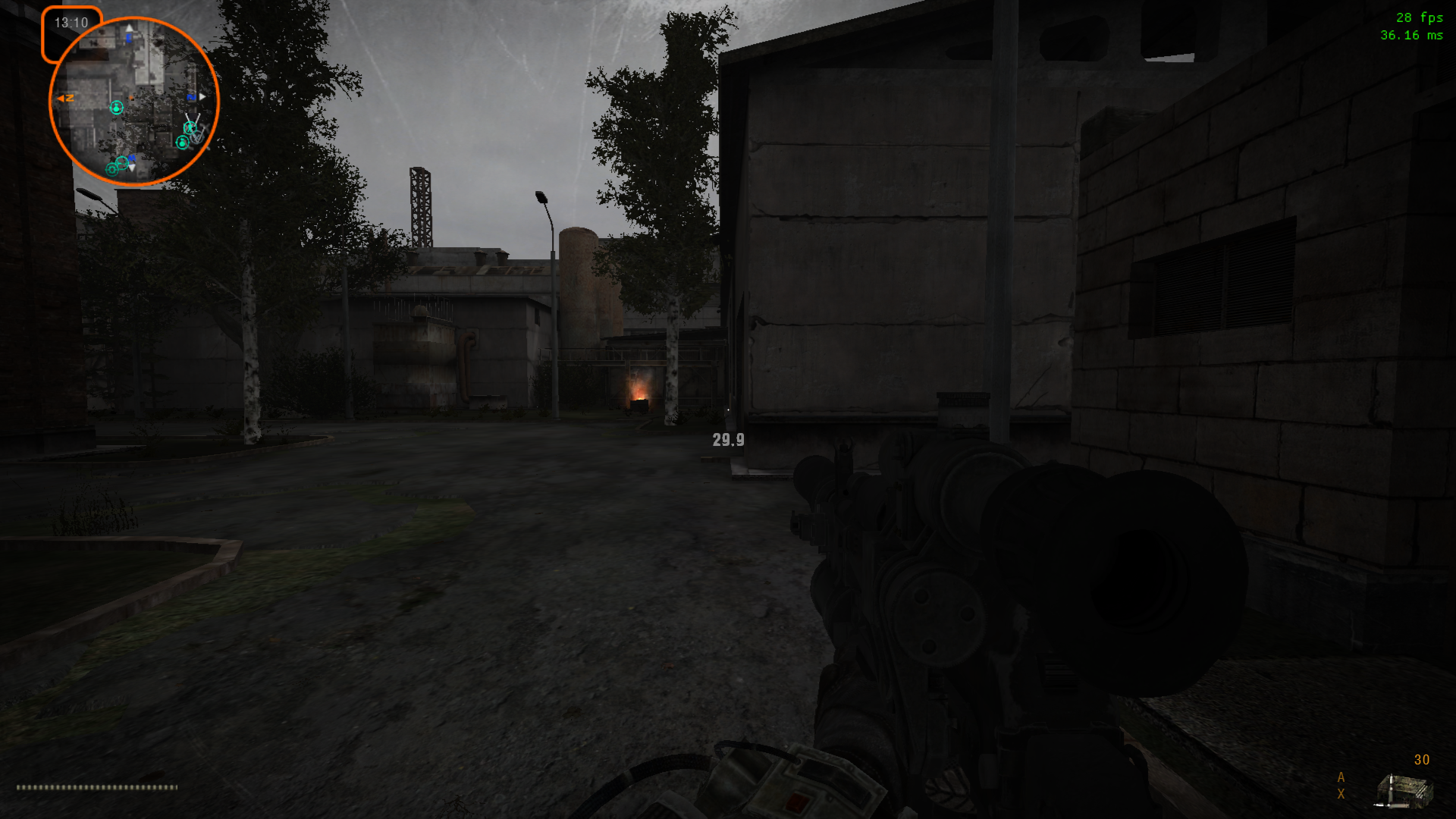


Preview
Post a comment
Related Mods
Related Games
S.T.A.L.K.E.R.: Call of Pripyat
First Person Shooter
Related Groups
Anomaly Developers
Developer
Tags
It smells like...Demosfen sborka
Переборщил малёха, да?
Да ваще)
Why is the name of the mod used obscene name?
Это имя моей собики(
Urban dictionary lists the word as:
Originally this is a Russian word ("долбаеб") that means a dumb man or an idiot in a rude form (in a very one). Also a crazy guy might be called that way.
Your dog is more than likely brighter than most STALKERS.
Okay, rename, and then another complaint thrown(
Just joking man!
GOOGLE translate and Urban dictionary aren't exactly the gold standard for non-English... or English speaking information.
This is a great STALKER song:
Back to important stuff.
Is the .db addon thing more difficult to make?
No, archiving files to db is not difficult to do)
Just wondering. The scope addon "Drisch" is awesome... and it seems to be gone.
and back again.
Masterpiece! Great work!
For anime lovers.
Looks like aids
I wanted to give this addon a fair shot and boy did I try but I have a few tweaks I would do to make it a bit better if I were going to do a holographic/futuristic themed UI.
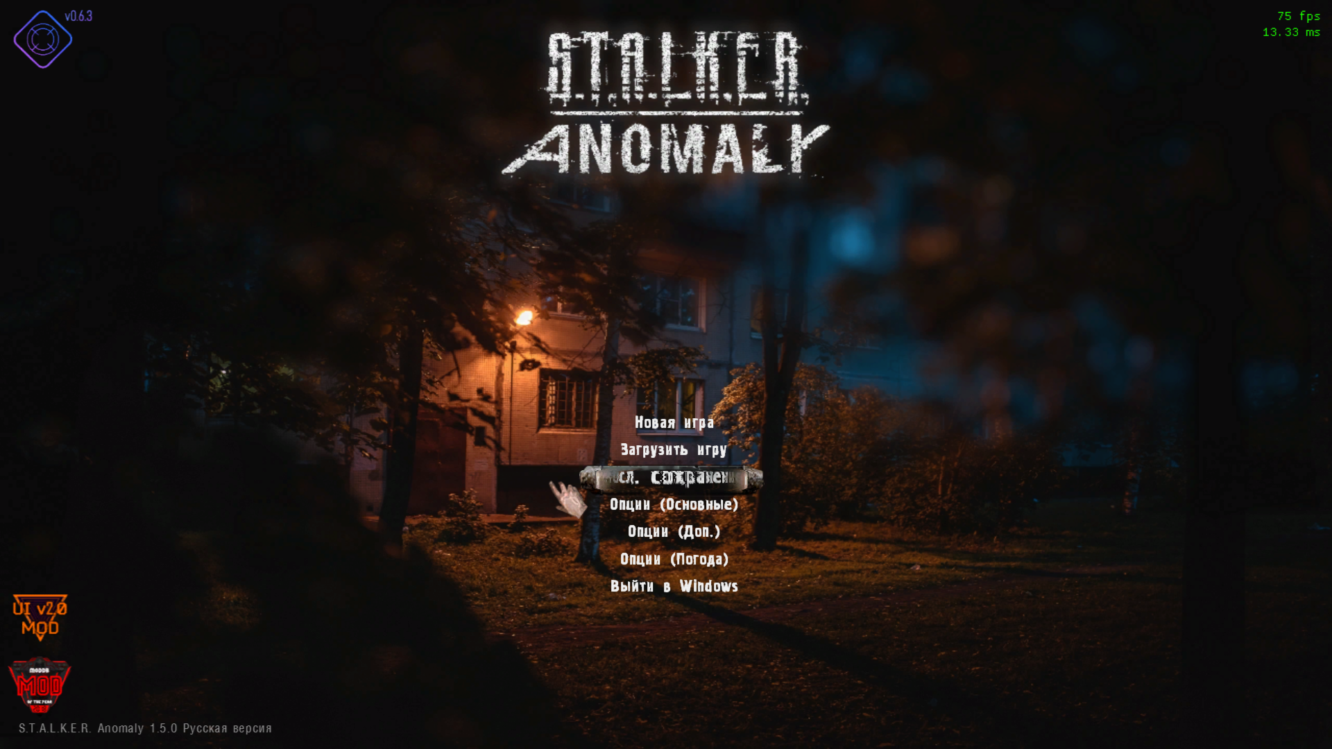
1) I understand wanting to build a brand, as it were, but slapping your logo on the main menu screen just feels really tacky. I suggest removing it.
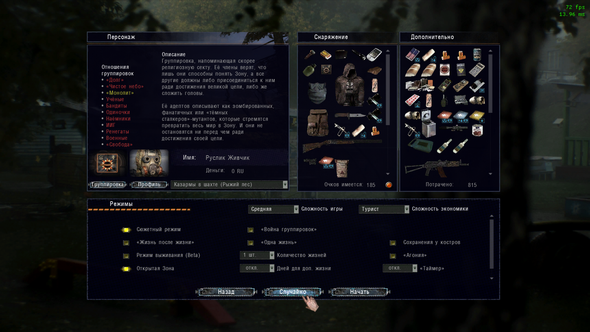
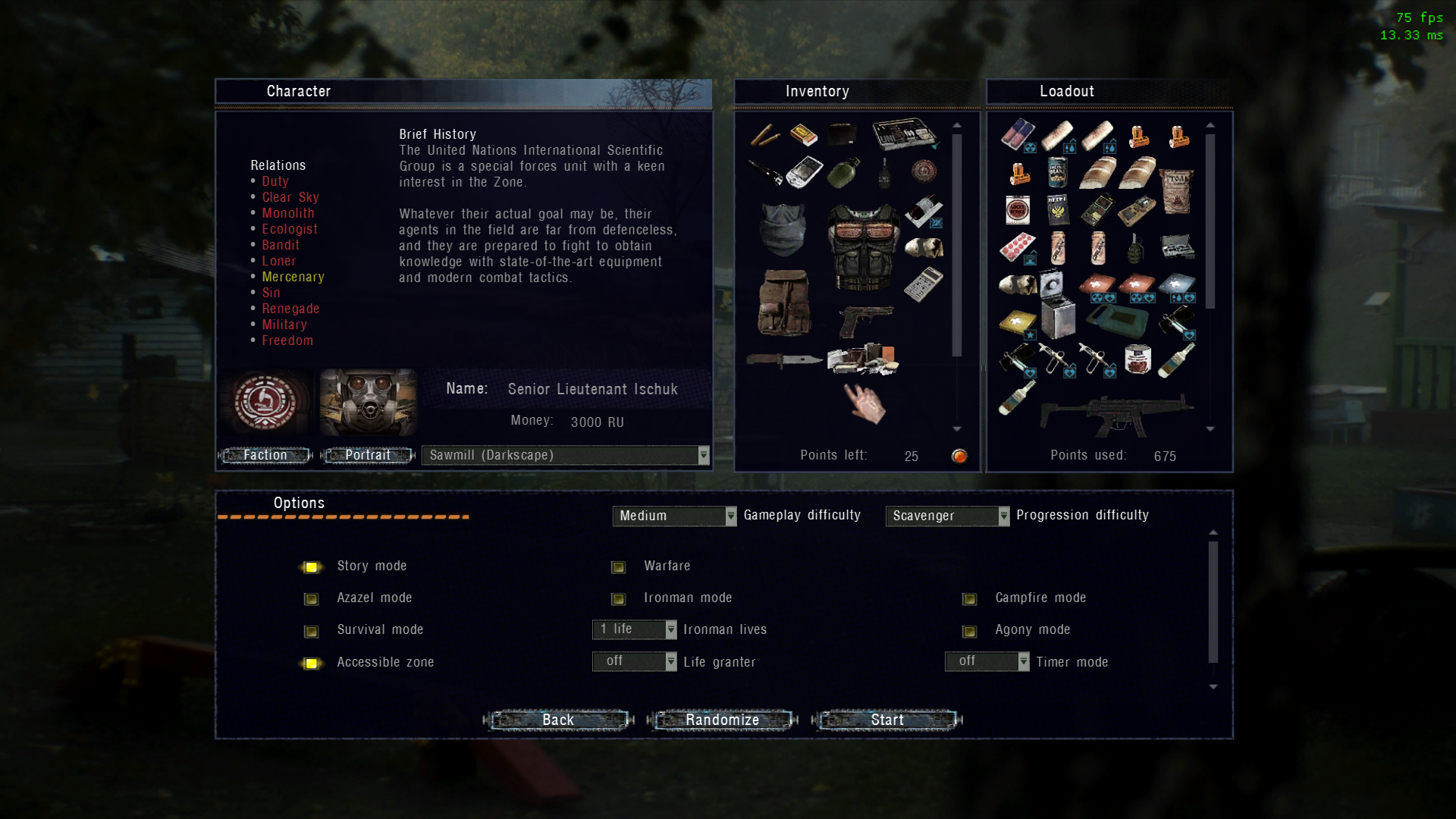
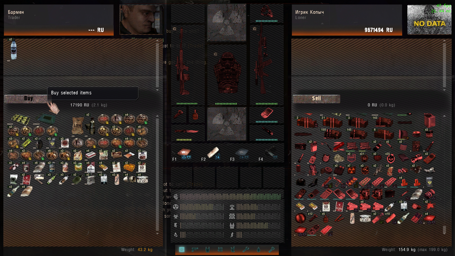
2) Make the buttons match the UI. Most of the menu buttons still have a metallic or rusty texture to them. I would change them to match the rest of the blue.
3) The orange outline around the radar is VERY distracting. Very bright and very ugly. Go for a more subtle color.
4) The item blocker. You know the little box that shows up when you can't equip a helmet or backpack?. Yeah. Change that to be more in line with the rest of the UI.
5) Removing the background texture from the PDA. I feel like that was a bad choice. Even if you are going for a futuristic/holographic UI at least give something physical for something as interactive as the PDA.
I understand that english isn't your primary language but I don't trust Google Translate since it apparently doesn't know how to handle cyrilic languages.
This comment is currently awaiting admin approval, join now to view.
This comment is currently awaiting admin approval, join now to view.
Thanks i like this mod \m/
What about that menu replacement ?
I'm looking for a menu addon standalone ^^
Any plan on that maybe ? =3
You can take it .
My plans for the interface graphics were interesting only for the sake of experiment
i like the idea altho i feel like it takes some immersion awa but it a bit more visually appealing pretty nice