I always find colour so difficult to choose. For my space game project (still untitled, ideas in comments please!) I've so far used grey for the asteroids, and a deep blue for space. I don't want to use the boring cliche of a starry black sky, space should be so much more colourful!
So here's some alternatives, with colour palettes I've taken from other works that have inspired me.

The rock here was inspired by this great low-poly art that I discovered on Pinterest.
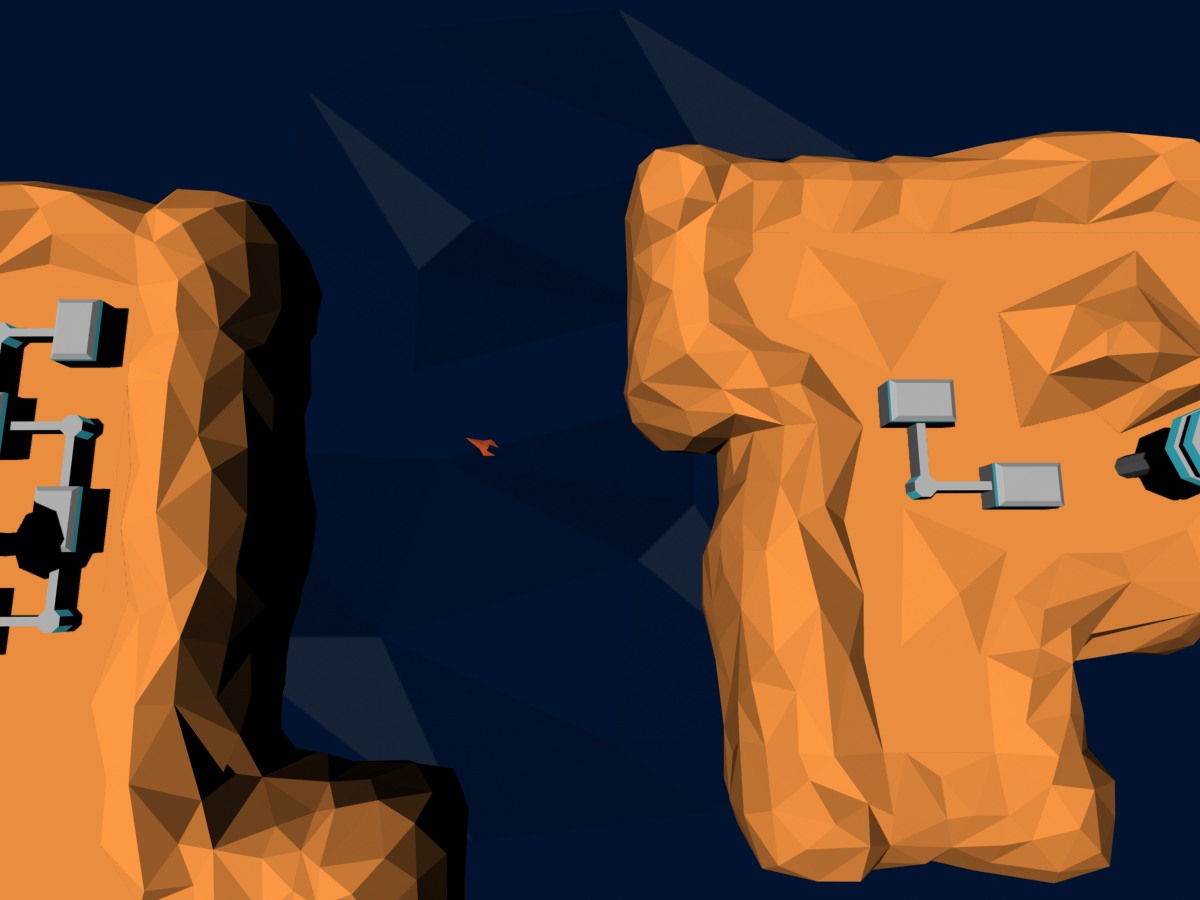
The bright orange rocks and dark blue space were inspired by this really cool low-poly piece on Pinterest.
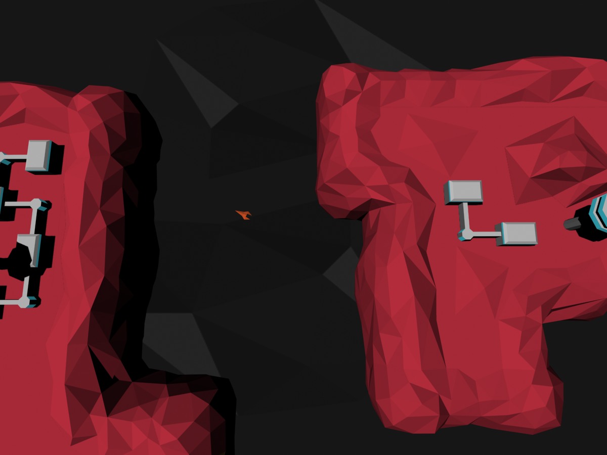
No so sure about this one, the rocks seem a bit too vivid in red! But I do really like the image that inspired these colours, on Pinterest.

Trying the red rocks in a darker maroon, & with the blue background. Dunno though, it's not very vivid, but it makes the buildings stand out!
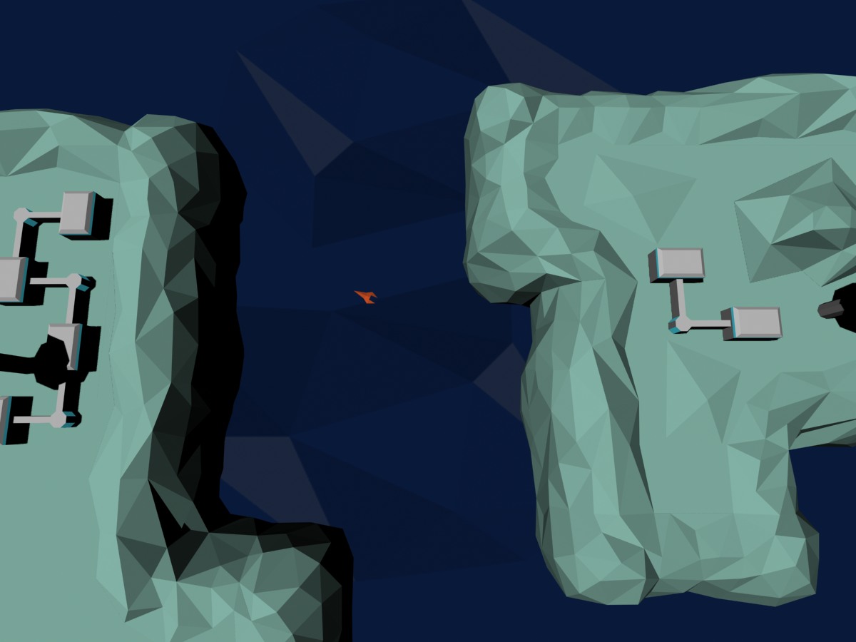 Not sure about this minty turquiose, the original artwork where I took these colours has beigey/orange rocks which might work here.

I went totally 'out there' for this last idea, inspired by the colours from Absolute Drift here on IndieDB.
So I'm undecided. If you could help me pick one of these or suggest alternatives, that would help me greatly. Like I said, I'm terrible at picking colours!