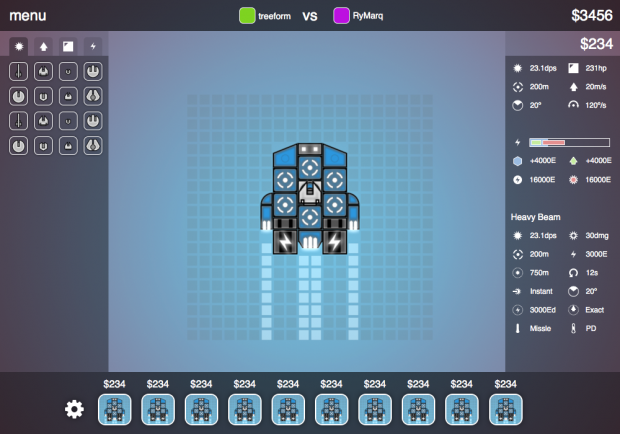
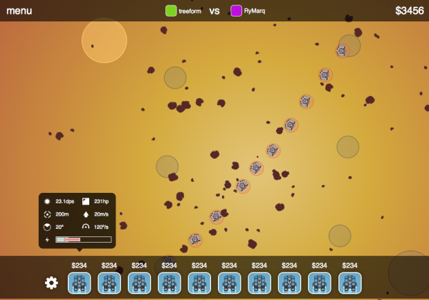
This week I tried to improve the UI. I feel like a substituted "a bag of words" with "mystery meat" icons. It looks visually better, but I am not sure if its an overall improvements. Any feedback is welcome.
In the editor:
In the battle:
Tried to figure different ways to represent the power bar:

Idea is to have power storage amount, power generation amount, power use when moving by engines and power use by weapons when firing, all represent on a bar so that you can see this information at glance.