When we made the first Overgrowth alpha a long time ago, we needed an icon. Aubrey quickly whipped up a stylized Overgrowth "O". This was, of course, a rough draft:
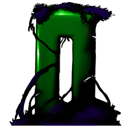
Overgrowth, Alpha 1
However, we haven't had time to make it super cool yet. In the meantime though, the amazing Tim Soret contributed his own take on the icon. A very detailed and realistic version:
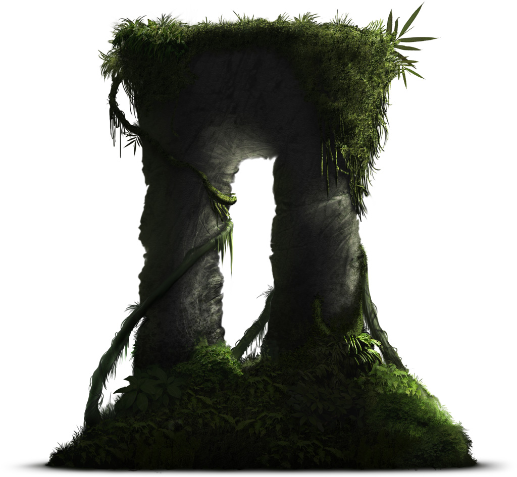
Click the icon for the huge, 1024x1024 version
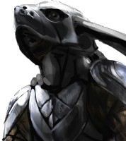
And Iiro's brother, Mordae, also submitted a sweet icon to use. Another very detailed take on the silhouette:

Click the icon for the huge, 1024x1024 version
I think these icons are awesome and it's really cool to see different takes on the same idea. The talent in the Overgrowth community always impresses me. More submissions are always welcome!(permalink)
Track us on ModDB (visit our page)
Please join us here too:


The second icon IMO is the best. I liked the colors of the first icon and the details on the third. But these shadows effect in the second got me D:
Well, the 2nd is cleaner and darker, the third is clearer and lighter. ;-) It's a matter of taste, to choose one. :-) The 1st can be good too, as a cartoony one.
yeah agreed with the top comment. second one's shadows is what does the trick, maybe a mix of the third and second would be the coolest!
Yeah I agree, someone actually sent me a fourth icon, which is literally a mix of the second and third, and it looks awesome! I will post the new icons we received later. :)
The third one looks best small, the second looks best big.
could we see it also on a black background if that's ok. Reminder that Icons have to look good on both light and dark desktops.. I'm just a bit worried the 2nd which is IMO the best, is a bit too dark.
If it turns out to be too dark then I'd suggest using an white overlay layer effect to make the entire icon brighter.
Something to be mindful of.
Just took a look at it on my desktop at home, It looks fine as a 32x32 icon on a black background. The monitor I use at work has terrible color range so that could be why it looked a bit dark when I first saw it.. but yeah I LOVE the second one.. It looks incredible as an actual icon.
hard to choose(
I realy love the second one :D (Y)
All three should have round O's. I thought it was a Roman II when I saw it.
Second one is best in style, though.
I would prefer the second one.
My vote is on the second one,
Maybe have a iconic relic ingame too to represent the game in many ways...
Just like how HL2 Icon is used in it's own game over and over and over again...
Well, more icons would be nicer, too. :-) One way or another, either iconic one or many variegated symbols.
That Mordae guy's favourite game is Dwarf Fortress. GO WITH HIS.
... That almost makes it sound like a unofficial contest :P
That is a cool idea. Contests are a lot of fun.:)
The second is the best picture full agree, however, I feel the grass lose a little the complete letter "O" of Overgrowth, I don´t know if is possible not erase, only decrease a little the mass of the grass, but only a little because like this Ok looks awesome, but looks more a Stone-Edge idea or something like... well maybe will be a "II"
Whatever is looking good this game, and I´m agree with with Assaultman, will be nice make a contest. :D