Right, here we go:
Obviously I have to state that all of the art is a work in progress, and this isn't really a "teaser" or "trailer" as such - just something we threw together quickly to give people a crash course in the game. Some of the core mechanics are touched on here.
I really hope you guys like this and like the path we've taken - we still have a LONG way to go before the game looks how we want: this vid is still rife with errors and problems. Anyway, we're pleased with this as an early stage - I'm interested to know what you think.
Oh, and if you like this, please TRACK OUR UPDATES! Thanks.

It's weird but it actually reminds me of the good times when I used to play paintball in urban environments. :D Looking forward to it, looks promising.
"Paintball in urban environments" sounds amazing.
the gameplay of this game looks amazing! wonderful
Thank you! Ian, our lead designer, has worked incredibly hard on the gameplay and we're still working on refining things.
A nice looking indie flick, I really hope we'll see more diversity environments-wise so that it won't get old/repetitive too soon. Also I would prefer to see more stylized menus where you choose your actions (like circular menu), the one you have looks very functional but it's not really different in style to windows right-click options.Besides that really good work!
Thanks for this.
"I really hope we'll see more diversity environments-wise"
I was actually thinking about this exact issue quite a lot today.
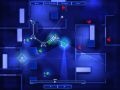
We still haven't got this blue look quite right - the background still needs some work, and I want to see it after another pass on the lighting system. I'm also thinking about doing some things with coloured lights, and also different patterns on the floor.
After that, I want to see how much variation we can get just by tweaking the background.
Once that is done, we definitely want to add some extra colour schemes - probably one with a dark red background and one with a blue background. These will just be simple colour swaps, but they'll help break up the monotony.
We did actually try a different style of menu initially - you can see the original diamond one we had in the concept. After working on this for a while, we realised that 1.) it looked better 2.) everyone on the dev team hated using it. It really was annoying to use. This menu WORKS a hell of a lot better - when you're playing the game it really matters that all of the orders are clear and accessible. I'll look at tweaking it slightly, maybe making it a little smaller, but I don't think it's going to change that much.
Cheers for the feedback - always useful.
Thinking about environments, have you tried the Tron look? I guess it won't look good enough, but it's just an idea. :)
Oh, and more thing, when you get far enough in develepment, how about several storey buildings with full 3D view?
And yeah, the game really looks great!
Thanks for that. Not really sure what you mean by "the Tron look"; I'm familiar with Tron, I'm not just sure what you're going for specifically - I guess we could try going more wireframey for one of the environments.
We actually started making this game in 2D, then sort of bodged it into 3D (yes, I know how ridiculous that is), so I'm not sure what we can do in terms of full 3D transitions etc. I'm going to talk to Matt and Ian about this - it would be amazing if you could pan the camera around in 3D for certain effects (not as part of gameplay though). Yes, I agree, a transition from a big 3D building would looking fantastic - I really want to see if that's possible, and I'll look into it.
Or you could try using different colors besides blue on other levels.
Some dark shades of green, crimson, maybe grey ect.
Not sure if it might screw up the "frozen blue" theme, but could be a good test
to see if its any good.
One thing that might be cool is some details on the maps or interactive objects
like explosive barrels, gas leaks, switches, doors, movable crates and such.
I must say this is really looking interesting and very fun to play.
Looking forward to it.
Nice work!
Btw, this game reminds me a lot of RoboSport: En.wikipedia.org
I used to play that game all the time as a kid.
Wow, wasn't aware of Robosport, Jeff! That looks incredible - we'll be checking that out. Awesome stuff on Overgrowth btw - really impressed by all of your work so far.
Love the little gameplay, man this is like playing Rainbow Six while in the plan screen... Just awesome.
The gameplay possibilities of this can be infinites. What do you say? Map packs maybe? Complex and hard maps that will make you loose about 1 hour planning all?...haha!
The look is pretty nice to the eyes too, the shadows, the light thru the wall edges, also, the enviroments will only be blue or maybe in other levels we got other colors?
Keep the good job guys ^^
Colour swap will definitely be possible - as I said, once we've got this colour scheme looking good, I will do two or three more.
In-level objects. Hmm. I like it conceptually, but they wouldn't work with gameplay currently. We definitely could do with some non-gameplay-relevant level "furniture" though. Explody barrels are the most likely thing we could do, and I like that idea personally - will talk to the guys about it.
Mmm...color me interested. Keep up the good work!
Thank you! Response to this video has been fantastic - your support is VERY motivating.
The tutorial functions really well btw, I like how you also give special tips how to do things right ingame, unlike some games just show you a bloody sheet of hotkeys and say "off you go into the wilderness! Have fun haha"
Also the font is very clear and good. I really love the visual design of the game.
Btw, can the troops grab weapons of fallen enemies and/or change their class by dropping their current equipment and switching to the fallen unit's outfit? Quite complex, but might turn out interesting.
Because we have some pretty new mechanics (firefights are basically won or lost on "time to aim" - a metric of how "prepared" both units are), and some contentious things like no health bars, we really want to DEMONSTRATE how the game works as economically as possible. I think this kind of quick video, combined with a step-by-step slower tutorial for those who want the in-depth stuff, will be how we'll handle teaching the game.
So cool that you have reacted well to the visual design - really appreciate that. This is the first game that I have art directed, and the work our artists have done so far is great.
Class-swapping...that is a really intersting idea, actually. I read it and immediately thought, "That won't work", but there could well be something in there. Again, I'll talk to our designer about it.
Great video. Good job so far guys :).
Thanks mate!