In our last news post we made a promise - the promise to take a break and implement some of the community feedback given to us. Well... here we go: This is the Feedback Imp #1!
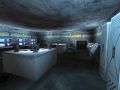
The probably greatest wish was we'd cover the boxy rooms a little with more entities and debris, add more detail. So we decided to take this point at first and give it a try. You can see the results below: We've made comperative screenshots, taken from similar angles and points of view as some of our older shots. You can read these per line, from left (before) to right (after).
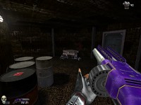
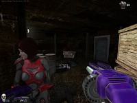
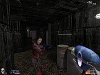
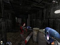
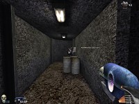
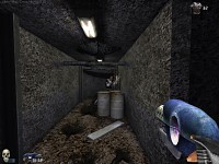
You can see what we've done: We added quite a few grass tufts to cover the floor, and added planks and other objects to fill the room. The ceilings were given additional cables, tubes and rocks. However, we had to watch our framerate, and our first test were... well, a little over our head: We had a stable framerate of about 17 - not exactly the desired outcome! So the changes are rather decent, we know and see that. We hope you nevertheless do like what you see. We are still open for ideas about (decent) changes to the already existing ones.
As we stated before, we are aware of the overall remaining boxyness of the rooms, but we don't wish to change the whole level layout for this game as the gameplay feels right to us, and we do not wish to kinda completely redraw what we got done so far.
Imp #2
The next step will be a review of our existing lighting system and possibly modify the colours of the lights to more saturated colours. We are not 100% sure whether this is what we wish the game to become, so take it as an experiment we will definitely report about when it's finished. Then we will see whether it has a positive outcome that should be kept for the future development, or if we should rather reject it. Like this update.


I love the direction this is going in....
Looks like you added some more brushes to the wall and ceilings. you also add more object too. Great job. Its really hard to tell what you changed until we play it of course, but I like what I see. Good job
dont saturate the colors TOO much in some areas. make sure it fits the mood of the area the player will be in. if something looks better with a dull shade of colored light then it should be dull. i found its best when you make a map for a game to always hop ingame and see what the finished or even work in progress looks like. its best just to play around till you get it perfect!
Thanks for both, your feedback and your advice, guys!
Highly appreciated! :)