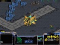
Funny that someone made use of the SC2 interface, moved the menu button to the top left of the screen and made space for 5 rows of buttons.
Anyway I think it could look better if the portrait could be displatyed in the middle or at the bottom, the button area being 4x3 and not 5x3 as that's really overkill for SC1.
Although nice work with the buttons making their background black.
Although you may want to make the map area of the interface a bit wider to look good.
Overall it'sa great start
By the way is it possible to make the interface appear as in SC2?
Is it possible to make use of taller portraits and making them being displayed correctly in the portrait area?
no, made by KYSXD Moddb.com
i just give sample and bug fix
Moddb.com