So yesterday I posted my first major media release for The Core which features several locations from the Black Mesa Central Admin Building - a modern, well funded and bright place to work full of accountants and legal teams. I received the following comment from impcnrd:
"DAMN!
great brushwork and architecture
it reminds me a lot like mirrors edge"
Firstly, thankyou for the positive comment. Seriously, it means a lot to hear that people like my work. However, the reference to Mirror's Edge really irritated me. Why? Because it seems that whenever a game/mod developer uses primary colours in their work people think it's been inspired by Mirror's Edge.
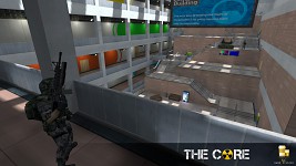
We've been ruined by mainstream games and their absolute fear of using any colour that isn't brown. My maps are in fact not inspired by Mirror's Edge. They're inspired by real life places where I've worked. Real life places filled with bright colours and light. Filled with clean whites contrasting solid primary reds and blues and greens and yellows. These places exist in realty. Honestly, they do. So why can't they exist in games without people linking them to a dystopian future parkour game?
Mod developers of the world, I hereby lay down a challenge to use bright colours in your productions. Don't make it a weird quirky thing to do; make it the norm.
Cheers,
Archie
Totally fu***ng agree!