Visual appearance of Rise of Titans
Within the visual appearance of the game we can find four contrasts.
The first contrast it’s found in the main menu. An interactive 3D menu with a cartoon appearance, with a lot of bright colors and a fresh dynamic and with several visual effects.

The most significant menus of the project (shop and deck-building) and the battlefields follow the same aesthetic of the main menu.

Moreover, you can find some submenus trying to break with the previous aesthetic using ancient symbols and an underscore finished product. Realism is not what we’re seeking, nor shade but yes the touch of sobriety against such colorful and round forms you can see in the main menu.
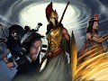
Finally, for the visual appearance of the cards we’ve create illustrations that are aggressive, dark and with landscapes to highlight the ferocity of the creatures.


In dissonance with this we've created several groups of cards (elementary and some neutral cards) that seek the cartoon visual appearance, typical of the menus.


It’s a project of contrasts where we don’t pretend to be on a single subject but seeking contrasts that make more creative and understandable the status which the player experience throughout the game.
*Stay tuned for more information and don't forget to leave your feedback.*


Not bad at all!
Continue evoluindo o projeto,parece legal.
Looks epic.
красиво