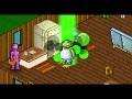
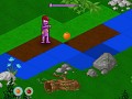
I have a little criticism about the game. While I like the art style of the actual game and wouldn't change anything in it, there are various other screens and stuff that seem really out of place.
For instance, the purple guy who pops up in the win/lose screens, the game logo, the circle particles when the sheeple are awakened (to a lesser extent), etc. Basically, most of the things that aren't pixelated.
Generally speaking, pixel art and regular assets don't really go together, and I think that the regular assets should be replaced with things that are more jagged. Maybe replace the purple guy with poses of Patchman in the same pixel art fashion. Maybe make the circles rough like the other shape particles, and the same for the logo.
That said, the game itself looks pretty good. The concept looks interesting, and I can't wait to see some full gameplay footage of this in action.