
Hello IndieDB!
Today we've got some more screenshots of the different parts of our game.
This includes the launcher and updater, which is the first thing you'll see normally when starting the game.
We've changed it as well to fit the new style, and you can tell us what you think!

Here is a gif: Media.moddb.com
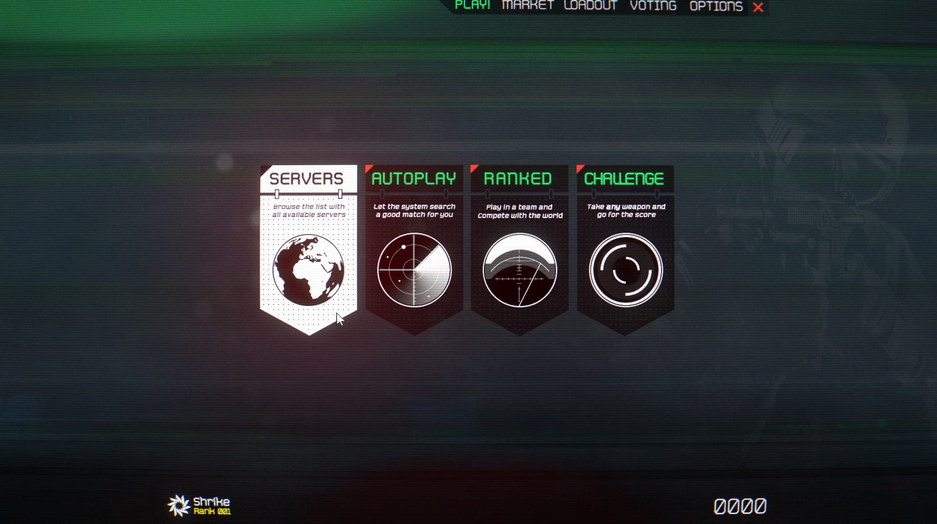
There's also the Play menu, which features the different ways to play and join servers that we plan to implement. Right now we have just the option to browse the available servers, the screenshot of which is in our last update, but an automated joining mode will be added, as well as the option for our big ranked team games and the challenge mode! - more info about those in a future update.
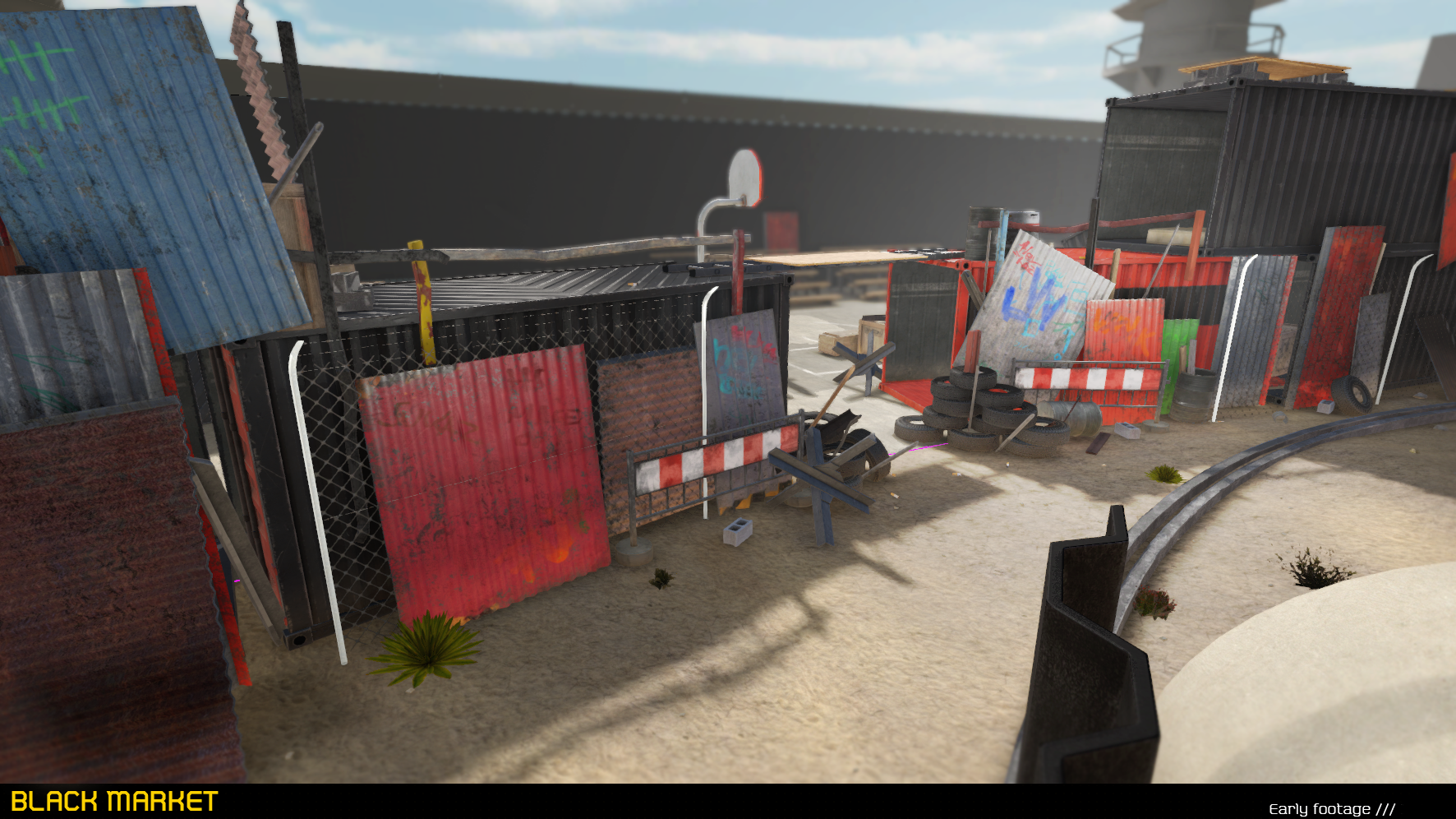
And lastly, there's a brand new in-game screenshot! (Walls WIP)
By the way, if you're a 3D artist or animator and want to work with us, get in touch! ; )
That's it for this week! We hope you enjoyed this little update.
Please tell us what you think, like and dislike,
we are really happy to read your comments and we do listen!

that detail O_O
Beautiful UI design, seems very clean and intuitive.
Also sick level of detail on that suppressed AK
That UI is sexy as ****. I really love the look of this game. Any idea when we will be able to get our hands on an early build?
Glad that you like our art.
If I had to give a date, it would be around 6 months from now, but
thats no promise! Depends on how many maps we can/want to give out at that given time.
I love the UI! Very well done.
top of the container uv problem. Nice work, with that AK on the main menu is a ingame model, kudos.
Thanks! It's no actual UV problem, it is a diagonal stripe pattern that is viewed from a sharp angle :)