The show must go on: Here comes the Feedback Implementation #2.
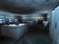
The experiment I stated last news post about re-arranging the lighting colours has surprising outcome, for me. While at the first glance, it was a bit strange to move through such highly coloured scenes, it appears to me to that the whole scenery looks much more interesting on the long run. Here are three pictures, of differently coloured scenes:


You have probably already guessed yourself: These are blue, green and red. The difference in the mood of these screens is quite interesting, I hadn't expected such a change. The colours of the lights had a saturation of 28 each before, and now I've raised them all to have a saturation of 96. What do you think?
Imp #3
We're nearly done with this first Feedback Imp Phase, but there is a last remaining point: The city environment, which could use some rain and a darker skybox according to the collected feedback. I doubt that the framerate (which appears to be at the absolute limit already) can take the addition of rain, even with decals, but we'll have a try and then see how it turns out.


Great Idea! Maybe even make the red more intense and color the lights red. Blue is great for outdoor areas at night or if there is some kind of nuclear glow or from windows at night.