In the last news post, I explained how I created the walls and doors of my dungeon, as well as how I added in some initial graphics to see how it all works together. The results were better than I could have hoped for, especially after I added in some optimisation, but having a nice looking dungeon isn't really much fun if the player can't see it properly, so in this weeks tech blog I'll be talking about the decisions I took for setting the view size and aspect ratio as well as the GUI layer.
Decisions, Decisions
At this point in the project I had to start to take some hard decisions, namely:
- What size to make the rooms and the view?
- What kind of movement should the player have?
- What controls to give the user?
These three things were, in my mind, the most important decisions of the whole game, since they all would have a far reaching impact on the gameplay and final UX (User eXperience). I also had to take into account the fact that I was planning the game as a mobile release as well as desktop, which meant that certain things I would have to make adaptive to suit different screen sizes and the controls would have to be mouse, keyboard and touch screen compatible. Knowing that these issues were ahead of me, I tackled the views first...
Views And Devices
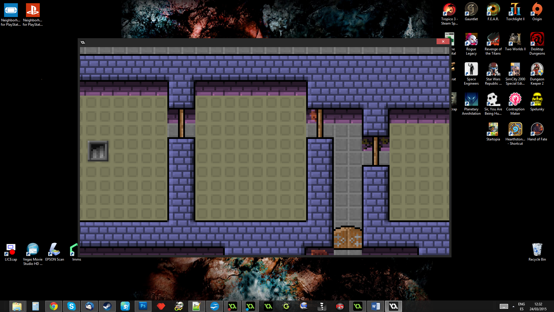
While playing with the BSP scripts I wrote for the dungeon, I'd found that for an 8x8 tile size, a minimum room width/height of about 240px gave a nice initial maze, so that decision was pretty much taken without realising it. But what about the view? I started looking at other "low-res" games to get an idea of what kind of formats people used and a lot seem to go for 320x240 (3:2). I decided to use this as a starting point for setting up the views, but after a quick initial test I wasn't happy with the view taking in the whole initial room, especially with such small 8x8 sprites - on phones, this would make everything really small! So, I just halved that again and tested with a 160x120 view.
Okay, I liked that size as it let the user see the graphics clearly on any mobile device, but would still provide a bit of extra "space" around the player to see what's coming at them. However I want the game to take up the full screen of the device and not have those horrible black borders that are added when you have "keep aspect ratio" enabled. This meant that I would have to forget the 3:2 aspect ratio and get the aspect ratio of the device itself (in landscape) and use that to then set the view width in ratio, using the base height of 120. I've actually done this for all of my mobile games and it's pretty simple to do:
view_wview[0] = view_hview[0] * ratio;
After that I simply set the view ports to the display size and the application surface to the view size and "voilà!", a correctly scaled game that fills the screen.
Desktop Scaling
For desktop I had to modify this ever so slightly, however, as it would create a game window that covers the display when not in fullscreen mode, which is not what most users want when they play a game in a window! This meant that I would need to add some code to check what platform was running the game and if it was a desktop target, set the window and port size to something more appropriate.
Now, I could just set the initial views to 160x120 and then set the ports to be 3 or 4 times that (giving a window of 640x480, for example), but this would then cause problems when the player goes fullscreen, as the display aspect ratio could be 4:3 or 16:9, and the 3:2 ratio that I had chosen would scale terribly. I could obviously re-enable "keep aspect ratio" and let GMS deal with things, but that would also mean a return to those black bars, which I really didn't want - AAA games don't have black bars, so I was not going to let mine be anything less!

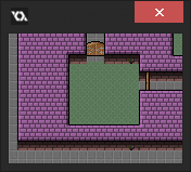
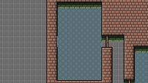
The images above show (on the left) how "keep aspect ratio" looks in fullscreen, and (on the right) what happened when I disabled this. Neither of these was very nice, and it seemed to me that I was going to have to do one of two things:
- Disable fullscreen mode using ALT+Enter and only permit the user to go fullscreen from an option (as then I could add code to re-scale the views to suit the display)
- Add in a "catch" code to my game controller object that checks if the window size has changed and adapts the view accordingly.
I wasn't really happy with either of these options, but I decided that the "catch" code would be a better user experience, since most people are used to having ALT+Enter work for them. So I sat down to add this in when I had an idea...
Why not just treat the desktop display like any other device? I mean, you can be almost certain that the display is going to be landscape and greater than 1024x768, so why not just make the views and window in the same aspect ratio as the display? I couldn't actually think of any reason not to do this, so I quickly adapted my device scaling code to suit desktop too. Basically, I used the os_type constants to check the OS that was running the game, and if it was a desktop target it would set the view port to be a size proportional to the display. The actual size is the display height - (3 * 120), so that the game window will scale dynamically with the display. The code itself looks a bit like this (room_set_res() is a custom script that simply sets up the views):
while (hh < display_get_height() - (120 * 3)){
hh += 120;
}
var ratio = display_get_width() / display_get_height();
window_set_size(floor(hh * ratio), hh);
surface_resize(application_surface, floor(120 * ratio), 120);
room_set_res(floor(120 * ratio), 120, floor(hh * ratio), hh);
This meant that for every user the actual game window would be slightly different depending on their monitor resolution (just like on mobile devices), but it had the great benefit that going fullscreen would just "work" and I'd need no extra code for scaling. On my monitor (1920x1080) the game now looked like this:
Even on the smallest monitor resolutions this should give a good sized game window, and I wasn't too worried about the differences in width between a 4:3 or a 16:9 display. Yes, those with 4:3 displays would have a "narrower" window, but I didn't think this would impact too much on the gameplay as for what I had in mind, the action was all going to be centred round the player anyway, and the limiting factor was the height, which would always be a fixed 120px. A little more or a little less on the width should make no real difference to the final gameplay and user experience, as long as a radius of half the height was visible around the player. This also meant that I'd have space around the sides for the GUI elements.
The GUI
Since I was working on the views and presentation of the game, I also took this opportunity to set up the GUI layer, and at the same time lay out some base designs for the HUD. This may seem premature - after all, we haven't even got a player yet! - but, I was going to have to think about these things sometime, so I might as well do it now. Hopefully it would help clarify the direction of the game a bit more!
So, what did my HUD need and how much space would it occupy? Obviously, I'd need some type of health counter, a score, and magic of some kind... of these three things I was certain, but what else? And in what form was the magic to take? Thinking about mobile again, I deceided to have two "magic" options, both of them simple to use but offering variety at the same time. One would be a class skill - accessible through an attack button and with a "cooldown" - and the other would be one-off "spells" that the player could pick up and use at any time.
In my original homage game to Gauntlet, I had "potions" which would give the player certain abilities and powers, and I figured that something like this would be great to have in my new game too. It would mean that I could procedurally add pickups throughout the rooms and that the player could use these at any time to boost their damage or get special effects. In a game like this, which is obviously aimed at the casual market, having something to spice up the action is essential, and I could scale the magic to the current level, introducing newer and more powerful spells as the player progresses.
With this in mind I started to mock up some HUDs in Photoshop, but quickly found a problem. At 120px, there wasn't going to be room for even the most basic controls if I wanted to have text. Have a look at this:
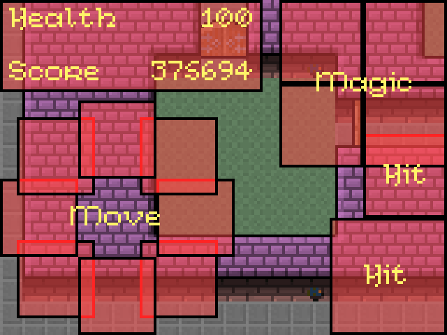
The button sizes are based on the text size, and that's a 10px pixel font! Oh, dear... thankfully, GameMaker permits you to resize the GUI layer, and it was obvious to me that I was going to have to use this function to have the GUI at a higher resolution than the actual game view. Now, I know that a lot of people don't like this - pixel purists just hate seeing inconsistencies in pixel sizes! - but personally I don't care and feel that as long as the style is consistent, the actual pixel size matters less. So, a bit of re-arranging later and I had this:
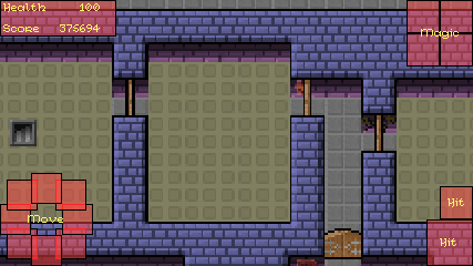
Bottom left is the touch screen controls (either analogue or virtual key - I wasn't sure yet which), bottom right are the regular shoot/fight button and the special "class" action button. Then at the top left we have the score and health, with the top right being reserved for the magic (in whatever form I decided that was going to take). The GUI layer itself is now 240px high, with a proportional scale along the width based on the aspect ratio, so the GUI was going to have twice the pixels that the game view has, which seemed like a good ratio.
Moving On
With that decided, I could now move along and return to GameMaker to start coding the next major part of the game - the movement and controls. Creating a mock HUD this early in development had helped clarify my ideas on the game, and I was eager to add in the Player and get to work on the more elemental parts of the gameplay. In the next news post, I'll discuss that part of development in all it's gory detail...