The game you are trying to view has ceased development and consequently been archived. If you are a member of this game, can demonstrate that it is being actively developed and will be able to keep this profile up to date with the latest news, images, videos and downloads, please contact us with all details and we will consider its re-activation.
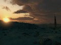
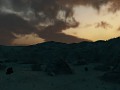
A survival shooter set in Central Asia after the end of civilization.
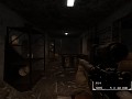
HUD(maybe)
(view original)
")
Post a comment
Description
The HUD that briefly appears when you reload.
nice oldschool HUD
I like.
I don't like the bordering. The font is ok though.
Agree, the borders are odd.
Maybe have the Text with NO Borders at all....Would be good :)
Pokemon blue version HUD
It looks nice, but I dont like the box that it is in and I think it should be a little lower on the screen.
i think the position is fine, it overlays the weapon, so its not blocking your vision
and it only shows up when u reload anyway
Perhaps it's better on the left side so it doesn't overlap the weapons, I just love to be able to see what I'm holding =.=
Umm... I don't like it. Its way to oldschool, reminds me gameboy ;P. Iwould suggest somethink more artistic, take a look on awesome City 17: Episode 1 HUD, and You will understand what I'm talking about.
I think it's perfect. Don't change it, please. :>
I hope the HUD is on demand.
well classic hud as i like!
Pls remove HUD.
I hope the HUD is optional (but provide a way to check to magezine capacity without it).
Can you do the HUD where it only pops up when your reloading or checking your equipment/Magazine ?
Can you read the description?
I think a perfect solution would be to have a few in game options for the HUD. But please add the ability to turn it off totally.
Look to Fallout 3 for inspiration on the HUD. You are on the right track to recreating it here.
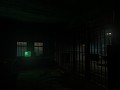
As for the level: Disable shadows on the shelves. Also, it seems like the lighting should be brighter and less directional, based on the light props used. Slightly dim the light_spots and set the outer angle to be 89...lower the generic light entities and increase the brightness a little bit until the upper corners are well-illuminated. I have no problems with the brushwork, as underground is supposed to be sparing.
I liked the paper HUD more.
Did anyone read the description?
This hud is ******* awesome.
KEEPIT KEEPIT KEEPIT KEEPIT KEEPIT KEEPIT KEEPIT KEEPIT KEEPIT KEEPIT KEEPIT KEEPIT KEEPIT KEEPIT KEEPIT KEEPIT KEEPIT KEEPIT KEEPIT KEEPIT KEEPIT KEEPIT KEEPIT KEEPIT KEEPIT KEEPIT KEEPIT KEEPIT KEEPIT KEEPIT KEEPIT KEEPIT KEEPIT KEEPIT
IT IS ******* AMAZING.
SERIOUSLY, ANYONE WHO SAYS OTHERWISE IS AN *******. KEEP THE HUD LIKE THIS. IN FACT MAKE ALL UI LOOK LIKE THIS.
Agree!
I love it, simple and neat
Add some transparency and it could work pretty well, an in game color changer would be nice also
I think people should know that JLea said that it appears when you RELOAD.
Is there any way it could be animated? Nothing fancy since it's only for a brief time.
Really pretty.