As game developers, it's very easy for us to take things like the user interface and HUD (heads-up-display) design for granted. I mean, how hard can it be to make a couple of buttons and a healthbar? As it turns out it's not very hard at all... With the GUI layer and a couple of objects you can quickly throw together menu elements and HUD elements in GameMaker: Studio, but the difficulty comes in making them user friendly, unobtrusive and consistent. The UI (user Interface) for Skein went through various iterations before I finally felt that I got this right, and in this weeks article we'll talk about the reasons behind the final designs and the problems with the ones I had initially.
All That Glitters...
My first UI for Skein consisted of some rather garish gold filigree-style menus and HUD elements. I chose this style for one simple reason - I'd made a logo that used it and the logo integrated the play/start button, meaning that it was also a part of the UI. Naturally this made me feel that I should use the same style for all my UI elements.
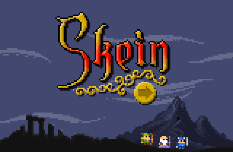
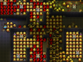
As logos go, it's not bad but with hindsight I can see lots of issues with it. The gradient doesn't quite work, the outline on some parts and not on others doesn't work, and the Photoshop bevel filter on the filigree most definitely doesn't work (I apologise to all you design gods out there for using it). However I rather liked it at the time and so went ahead and used the style to make the main UI elements. The image below shows how the initial game HUD turned out:
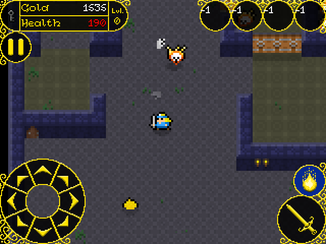
Remember, at that time I was making the UI for mobile and so things had to be a bit bigger than I would really have liked, since they would be getting pressed by a big fat finger and not a little mouse pointer! However, that doesn't really excuse the horror that is the HUD I designed! Okay, maybe it's not that bad, but with hindsight I can see multiple issues with it, which I'll list:
- Too bright - The gold colour is just to distracting and the eye doesn't know quite what it should be keeping track of in the display. This is a big issue, as the HUD really shouldn't distract from the acion on the screen.
- Too "baroque" - Yes, I had great fun making all those filigree details and shading them etc... but, let's be honest, they are completely unnecessary, distracting, and ugly. I do like the effect, but I think it's just too much for the HUD (although as you'll see later, other UI elements worked rather well with this)
- Too chunky - Okay, it's a mobile game, so the UI has to be a little bit bigger to suit fingers, but I think that in this case I went way too big. I'd estimate that the HUD is taking up about one quarter of the screen space, and in a game where you are being attacked from all sides by hundreds of enemies, limiting the view are for the player is not a good idea.
However, at the time I made this I wasn't thinking about any of those things and was purely concentrating on the aesthetics of the HUD, and so I continued on in the same vein and created menus in the style too.
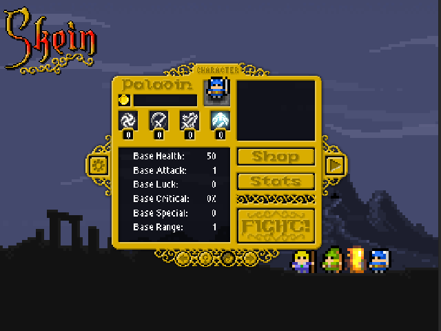
That is the original "Start" menu for Skein, where you can see and choose the character as well as set the options, see stats, and access other menus. I feel that the gold filigree effect actually works quite well here, but there are still issues:
- Too cluttered - There is too much all crammed into the one space, and it's not very well organised. Players don't want to have to navigate across a large screen area to hit different buttons, and it's better to have them all grouped together.
- Too vague - With the icons and text being done in relieve (that Photoshop filter again!) it makes them stand out less and be less obvious. Again, players don't want to have to search to find something and having vague icons and labels makes navigation harder.
i went with this design for quite some time, but when I transitioned from making a mobile game to concentrating on making a desktop/console game I had to rethink the whole thing and look harder at these issues and how to solve them, especially as the change required me to think about gamepads and keyboards...
Less Is More
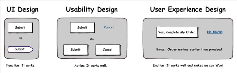
When I changed target audience for the game, it required a paradigm shift when thinking about the UI. I had to take into consideration multiple input options, larger screen sizes and the final user experience (UX) as a whole, so I scrapped what I had and went back basics. The final UX shouldn't ever be ignored and you should always take into account how people are going to use your menu and HUD elements - it's often handy to go back to games you've played where you found the UI and HUD to be great and those you found to be terrible and ask yourself "why?". If you hated the button placement in a AAA game, then think about why that was and how you would have changed it. That way you get into the UX mindset and can create better designs. Basically UI/UX design is like this:
After reviewing other games and working a fair bit more on my own game I had a much better idea of the "feel" of the gameplay and what was required for the UI/HUD. The core of Skein is action, so I figured a HUD that shows the minimum of information and that takes up the least possible space would be what is required - I want the player to focus on the enemies and magic and not on the HUD. The fact that I no longer had to worry about people actually touching on the display to activate things made everything simpler too, as I didn't have to to worry about inadvertent touches on buttons (like for the magic) and could also remove the controls from the bottom.
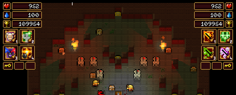
That's pretty much the final HUD in the game as it is now. I went with numbers instead of health/mana bars simply because I think they give a more accurate representation of what's happening, and also because there is no maximum health or mana in the game, so a bar would be pointless. I also made the spell icons much closer together and added them to the same area as the score display. Spells will be activated by key-presses or by pad buttons, so there was no need to make them touch/mouse sensitive, and I also chose colours that are a lot more neutral and less distracting. The gold is still present (although muted) in the outline of the HUD elements, but I chose a regal carmine/maroon for the background so that the information would "pop" but not distract the user. This colour scheme seemed to work well so I kept it when I started working on the menus for the game.
Menus, Buttons and Gamepads
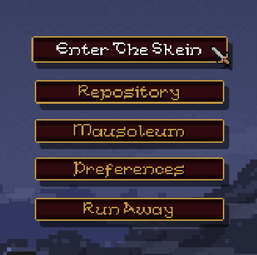
With my new simpler HUD, I made the initial menus as basic and standardised as possible - basically just some nice buttons that float up into the screen for the user to click on: play the game, library, high scores, preferences, and quit. the issue here was how to integrate gamepad, mouse and keyboard into the mix. My solution was to make a "menu controller" object, which would work like an FSM and detect which button was being hovered over or pressed based on the current menu "state". basically, all the buttons in the game purely graphical effects, and this single controller object checks which menu constant is currently set and reacts to input accordingly.
I also added in a nice little "highlight" effect to the buttons, as visual and aural feedback is a very important part of UX design. People like to hear a subtle sound or see a glow or something when they hover over a button, and they like a sound and another effect when they press that button. I also made a mouse cursor and had to add in a few extra checks for gamepads, as some buttons (like the back button in sub-menus) can be activated using the (B) button of the gamepad. If you look at most games that support gamepads this is pretty standard: (A) = accept, (B) = back. in practice, I'm glad I did this as it makes using a gamepad to navigate the menus actually easier than using the keyboard and mouse!
In the above image, you can see the main menu and how it reacts to both mouse and keyboard/gamepad navigation (and there is a quiet "whoosh" sound when a new button is highlighted). The mouse cursor will also fade out and disappear if it's not used for a few seconds so that gamepad control is even more "front and center" and one less distraction exists on the screen for the user. The sub-menu screens all follow the same idea, with all control types being supported and as much visual/audio feedback as possible without making the game garish or annoying. This is the re-vamped "bestiary" screen from the library section - as you play you will unlock new entries in the library for enemies, spells, etc...
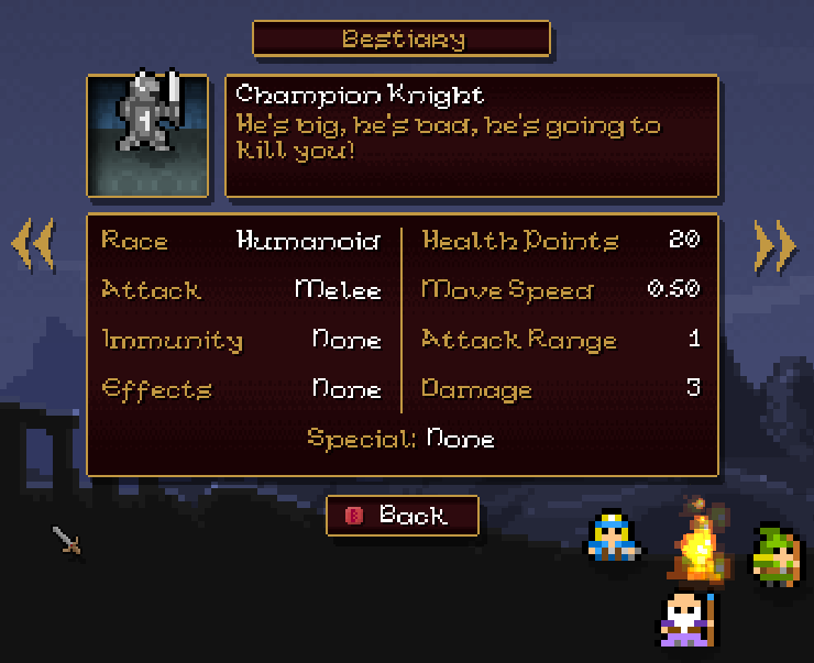
With this I was very happy indeed. it was easy to navigate and had the information very clearly displayed and easy to read. You can see what I mentioned earlier about gamepad buttons being labelled at the bottom with the "back" button, and I even made it so that if no gamepad is detected, these helper icons won't be shown! Little details like that really help push a game up to a new level, and while they may go unnoticed by most users, keep in mind that the best UI design is that which doesn't call attention to itself.
Standardise Everything
All the menus and UI/HUD elements in Skein now conform to this basic style, and I took some time to standardise things between menus. Paying attention to how many pixels are between each of your buttons on one menu and making sure that this same number is used for all menus is a minor detail but so very important, as is making use of roughly the same screen space for each menu and also using the same navigation controls throughout. Misaligned buttons, constantly changing sizes for text boxes or menu items, random colours, buttons that change place from menu to menu... all these things are minor details but to the end user they scream unprofessionaland sloppy. This final GIF shows a couple of the menus in the game being used and hopefully you can see how I've kept everything within set parameters for size and structure:
I've spent maybe a quarter of my development time on Skein just making these menus and the HUD, partly because making them support multiple controls was tricky, and partly because making sure that everything worked smoothly and (more importantly) was consistent required time and energy. However this attention to detail will pay off for me, as the player's first encounter with my game will be a UI that can be navigated seamlessly no matter what device (gamepad, mouse or keyboard) that they have chosen, which in turn means that they will get to playing the game and having fun quicker. This is something to note, as no matter how your game is structured, the very first thing that the player will interact with is the UI. Not gameplay, not audio, not graphics, but the actual interaction between the player and your game is one of the most fundamental things and is so often ignored, but getting it right can make a world of difference to how well your game sells later.
That's it for this week, and I think that next time I'll (finally) get around to talking about some of the effects I've used in Skein, other than the lighting...


Very nice job! It looks really good and simple (in a good way).
Yes, UI/UX is one of the most easy things to overlook, although it has a big impact on the final product.
Cheers and keep it up!
PS: Love the waving animations of the characters ^_^
This is gold! and it creates a better sense of theme and that there in fact exists this fantasy world which helps the player feel immersed in.