When we first set out making this mod, we asked ourselves what do we want to achieve? Or more specifically how will we know when to quit? When will we have achieved our goal? It may seem like a stupid question, but think about it. What makes a game, a mod or any product for that matter... finished?
We decided the easiest way to do this would be some sort of checklist, so we can mark this, that and everything off and when there's nothing left to check off were finished. The mod is made, the fans are happy(?) and we're satisfied. One of the most important factors on that checklist was a rather obvious one.'Make the players forget their playing Starcraft II'
We all agreed without question that once a player has downloaded WCLOTD and opened sc2, booted up a map and in-game. Nothing, no doubt should be left as to what their playing. We want your friend to come round to your house wait impaitently at the door, call up the stairs, hear no answer and run up and say "Oh my god! What's this!? That looks way cool!" You reply... "Starcraft II" - They Reply "Get Lost!".
If we can achieve that, well. Words could not describe my personal satisfaction, what about yours?
So... how do we plan to achieve it?
Well in several ways, actually. For starters we plan to replace all the sc2 models, units first and hopefully time abiding (and most likely after first release) tile-sets (terrain texutres), environmental doodads, water textures and the like may follow.
But really, that's stating the obvious, all that is expected of a 'total conversion' mod. A zealot model renamed to 'Grunt'... We plan to deliver a lot more than that. At any rate, I digress. The one and only feature of immersion and differentiation I plan to talk about in detail today is the Art-Style and Lighting in WCLOTD and the Starcraft II Editor.
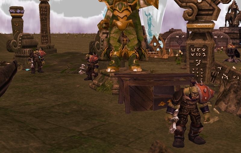
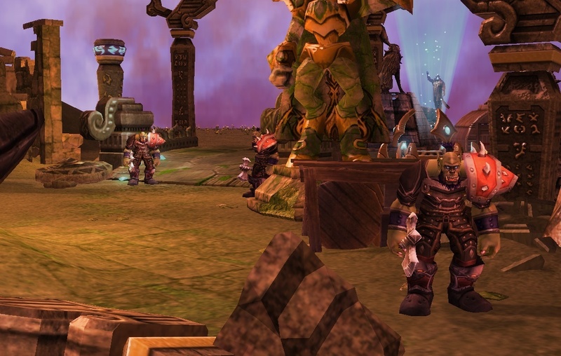
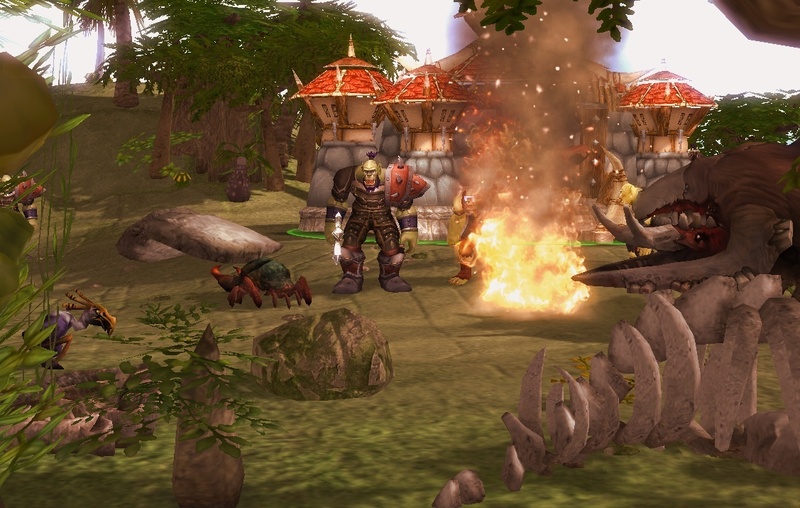
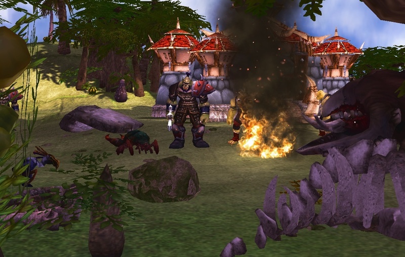
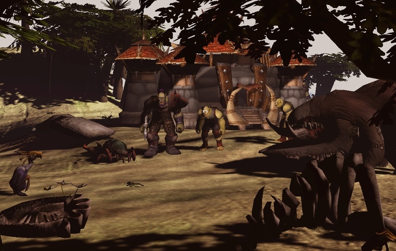
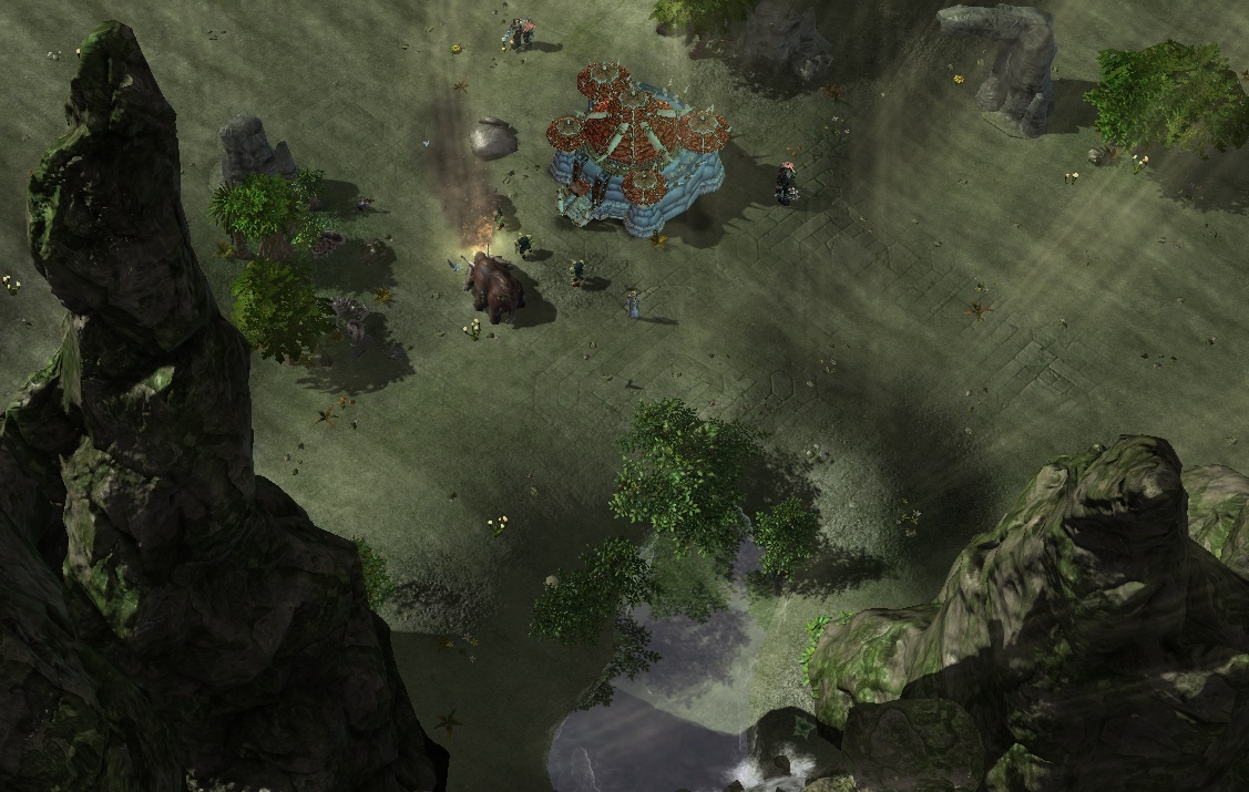
The last article, if you remember contained some 'cell-shaded' like images demonstrating a quick mess-around with said tool, the Light Editor. It's quite astonishing, at least for ex-Warcraft III modders, who were used to spamming thousands of 'glowing' doodads or 'static meshes' to achieve any kind of half-decent light environment. But here, right now. Were not talking about making a spooky dungeon with a greenish glow or a red misty cavern surrounded by glowing lava, no.
Were talking about changing the graphical style of a game. Borderlands compared to Crysis.
Warcraft III compared to Age of the Empires.
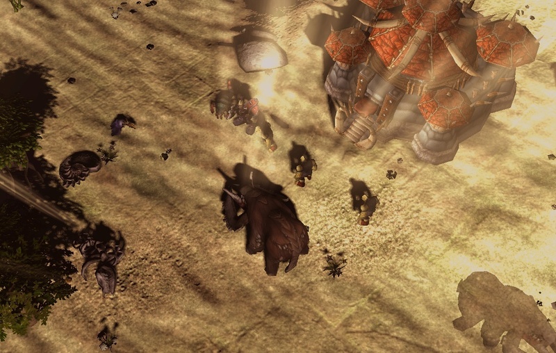
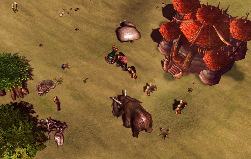
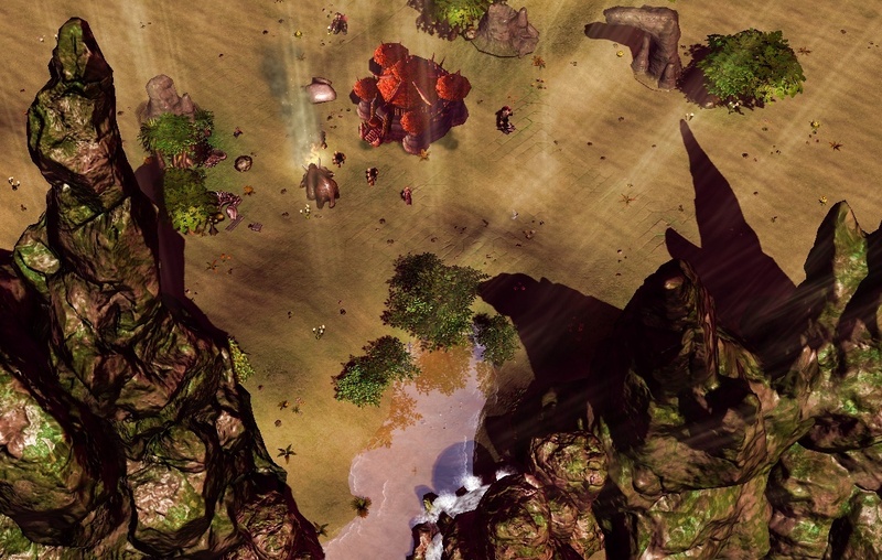
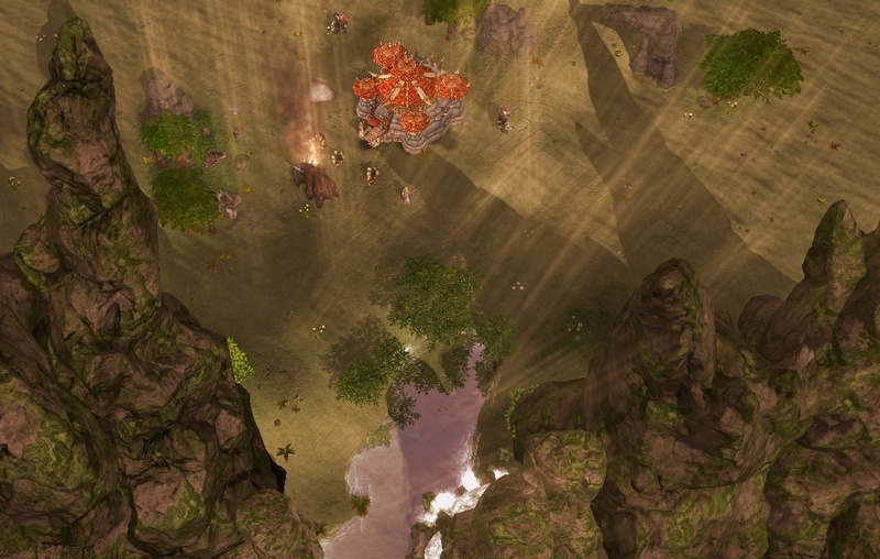
We hope to make a difference akin to that and without further ado, here are some screens of our progress. Without custom textures/models, all through the light editor (wow models are present).

")
That's what we've managed to come up with so far, anything take your fancy? Are you all in for high saturation? Like a little bit of shading? Or should the default sc2 style stay all the way? Whatever your thinking, we'd love to hear it!
Until next time guys!
Grey
P.S. - If there is a particular image you want to see full size just right click it and click 'open in new tab' or copy image address (and paste into a new tab). It will vary depending on your browser.


I think you should go with the average WC-looking shading. SC shading is a bit too dark and gritty for WC3, except playing as the Scourge or on Scourge-looking Maps the SC shading would look brilliant.
Just my two cents.
So nicely saturated (high colour intensity, very bright and jolly). Something akin to the second BIG picture down perhaps? Thanks for the feedback!
I think the middle picture in the second row is the most accurate!
Hmm, first 2 pictures, the left one is much better, I'd like to see it as shady-as-possible.
That's the least 'shaded' imo? :/
Oh did I say left? I meant right... just make it shaded and complicated as possible :D
I personally prefer some of the Intense shading on some of them. Most of our attempts have resulted in a more muted, sepia tone, I think trying to improve and enhance the saturation would be good to try before we decide on a serious path to pursue.
OH EM GEE, those pics look AMAZING!
Glad you think so, do you a particular favourite? :)
the pic with the mammoth like thingy and light beams is the best.
Thankyou ^^
Were getting mixed reviews on the lighting, it's something I think were going to have to keep coming back to.