I’m a big fan of iteration. I love letting some time pass and then revisiting something. The problem with iterating, is that takes too much time. Sometimes you have to do the same thing two or three times.
In this sense, ideally you want to do it right the first time. Of course, you can’t plan on doing it right the first time. You can try, but it’s very unlikely that you will have it right at first.
Time is another huge factor. Sometimes, you just want to see your work in game. Seeing things implemented, even when it’s a draft, can help a lot to give you an idea of how it will look and feel in the game. Context is important.
This week, I will show you the difference between the first and second versions of a character. I think that a few of these tips are useful not just in pixel art, but in almost every creative field.
The important part: If you are not extremely happy with your result, do it again!
Now, the example:
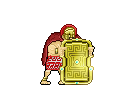
The last weeks, we’ve been showing you the Shield Bearer, an Ares warrior who takes cover behind a giant shield.
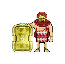
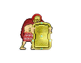
This is the original enemy design. If the character is looking forward, the only way to attack him is from behind, and vice versa if he is looking back. He always moves and attacks behind the shield, so you have to sneak from behind. We can start from here.
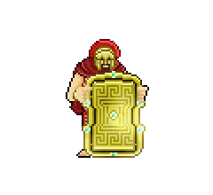
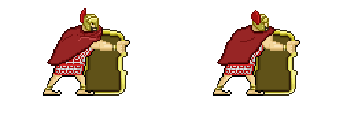
IDLE – Old Version
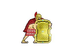
IDLE – New Version
As you can see, the base gesture is not horrible, but it doesn’t suggest action, and the stance is kind of boring because he is just standing there. The new version is much more dynamic. It has the same number of frames, but you can see that he is waiting for action! Also, you can see some shoulder deformation, almost like a hunchback. This was unintentional, but I thought that it added personality, so I left it.
ATTACK – Old Version
ATTACK – New Version
The new Attacking Animation preserves the same stance from the new idle animation. This version adds an extra frame, and that gives a little more momentum prior to the attack. Also, I reworked the cape, because the previous one was awful.
RUNNING – Old
RUNNING – New
This animation also derives from the idle stance. Like in the other cases, there wasn’t much I could use from the former animation, and I had to redraw a lot.
TURN – Old
TURN – New
The turn animation had the same problem as the idle one. It lacked action. Using the idle animation as a base, we could do something much more dynamic. Also, we added a subtle movement in the foots, that helped.
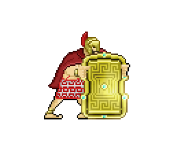
RUN / ATTACK – Old
RUN / ATTACK – New
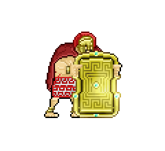
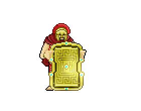
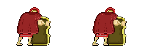
Back animations are a pain. A real pain. They are awful to do. They don’t look good, and that was a perfect excuse to stop doing them for the mob units.
In some enemies, we still have to do it. This was the case of the Shield Bearer. The back animations are as important as the front ones, so we had to add some love to them. Also, with the new animations, it’s much easier to read where he is facing at.
Animating these enemies is a completely different task than animating the mob units. I’ve learned a thing or two animating these giants: It really helps drawing some guidelines on top of your character, and not to think so much about reusing every part. You might need to redraw an arm, or the torso for a particular pose, but that will give some life to your animations.

The little blue cross you see below the character is a small mark I do to know the absolute position the frame must have in the .psd file, since each frame will be automatically exported into .png.
The blue / red thing is to have a better reading of what’s happening. You might need that when you are trying to understand a couple of strokes in a 50px canvas.
So that’s pretty much it for this week. It’s a bummer to have to redo some things but, in the end, it’s usually worth it.


nice improvement! looks really good
Thanks!