Give us your opinion on our textures.
Do you like our textures or should they look more like KW?
Kane's Wrath like Textures

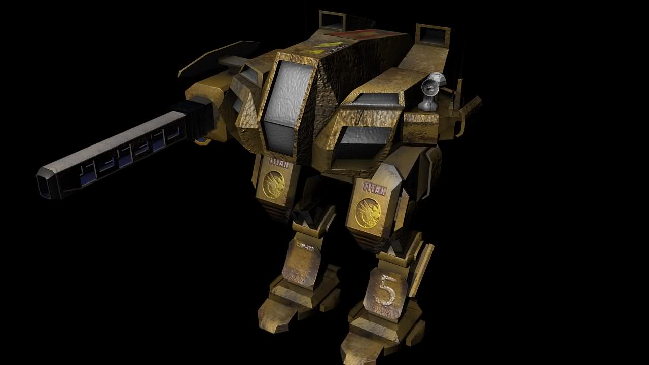
Our Textures!
I50.tinypic.com
We want your opinion on whether textures should look like the first pic or the second, this poll is mostly for gdi units because nod textures look very similar either way. Do you like our textures?
Posted by Coolness7 on
Give us your opinion on our textures.
Do you like our textures or should they look more like KW?
Kane's Wrath like Textures
Our Textures!
I50.tinypic.com
Somewhere in between the two, really. Yours have a rather nice dirty grungy look (though a little yellow for me), but the Kane's Wrath ones have extra detailing to them.
You should make them more like KW ones.
between the two, I prefer KW's tbh.
i like them both as they both have something that i liked of them.
KW titan i like is: it has the logo of the steel talons cause its the faction from TS and its toes.
your Titan i like is: its cannon is the kind of size that shows it really fires strong and big cannons, it has longer legs that shows it really is standing up and its head is not that pushed down to legs as KW's one.
the KW titan legs seems a bit too low that kinda looks like the unit is always bending down even when walking and its head is like covering its body like a shell to protect it. im thinking a titan that has combine of KW steel talons logo and its toes and your titan's cannon, its whole head and its legs put together.
hell yes
I like these textures; they look fine as they are.
The style of your textures has something unique to offer, which separates your mod from alot of other mods out there that try to emulate the original company's aesthetics.
So I say keep this style of texturing throughout and create your own unique visual style. It will help your mod stand out more. (This is not to say the texture can't be improved)
Your own style is good enough. I say add a little grunge to the edges to soften up the strong (its very strong atm) yellow color to balance it out a bit and maybe tone down the bump around the cockpit. Other than that, I think its perfect
definitely yours
What texture? There isn't much more than a way too grainy normal-map, solid color blocks for each shape and a couple of decals thrown in, which are also incorrectly integrated into the normal-map if I might say so.
Seriously, it looks even more toyish than EA's style! Scaling it down to ingame-size reveals that the colors just blur into about three solid blocks of color.
You should seriously consider to:
a) add more details for close up view. Hatches, vents, weld seams, rails, there's dozens of details that would fit this model.
b) separate the skin more noticeably into different parts by using multiple colors (like EA's dark+light brown, gray green) and high-contrast connection lines. Use the normal and specular map to accentuate these much stronger than the details.
You hit the nail on the head, Golan.
First of, get rid of that normal map. It's hideous, and makes everything turn into cardboard and paper-craft. Normal maps are designed to accentuate the form of the model not muddle it.
The lack of detail within the texture is disparaging. The goal isn't to simply give a plain model color but to really bring it to life.
You need things like:
-Paneling: to suggest how a unit was assembled
-Hatches, Hooks, and Nooks: take reference from current and past military vehicles as they are just smooth boxes with guns. They are littered with details that allows the personnel to stow, attach, stash, grip and enter.
-Weathering and grime: and not basically a noise + clouds filter like what is show. Weathering happens on certain materials especially on out and leading edges. From the effects of weathering come grime, and they are tucked into places where it is less available to be weathered.
I highly suggest that your texture artist takes a long hard look at really the masters of the medium for CnC3. Analyze the textures for MEC2, Renovation, TSR, TD, and Asylum, and that will help you extrapolate what detail needs to be poured into the maps.
Always listen to Golan, whatever he says!
I know I hate EAs textures so something so far from theirs as possible would be nice.
tbh, you guys should mix the kw with the TEc texture..
It's kind of hard to decide though. I could imagine your unit model but using EA's texturing style. But at least your model do kept a little towards Tiberian Sun. I think.
Anyway, I wonder if swapping the regular GDI logo for the Steel Talon one (From your model's texture) is a good idea.
I like the KW textures better than yours, you should aim for that kind of beige and maybe a little less dirtier. The GDI logos don't fit in nicely, either.
Just add some more detail to yours like the GDI logo on the cockpit. Damn fine work I must say, although the cannon does more resemble the railgun upgrade.
I like your but imo the KW Titan is a bit more detailed
Some texture like the units in TE would be cool.
for that you need too ask carnius
I like them both, but if it is easier on you guys in any way, stick with the KW textures to save you some time and effort.
The textureing looks good. C&C 4 cas very bright looking and made the war look like a fasion show. This unit is rugged and looks like it's seen some hell. I agree with Golan that some railings, hatches, vents, etc would really set your unit apart from anyone elses. This is some good work. KW style isn't a bad style to base your units off of but original ideas are a good idea as well
Kane's Wrath.
Yours definetly
i like the first one the best ! :D
You guys are doing a great job, but I agree that it looks a little to yellow. Some more detail, like the KW one (more segmented parts) would be good.
i liked how the tiberian sun titans were like
Micro.info
it looks like the complaint is and i entirely agree that there is little detail and yellow is a crappy color
It's hard to choose... Both are different styles but you have to remember Kane's Wrath is a finished, working game. But all things considered, I like you're the best, it fits with the C&C universe more.
kane's wrath looks a bit better.
Kane's wrath with your version of the cannon .
I find the KW version better IMO.
I Like your texturing but it seems rather Shiny Thats why I Prefer the KW titan Cause its not so Shiny... I Mean Do Titans go into battle Shiny?
I Also Prefer the KW's titan as it has more "Small" Details.
I Like both but If I Where to Choose now I Would go with the KW Textures.
your textures (the pic below) is very old fashioned and very Tiberian Sun. I like it lots :)
KW ones. They just look better.
KW ones are better.
Both have a good overall look... a combination of the two would be cool maybe.
I like your textures but if you could make them a little brighter not so dark.