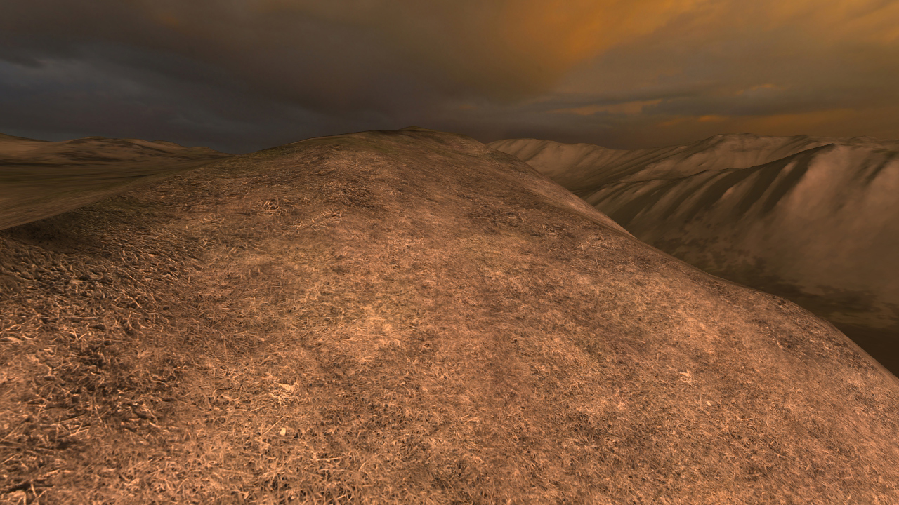
One common problem with detail textures is that they can change the overall color of the terrain. For example, let's say we have a patch of terrain that's supposed to be a light brown color like this:

If we simply apply the closest detail maps, we can change the color substantially. For example, here the closest matches are greenish or dark brown, giving us a patchy, saturated look that we don't want. This looks especially weird on the distant hills to the right:

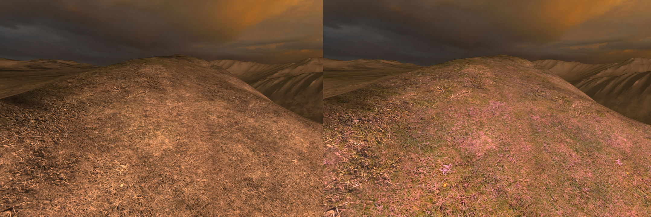
Most games, including those using Unreal Engine 3 or Gamebryo, require the artists to compensate for this by carefully tweaking each detail texture to make sure it matches the target terrain color. Other games, such as Crysis, use desaturated detail textures so that they don't affect the terrain color. Here's the terrain using a greyscale texture:
The desaturated texture successfully preserves the original color, but loses a lot of the visual interest of the colorful detail textures. In Overgrowth, we have a third option: automatically tinting detail textures on a per-texel basis to match the detail textures to the terrain. We start by creating a 'tint map' by dividing the terrain color by the average detail map color. Below you can see the terrain color on the left, the average detail map color in the middle, and the tint map on the right.

To render the final terrain color, we just multiply the detail texture color with the tint map. Here we have the detail maps on the left, the tint map in the center, and the combination on the right. Note how the two detail textures now seamlessly combine!

Below is a comparison of the greyscale method on the left, and our tinting method on the right. I think our method retains both the intended look of the terrain as well as the visual interest of the detail texture.
I'm very happy with this technique because it saves development time while also looking better! Can you think of any other ways we can make the detail textures fit together better? Also, can you think of any other applications for this technique?(permalink)
Track us on ModDB (visit our page)
Please join us here too:


Well, that's... Interesting! =D Cool stuff.
Bloody brilliant!
Awesome, it looks better each update.
I must say, with the things you guys place up here, you are doing more then making a great game, you are also giving s great tutorial for those wishing to make a good looking game as well.
if ever I work up the nerves to attempt building something, i may come and review these, lol.
Thanks! We hope this will help other indies.
Oh man.. another great and intelligent way of solving a problem. Awesome post as usual!
I agree - I really love your articles :)
You can also blend the textures where you guys now have hard edges, that would keep the textures more saturated. This technique takes away lots of color.
Also, the color should probably be more yellowish/orange. Because the sky lets a lot of red and green light through.
Cool.
Great....apart from the pink....
Well not every piece of terrain is the same general 3+ colors, there will be flowers and well, any sort of contrasting colors. Back to the article though; I've read all of these you guys have posted and I gotta say, just a great approach! Keep doing what you love.
looks really awesome, but i gotta agree with samthebobman.
sweet,carnt w8 for it to be released :D
Are u needing mappers at the moment? Becouse i will love the work in this game as a mapper
They don't need paid mappers for the moment, but you can preorder the game if you want to use the weekly alphas to make maps! :)
You guys seem to post more solutions to doing your own thing than just going along with the norm... in a way... if that makes sense lol, still its interesting, and really adds up, this is probably going to be far beyond the worth of a indie game =]
Keep it up
if you look closely your tint map is adding extra pink to your color.
This is really going to rock!