Hello from the depths of crunch!
Ian, Matt and Robin have been slaving away trying to reorganise stuff with our new UI elements, fixing a bunch of bugs, doing riveting things like mouseover behaviours, selection and deselection, resizing and scaling.
This is the least glamourous part of game development by a long way: the slog to make something actually playable; the desperate swimming through hours of nonsense to try and present your game properly.
I'm pleased to say that we're making progress and the list is dwindling. I'll bring you more updates on that as we go.
Matt has fixed a REALLY annoying animation bug which made the snipers look like they had a very nasty spinal problem, so the new anims are properly in now. I'd like to get a video out soon, but I want to get some bugs around the weapon FX fixed before I do that.
That reminds me, he's also been working further on those new weapon FX I showed you recently - they're really making the game look a lot better.
Ian added something which I really like: some small "teletype" style text zooms in after a kill to break down exactly what happened (who had better cover, who saw whom first etc.) Once we make this look good it will be awesome.
Here's a big screengrab just taken of what I had open: there is so much random stuff on the screen, including a half-finished menu bar on the left - I think it illustrates the insanity of this period fairly well:
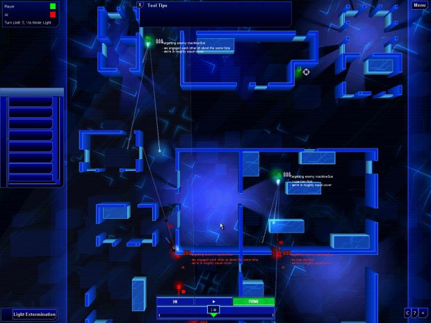
You can see on there that we've simplified the time controls, added UI elements to show who you and your opponents are, made a bunch of the other icons smaller and tucked them out of the way...
I almost forgot tool tips! Another desperately unsexy feature but one which will ease the path of new players into the game a lot more: every order and button has a tool-tip to explain how to use it.
Our new front-end is also almost ready - we still need to do backgrounds for the menus, tidy them up and sort out which UI element is being used for which thing, but that's all on-hold until we get the in-game stuff sorted.
Yes, we truly are incredibly busy.
I'm kind of liveblogging the process on the increasingly weird Facebook page - people are joining every day - you should too.
Thanks for your support - it's keeping us going through this madness. More soon.

(This button will take you straight to our IRC chat room where you can talk live with the developers of Frozen Synapse!)

(Please track our updates! We try to make each one as amusing and informative as possible. Remember, don't click this button if you are already tracking - it will make you stop tracking! This is the opposite of what we want!)

(If you join our mailing list, we will use it only to send you important Frozen Synapse and Mode 7 Games updates. These will be very infrequent and guaranteed to be interesting! We will never, ever give or sell your precious juicy email to any naughty people - promise).

cool, getting better and better...
Thank you! Yeah, we feel that way too.
It's always looking good. I would ask "when will it be out?" but I know the answer will always be "when it's done." I'm excited.
Thanks - we really hope it'll be out later this year, and that we'll be able to get pre-orders open soon so people can play the beta.
Cooool...
Ta!
The lighting and models look great but in my honest opinion the UI looks a bit dodgy.
I say try moving most or all of the UI elements to the bottom of the screen just to see how it looks that way. It should also give a wider view of the battlefield.
Other than that the game looks superb.
I still don't think everything (!) has to be blue... eg UI
Hey - we've changed the colour on the UI slightly and added transparency to it since this shot was taken, if that's any consolation! I like the non-essential UI elements blending in slightly, to be honest - yes, this is not a good game for haters of the colour blue...
[This is @Johnny - wouldn't post in the right place for some reason]
Cheers - the UI in this image is by no means finished! For starters, the menu with the buttons on it centre left shouldn't be there at all.
We can't put *all* of the elements at the botttom - there's simply not enough space at the lower resolutions we support. The only thing I can think of is that we could stack the "who is playing this match" display (top left currently) on top of the mode preferences selector (bottom left). That would leave only the menu and tooltips at the top. I'm not convinced that would look great, but we could easily try it.
The largest panel in the top at the centre is for tool tips - you'll only have this open while you're learning to play the game, and you can obviously close it, so once that's out of the way there's a better view of the play area.
The time bar (at the bottom centre) needs some work to bring it into line with the other elements - we're on that. The buttons at the bottom right need icons as well.
stacking the "who is playing this match" on top of the mode preferences may be confusing. I mean, the former is data about THIS match, while the later is data about future own matches. Stacking it together could imply that i.e. THIS match is "light extermination". I do agree that some reordering may make sense, but as it is in the screenshot, it doesnt look "bad" to me - just "improvable" :)
Well, I agree, I don't think it's necessarily wise to put those two things together! I'll post a grab of the new UI once its tidied up.
Like I said, the most obtrusive element is the tool-tips, which can probably actually be a bit smaller and definitely won't be something that you use once you've figured out the game a bit.