As you may or may not know, TerraForge is an MMORPG TCG currently being developed by DLK Studios, a small indie video game development firm from Canada.
As with any MMORPG, storytelling, lore, and mythos are all of paramount importance. When we first started to work on TerraForge, we had a rough idea in mind as to how our story would unfold. We had five identified factions, we had the premise behind the factions, and we had a common factor bringing all of these factions together (we're not disclosing too much right now, as the game is still in pre-alpha stages... almost alpha). In order to really solidify these ideas and bring some more depth to the overall mythos, we found it was exceptionally useful to create a map which basically outlines the world our game is set in. This process was not only useful because we got a pretty map out of it, but the overall exercise really helped us think about some of the more in depth questions associated with the mythos, like why are these factions allies? why are these enemies? what kind of personalities and cultures do they have? is this affected by climate or land boundaries? All of these kinds of things were basically forced into consideration during the map creation process.
So now onto the fun stuff! We're basically going to outline the steps we had taken in constructing our TerraForge map. The following steps are outlined by our GUI and Art design guy.
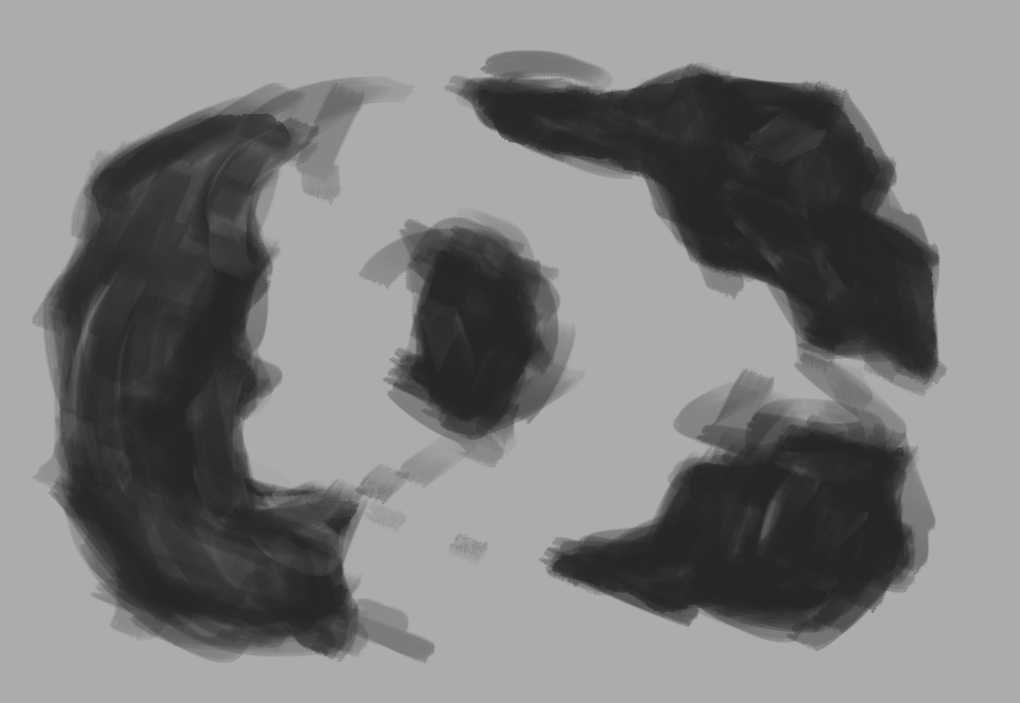
Step 1: Roughing in Geometry
Setting up basic geometry. Now I'm not sure if other people are able to visualize what their map will look like immediately, but my cognitive abilities are certainly not up to this task. As with any illustration or GUI design, I start out by roughing ideas out. This literally means, I take a brush and start splattering potato shapes on the canvas. This really helps me find forms and shapes and get overall inspiration that otherwise would not have been there. The image below shows what I'm talking about.
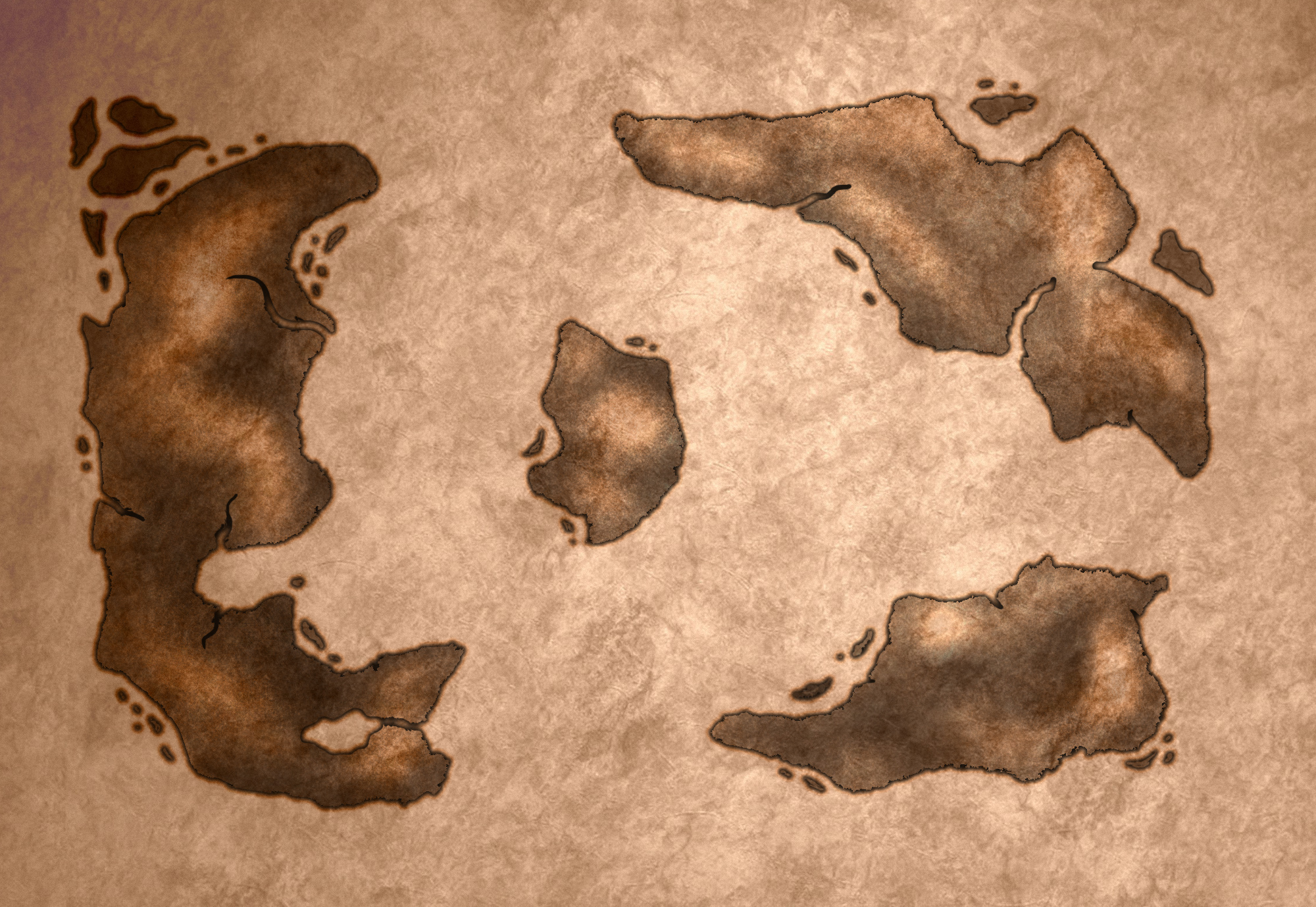
Step 2: Developing Base Color, Texture, and Early Detailing
The next step is to take this giant blob seen above and turn it into something that looks reminiscent of a map. To do this, I first get an idea for a color scheme. This is basically done by looking around google images for inspiration and playing around with hue/saturation values in whichever image editing software you may be using. After a color scheme is basically identified can basically apply it as an overlay layer and add texture to the layers below. In this case, I added base texture using an overlay layer with an image texture that seems interesting. You can either generate your own (lots of great tutorials online) or download one from a stock footage site. After this is done we can clean up the existing geometry (takes a bit of time) and add details such as coastal ridges and rivers in order to attain a look that is to our liking. I recommend random splatter (soft edge) brushes for polishing of the inner terrain areas, as this will create a look that mimics real topography. After going through this, we basically have the image seen below. Starting to look like a map!
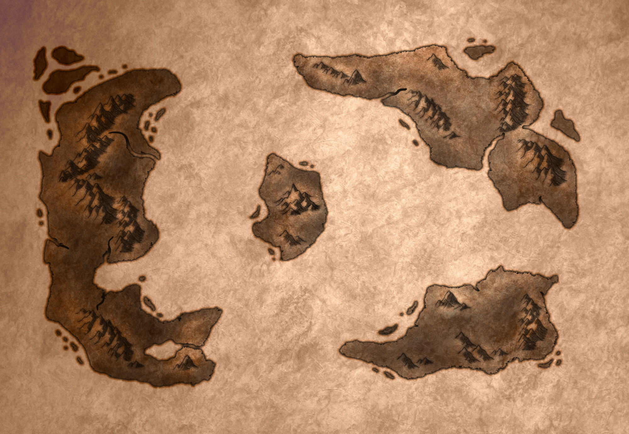
Step 3: Adding mountains
Step 3 can either be exceptionally long, or exceptionally short, depending on how you want to go about it. For step 3 I used a mountain stamp brush. If you already have a mountain stamp brush, this is a 5-10 minute task, if you do not, you can either download some or make your own. If you opt to download a set of mountain stamp brushes, this will once again be a 5-10 minute task. If you opt to make your own, the time sink basically becomes dependent on how many different mountain brushes you want to create, and at how proficient you are at doing such a task. Anyways, basically once you have a brush, add mountains where you feel like it. Typically i find that mountains look good if you place them in a somewhat connected linear fashion, kind of like a spine along the land (hope that makes sense). After adding mountains, we basically have the picture shown below.
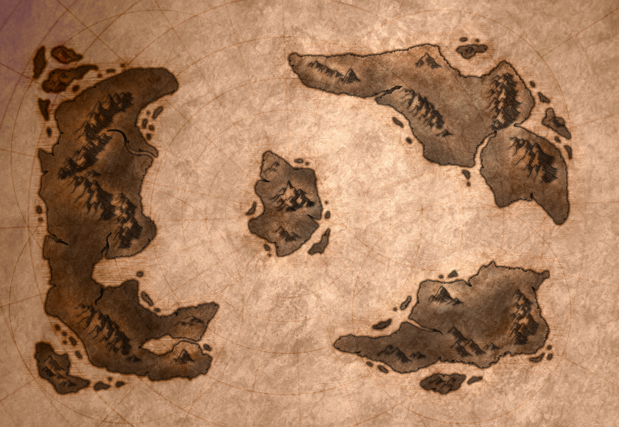
Step 4: Cosmetic Items
The next step is to add cosmetic items. These items basically mean nothing (at least as far as I'm concerned). The idea is to bring some interesting aspects to your map so that the viewer has something to keep their attention as they move from one landmark to another. As an example, if we look at the picture above, the land masses are already taking shape and look pretty interesting, however the void between these land masses (which is presumably an ocean of water) is rather boring, we can fix this with such cosmetic items. To get a better idea of what I'm talking about, I recommend that you google images of Old Maps or Old Tattered Maps. All of these maps have some kind of etching on the paper, making it seem as if someone was perhaps making some calculated markings. Perhaps navigational? war strategies? who knows... point of the matter is they're there and this map has history. For our map, I opted to use some circles to vaguely allude to some kind of division of land for each of the land masses, and a series of circles radiating from the center island, which alludes to some kind of normalized measurement with the center island as a focal point. To further add interest, I opted to use a series of lines which cross the entire map and rotate them around the center island by 15 degrees in order to create a "pie division" of the map. Once all of the lines were placed, I rotated them all around the same pivot at a random angle (not 15 degrees), such that they weren't symmetric about the X and Y axis of the map (I just generally find this more interesting). All of these lines and circles can be drawn in a black color. Once drawn, the respective layers should be set to "color burn". This produces an "aged" effect which makes it seem like these lines were perhaps more pronounced at some point, but have faded over time. Playing around with the opacity settings of these items allows for fine-tuning.
Lastly, I added some horizontal scratches to the borders of our land masses. The idea behind this was to suggest that there are shallow waters here. This was done by basically painting a black border around and under the existing land masses (lower level layer). Filtering the border with a noise function (maxed out) and applying a horizontal motion blur effect. To finish off, a very mild wave filter was applied, just to spice things up a bit. After these steps, we have the image below.
Step 5. Adding Names and Icons
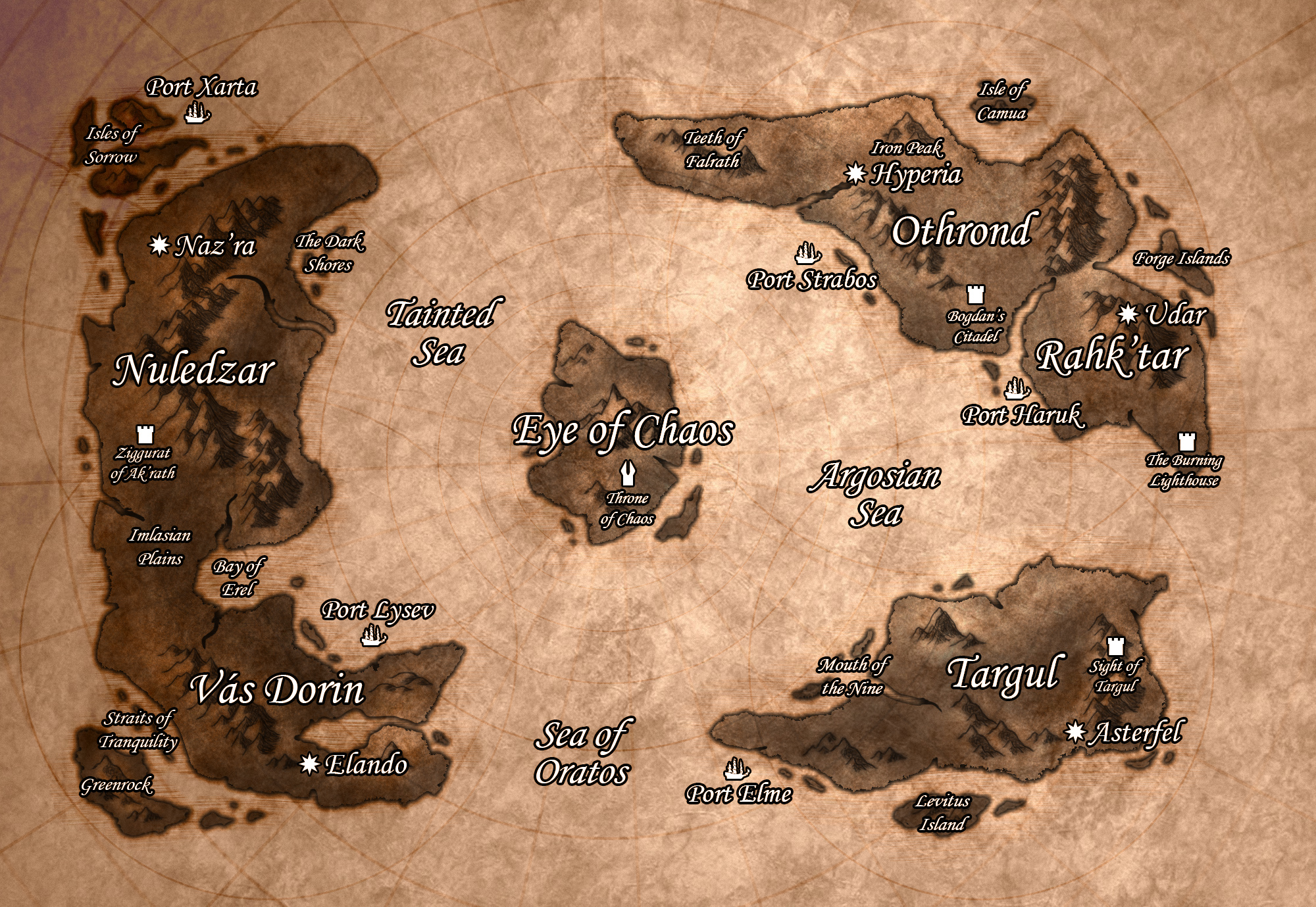
This is where most of the mythos / lore building comes into play. In this step you basically need to choose a text style that you feel looks good and compliments your style of map. For our olden, fantasy style, a cursive font looks good. After you've named locations of interest on your map, and gone through the process of lore building in conjunction, it is time to add some icons for some of these locations. Prominent / important locations deserve recognition. Adding fitting icons to these locations will really help make your map more interesting and give the viewer something to spend their time on. What could these symbols means? Why are these locations important? etc... After taking care of business we have the picture below.
Step 6: Final touch ups
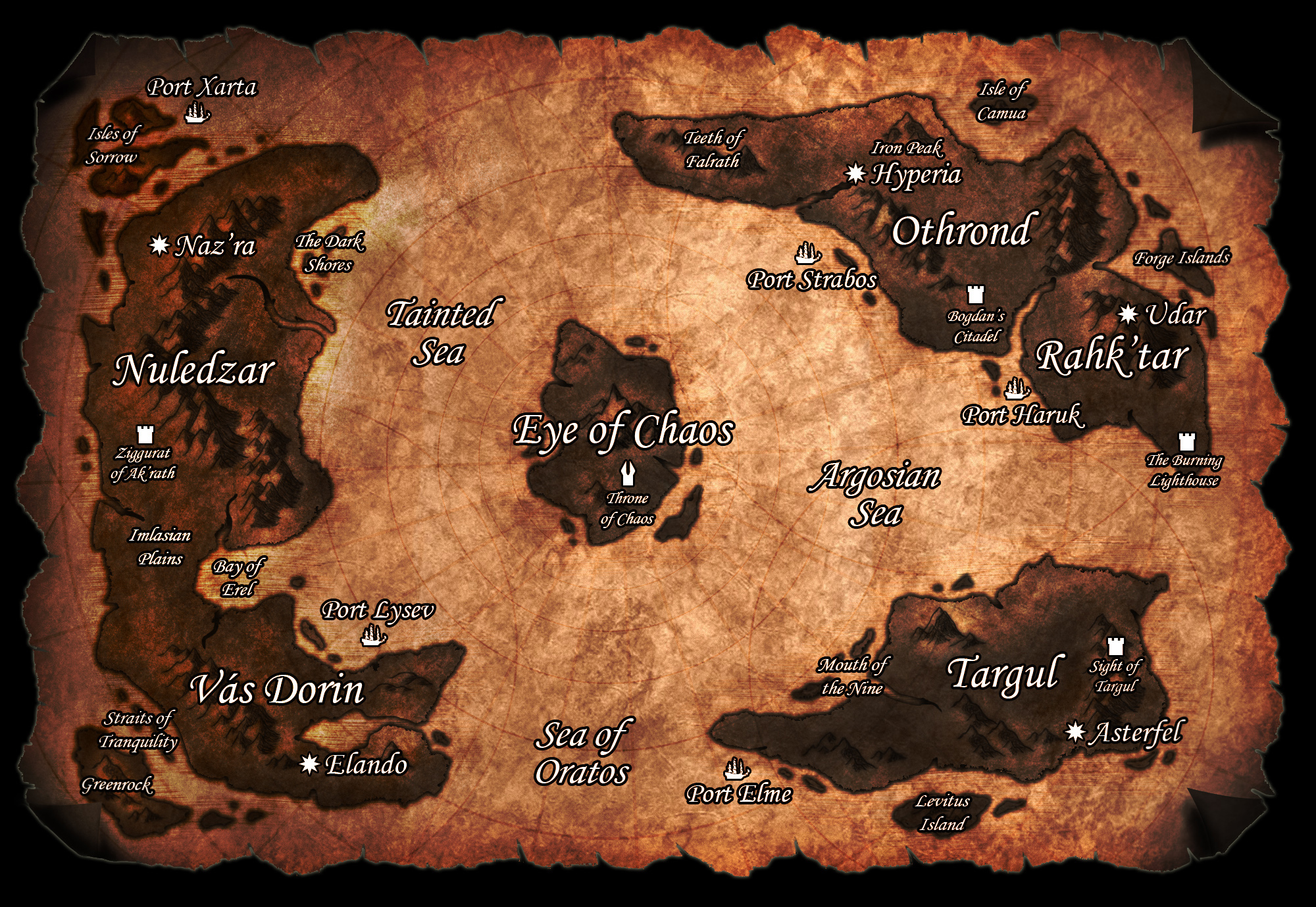
Now step 6 is completely optional, since the the image above basically does the job. Step 6 is basically adding some finishing cosmetic touches that don't really have anything to do with the map design, but just the overall presentation. In our case we opted to do a little bit of a color balancing to make the paper seem a little more interesting and not so monotonous. We then deleted some of the portions of the map around the edges in order to create a "tattered look". Lastly we added some folds to the corners using warp transform techniques and applied a folded paper overlay layer texture. Voila! we have a completed map!
We hope this helps anyone out who may be interested in fantasy map creation. Feel free to comment and let us know what you think. Cheers!


Love Cartography, thanks for sharing.
@Jetcutter no worries! Glad you enjoyed it! :)