
Hello everyone! I'm sure that you're all excited to hear of Portal 2 being announced. And I bet you're also happy about the co-op and the new story. I know I am, we at the Blue Portals Development Crew can't wait!
But on to the mod news.
For Chamber 06, we wanted to throw the player into a new area. A different environment scheme that's still related to the others. The first concept of Chamber 06 was to have shiny white walls and lights protruding from the floor.
(Eww. . . )
However, if you look at the picture, this was somewhat hard to relate to the other five chambers. It was too white and lacked warmth and color. I spent months trying to make it look better, however it failed to show relationship with the other chambers. The entire idea was trashed for the reasons of me not being happy with the design; and the fact that Portal 2 shared the same idea.
Recently, referring back to the design scheme, I was browsing for concepts of spaceships and interior building designs. Finally, I had pictures to base the design off of and I got to work. As you can see, these building designs had the colors of Blue Portals, so they were picked right off the bat.
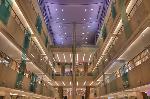
I really liked the metal with the colors, as well as the glass panels of this concept. However, the image alone was not enough. The light sources would not work in Portal, and the cold blue tint of the ceiling would kill the warm atmosphere; but I liked the shape of it. Lastly, it looked too plain. Mainly just the tan color.

This image finished what the other image started. The glass rooms could be replaced with observation rooms; a source of light and the way it worked with both white and tan was just perfect.
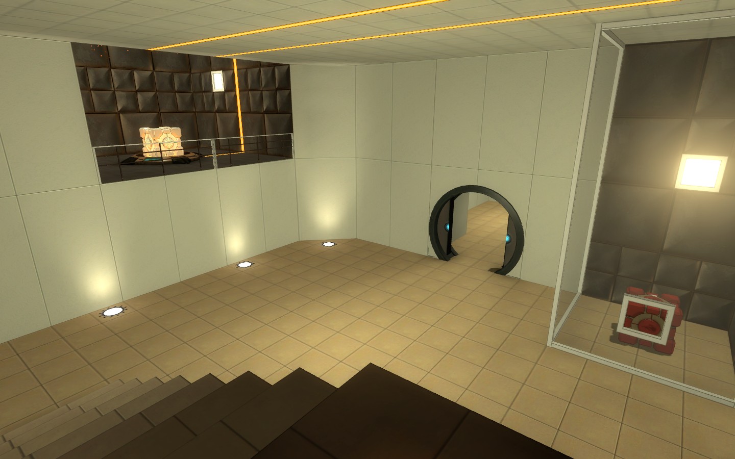
Finally, the two concepts were put to work. However, I needed to have a new non-portalable material. I first picked a basic brick texture, but people are common that bricks can hold portals due to its use in community maps. Hunterbrute from the Project-Beta team recommended sandstone; then Colossal got to work. However, it was too plain alone and looked more like a shopping mall. Colossal commented that there should be plates of metal spreading on parts of the wall so it looked more like a test chamber. He was on the right track, but the metal was ugly and didn't fit with the sandstone blocks. After that, we chose glass panels, but to no avail. Finally, we tried white tiles. In the end, the design held the warm feel of the mod, the darkness of non-portalable materials, and the cool blue from the glass. End product? This:

(This is just the concept room. I was able to plan out a puzzle, although it's not that hard. You might possibly see this room again. Click to see full)
So, the scheme has the ceiling and metal pillars of the first concept, but holds the color balance of the second.
We've also got some bad news. We've had to drop the Turret Challenge gamemode idea. For now. After Portal 2 is released, we will be making a version of Blue Portals for it, and add not only Turret Challenges, but also multiplayer co-op. And that concludes this news article.


Epic.
lol your dp matches your comment
Looking good, like the style your going for.
Nice job. I really like Blur Portals' color scheme.
Looking good...
I think moving glass platforms that slide from side to side along the wall, occasionally blocking the portals on the walls, could be cool.
Think of the floating glass platforms that already exist in Portal, just rotate them 90 degrees and make them float along the side of a wall, back and forth.
Having to rely on using blue portals only, you can make this into an interesting addition to the puzzles.
That's pretty impressive work!
I don't know about this... the design is much less readable now. It goes against the minimalist / functionalist design ethos of Portal, really. I mean, the Portal team adopted that aesthetic for that reason: it's readable and it's simple to prototype and polish. When you decorate like this, it's looks less like Portal and more of an imitation of Mirror's Edge.
I like the attempt at a different color scheme, but remember the functionality of Portal 1's -- dark metal read like metal. Light concrete read like concrete. I can't tell what the materials are in those screenshots.
I like to see developers push the envelope. I loved the Game, looks like the Mod is going to be just as great!
dark rocks and white tiles make a good diversification!
looks epic.
keep up the effort.
Awesome mod, will be very good addition to Portal. Hope it will be released before Portal 2
Cool