Thibault Testart, our executive director decided recently to update the mod pages because the design of our website was not anymore related to the old design, established previously on ModDB (that grey design). This is the reason why, today, you have the opportunity to follow our mods with a brand new design.
The design itself
This design is mostly minimalist but visually beautiful and powerful. This version is by far more fluid than the previous one and includes special features such as the team recognition (different color for usernames and a little Phoenix Logo below the avatars).
The design is powered by the @font-face technology which enables us to add customized font to the website (except for Mozilla Firefox). Therefore, you will have the opportunity to see the font MyriadPro for example.

Special features
While the design itself innovates the whole structure, other features were included. The karma is no longer present because the majority of our community asked to delete it. Mostly because some people get buried sometimes for no reason, like asking a simple question. Of course, rude comments won't be accepted and they will be removed directly from ModDB. It's simple, each of us need to respect the conditions established on the website.
On the other hand, it's now easier for each of us to connect to the mod pages, including for cellphones and tablets. It's fluid, and you know it when you are on other devices. The resolution is the same and is still delimited to 1024px (width). The last great enhancement is by far the way the slider looks, which enables the watcher to load the pictures as quickly as possible.
How is that possible ?
Are there any plans for releasing the old version into the public domain ?
To edit your pages, you need first to have the required skills or at least to contact the good person, like Thibault Testart which is by far really talented when it comes to HTML/CSS designs.
On the other hand, the old version will be released into the public domain. However, the new one won't be released into the public domain and is protected by ModDB.
Have a great day !

i dont like this design its too white. The darker tones in the old design was alot easier on my eyes making text alot easier to read
Personally, I don't agree with you. Ironically, it's exactly the opposite for me. Read white text on a dark background is something not that great for our eyes, as far as I know. So I personally think that the white background is perfectly fine for ModDB.
I agree with Megas. As I understand it, the best way to view stuff on a computer is yellow text on a dark blue background.
Test :p lol
Je confirme, test reçu :D
The design itself is good, I only have a problem with the white. I never enjoyed reading things in white background. If it were only part of the screen, even if it were the part where the text is, I wouldn't have a problem. (This may be just personal preference)
The main problem is that when you leave the white page to another that isn't a bright color, your eyes have to get used to it. Just in the time I was writing this it started to happen (albeit very little), and I didn't even read the entire article, I just gave it a quick read and came here to write this.
I completely understand your feeling. I used to share the same opinion. However, the more the time passed, the more convinced I was that the white color was definitely better than the black one due to several reasons such as performance and the fact that the white backgrounds are definitely privileged in our world today.
Anyway, this is our respective opinions. I understand your feeling about it.
I like the new design. Only criticism I have is that it is a bit too bright. As I was reading through the article I noticed myself squinting. Perhaps a more natural colored background even if you leave the area with text white would help to balance it out I think. Overall better than the previous though.
Yeah. The article itself is bright because the images are bright. However, about the background, maybe a darker grey would be great but not too much.
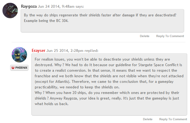
On the other hand, I plan finally to restore the Karma but only for positive opinions so that people can like a comment (like Facebook).
Looks like the modpage....
(•_•)
( •_•)>⌐■-■
(⌐■_■)
....has new design.
YEEEEEAAAAAAAH!!!
erm,.. i mean, nice white minimalist design!!
are the mod UI (or something like that) will gaet a new design too?
xD
In the simple with beauty,very cleared User Interface.
The style was just like the leading edge of CSS Designment.
I feeled some fresh air comed here.
Like other people are saying, very, VERY bright. The best website colors I've seen for reading is the "parchmenty" colors of FiMFiction.net.
I think I prefer the old dark scheme, it was very comfortable.
But other than that, this is very nice.
Edit: huh, seems Fimfiction.net is using white now, too. Oh yeah, I remember disliking that when they switched it now. I think they are using an off white, which helps, but their main saving grace is they use a large font-size.