Protector-class Frigate image - Rise of the Mandalorians mod for Star Wars: Empire at War: Forces of Corruption
The Empire has fallen and a New Republic is born out of the conflict. But in the ashes of civil war, yet another life stirs...

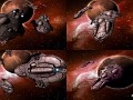
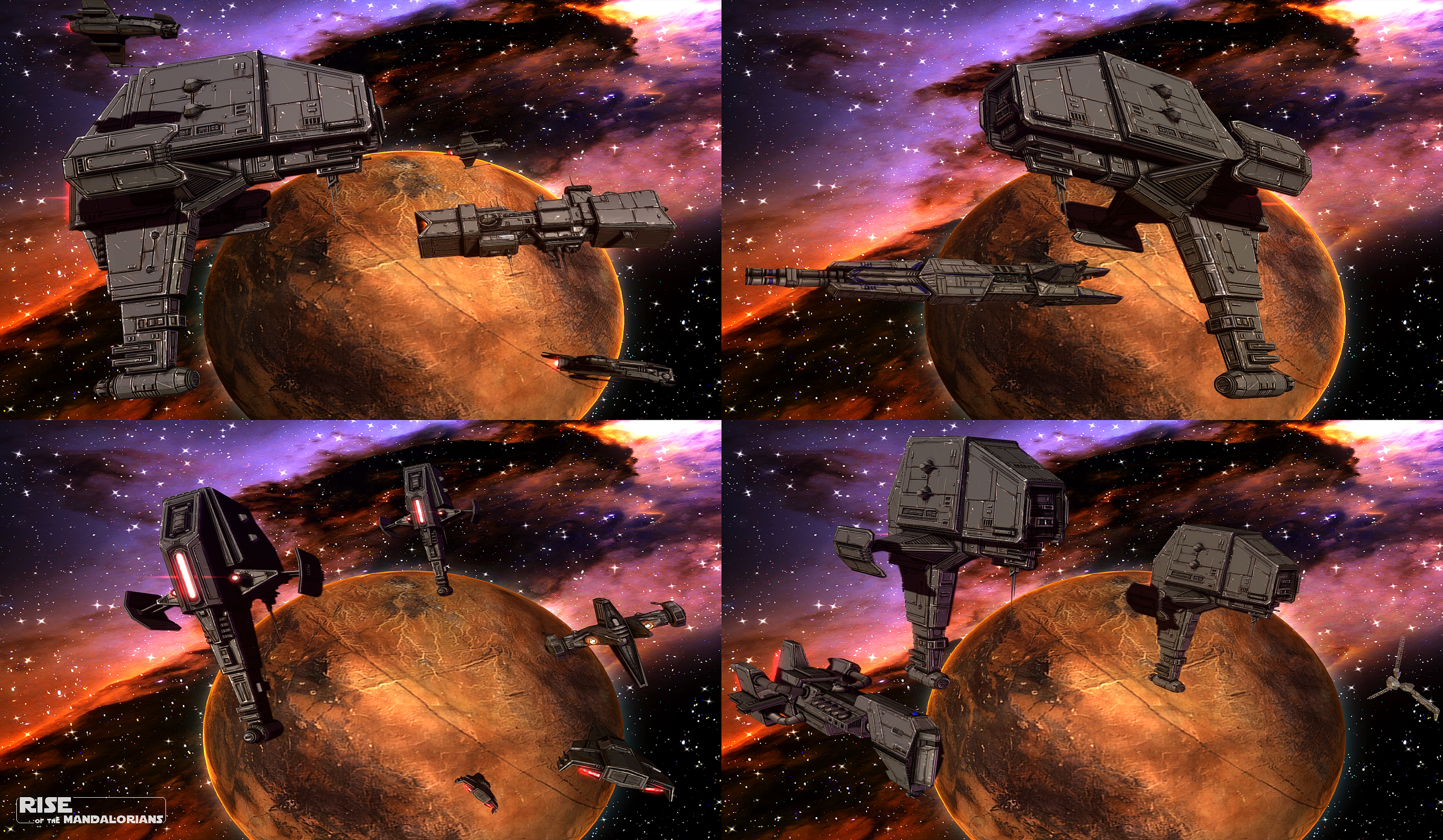
Most Mandal Motors ships designed prior to the reformation were made and sold for private clients such as the Hutts. In an effort to diversify and strengthen their fleets during the reformation post-Endor, the Mandalorians began to design new warships exclusive to their own military. One such ship is the Protector-class frigate, designed as a mid-sized missile frigate intended to act as long range support to the main battleships of an attacking fleet.
Drawing from the legendary Kyramud-type battleships of old, the design is layered in thick armor, with two armor plates mounted on either side for additional protection. The modern design is significantly smaller than its ancient source of inspiration and lacks hangar bays but the missile payload, which is loaded into the armored "fins", is significantly greater. Additionally, rather than load the ships with conventional concussion missiles, the Mandalorians opted for the more potent Diamond Boron missiles. Paired with their anti-fighter defense lasers, the Protector is potent against fighters but in general is well rounded enough to hold its own against larger ships as well. The four turbolaser turrets near the top of the craft provide the punch needed in those situations.
Mandalorian Engineer 1: At last I've finished the design for my greatest creation, the Protector-class Frigate!
Mandalorian Engineer 2: You me the space AT-AT?
Mandalorian Engineer 1: (Looks at the design)Shut-Up!
Shut-Up!
Lol
That was me thinking ahead in-case you didn't like me saying that it looks like a space AT-AT. XD
Its all good. Can't be unseen though! Damnit
Then again the Mandalorians did build space AT-ATs before. Starwars.wikia.com
I actually thought it was an at-at until i clicked on the pic
You've ruined this ship for me now...
But it looks great so no problem there
i swear that is really what it looked like at first though!
Awesome! I also have noiced the agressor has team colors, I like how tyoure using the minimum space for it.
PD: Something I've been wondering is, how do you make such awesome textures? Just using photoshop? I really like your style, and it does not seem it was made in a software such as substance painter for example.
Aside from the standard EaW-specific tools like the ALO viewer, my tools of the trade are 3dsMax/Maya and Photoshop, that's it.
I've been doing this stuff for over a decade so I learned to make textures and stuff before tools like Substance Painter and Quixel were available.
My method is pretty simple. I make the model and unwrap it, then export the UVs to photoshop (export as a TGA image). I then use my trusty Wacom to paint the texture using layers for the various elements of the unit. Ship hulls generally have 10 layers or so from bottom to top:
*windshields
*muzzles (the "holes" at the end of gun barrels)
*panels
*panels2
*inset panels
*paint
*dirt/grime
*scratches
*Ambient Occlusion
*Highlights
Other layers are added as needed for special instances by that's the typical setup. I overlay the UV map on top of the texture and paint away, everything by hand...including the ambient occlusion (I find that AO exporting from many programs just doesn't work that well).
Once I'm done with the texture and it looks how I want it to, I save out a version that removed the AO, dirt, scratches, etc... Basically it only leaves the panels... And I use that to generate a normal map with CrazyBump.
Amazing, if you ever do a twitch or live recording of you doing it, I would definatelly watch it lol This kind of things really captivate me.
Yea, I agree, that's a thing I think at least a few of us would surely be interested to see.
Farseer, you do some very fine work! :)
I do plan to do a tutorial series after the mod is complete. I'll include something like this, for those that are interested.
I'll definitely be interested. Sure plenty others would be as well.
Those are awesome, missile frigates with some bite I've always wanted a sort of siege platform for hitting SSD's and space stations with and these certainly seem to fit the bill. The art-style is also strutting it's stuff really well here, the almost pixel shaded borderlands look means this mod while still looking awesome may not be as graphic intensive as some of the other mods elegant yet practical, you I like you.
Thank you. Yes, EaW can handle a really good amount of polys but it's texture memory is crap... So you have to find the sweet spot where texture and model both look good together.
wwwwwoooooowwwww this ship is the result of a night of crazy sex between a at-at and a mandalorian Jehavey'ir.
Love it!!!
Oh i read the reference of the space at-at in the comments to late :(
Lol. Glad you like it!
"Oh, it's beautiful..."
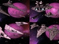
Love it, especially the engine array, i would add something to the front panel (the bridge?) though, maybe a missile launcher hardpoint that cant be destroyed?
Hard to see but there is a chin turret under the bridge section that will be a targetable hardpoint. It's a smaller anti-fighter gun.
Great work Far!
Is that blue thing on top of the bridge structure on the crusader corvette (lower right hand corner picture) a collision mesh sticking through the hull?
Thanks! Nope, that's the point defense system. Since turrets wont track projectiles, I made an omni-directional emitter... Like CnC Tesla Towers in a sense.
You actually reminded me that I need to change the color though... Point Defense will be red in the mod, not blue.
hmmm, I guess General Veers joined the navy
stunning
Oh, my. I've just noticed that your spacescapes look cartoony as well. It all feels like it's from some 80s/90s space anime. It's awesome! :D
The planet sticks out a bit, though. Like it's too much detail xD
I dont know how thats possible since im using hubble pics and nasa images for the environment. The lighting is dynamic, sure
..but the textures are real life. Really though, the lighting in space is giing to be bright colors with hard shadows because there is no reflected light or atmospheric diffusion. Idk. I feel like its just realistic space lighting with a little style thrown in.
I think that aside from the bright colors the background might also seem cartoony because of the diffraction spikes. That's not a complaint, though - it adds a lot to the style, IMHO.
The planet does seem to be sticking out, perhaps because it actually lacks a hard shadow. Judging by the illuminated atmosphere and the shadows on the ships I'd expect to see a shadow as hard as the ones on the ships on the lower left side of the planet on the two top frames and on the right side of the planet on the bottom two.
This ^^^
Yes, looking at the other screen shots, where they aren't as prominent as here, you can tell that the diffraction spikes definitely have a lot of impact on that cartoony feel.
And yeah, now that you mention it, the planet could use a hard shadow.
Oddly enough, the spikes are something from the original game that I have not touched.
As for the hard shadow on the planet... I would love to add it but even if you add a shadow mesh to a planet prop, the game turns it off. Any planet prop has shadow disabled and if you add the planet as a regular prop, the shadow mesh misbehaves, likely due to the scale of the prop. "Sounds good, doesnt work" lol
Maybe you could just draw it directly on the texture then (if a planet is only used on one map with a fixed light source)? Of course, in that case the planet can't be rotating, but, if the environment's supposed to be somewhat realistic, it shouldn't be noticeably rotating anyway (in most cases), while a proper shadow would be a great improvement.
I've actually considered removing the idle animations on planets because yes, IRL you wouldn't see it actually moving. I can play with the map lighting too to try and get the desired results.
Outer space doesn't really look like that, Hubble pictures are just a tiny tiny speck of the sky blown up to viewable size
They are also captured using X-ray and infrared, among other spectra that the human eye cannot see ;)
Some artistic license is allowable in this case. But as for lighting, I simply prefer the more realistic approach. Probably because comic books and noir film.
On a side note, I can't shake the impression that the Aggressor-class's front part (the one the barrels protrude from, especially the smaller vertically symmetrical plates on the side) is stretched. Looking back, it appeared OK on the version without the team-color, but here it looks... well, stretched. Or squished. It seems this section would look fine if it was about twice as tall, but currently the texture seems too busy compared to the rest of the ship. Maybe it's just a bad angle causing some optical illusion or it is the team-color causing it, I can't tell.
There are team colors on other parts of the ship that balance it out. You can't see them so much in this shot but it does look good in game.
Front half of a Nebulon-B merged with an AT-AT body and loaded with Diamond Boron missiles. Winning combination.
I LOVE IT! YAAAAAAAAAAAAAAAAAAAY!