Raising the Bar is a mod based off of the idea of amalgamating the earliest concepts of Half-Life 2 into a coherent story. This mod is not a leak-fix, nor is it a concept art recreation gallery; it will be a full story with inspiration from the old material as well as our own ideas of how to make it all fit together.
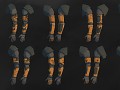
Arm Prototypes
(view original)

Post a comment
Description
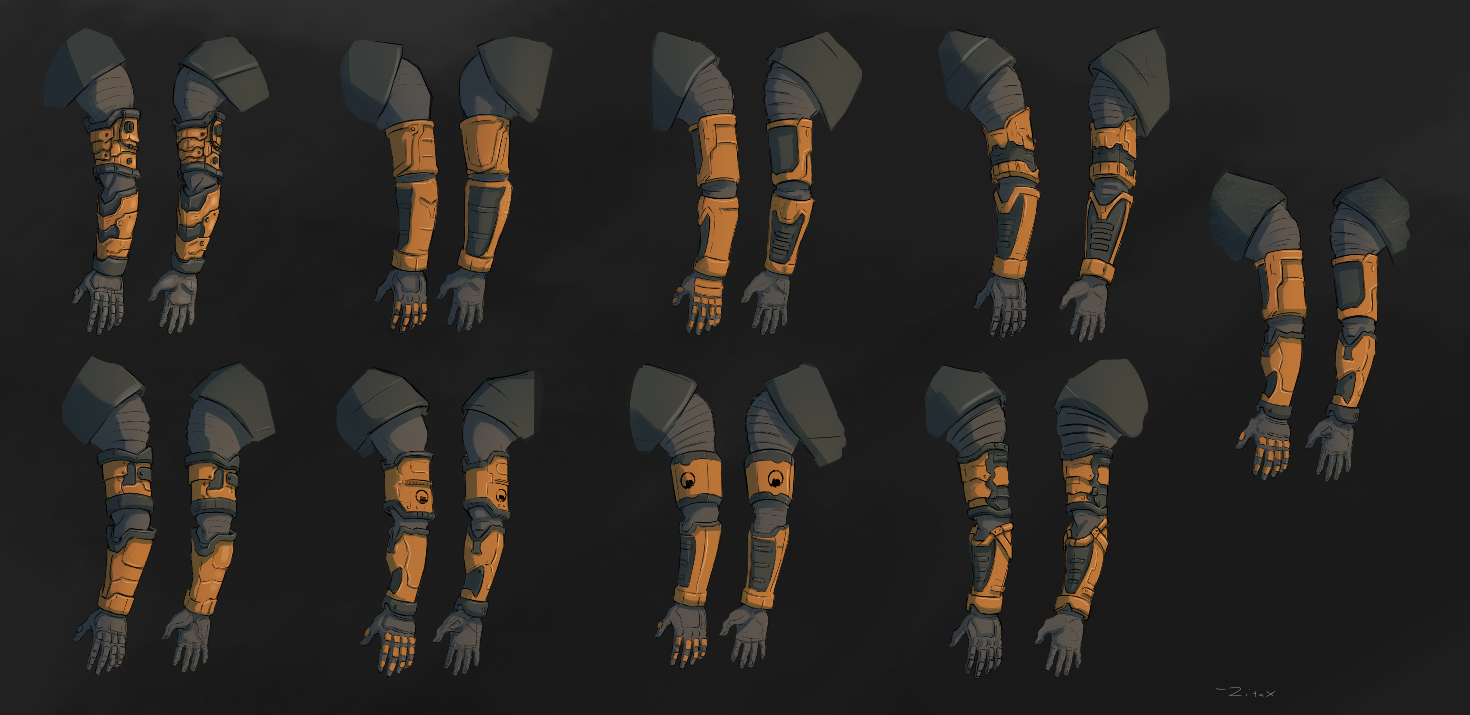
A collection of arm concepts made by ZitaX for our upcoming HEV Suit.
they look awesome :)
They all look really cool, but I thing the bottom right one is my favorite.
So it wouldn't be more red than orange like in Leaked Beta HEV arms
Technically the red HEV suit was only in the early version of Half-Life 1, not 2. There were some early textures showing a more leather-y suit, but it just plain looked weird and didn't fit. Coming from the perspective of ret-conning the retail release of HL2, we decided to follow in the orange theme from HL1 retail.
What about hands? They are some kind of dark-violetish
I think he's referring to the hands seen in the old OICW and SMG2 view models, with the purpleish gloves and the darker orange forearm bits
Yeah, he's referring to the leak hands. They weren't terribly different from retail, and honestly Gordon having a burnt orange and purple-leather suit seems a lot less fitting than the classic orange and grey.
Woah, in terms of concept, this is potentially looking like Half Life 3.
This kind of reminds me of the Spartan armour selection from Halo 3 or Reach.
It's so hard to choose which one I like best, they all look great!
"It's time to chose..." They all look perfect, the ammount of detail is amazing :O
Top-Left is best one, only missing is colored pads on gloves.
man, the amount of detail in this makes me wanna play hl3 :(
Cool, but that's typical gaming sci-fi, and that is the thing that Marc Laidlaw tried to not make, but since you guys have so much power over thus amazing mod, you'll decide)
*This amazing mod.
Yeah, we're definitely trying to avoid the arms from being too sci-fi. We are basing it off of the information we have and also from a practicality stand-point. We believe this will create the most accurate and believable result.
Yeah, design is still cool, but Half-Life already lost it's dark sci-fi magic in Episode One (for me) and the only factor of this is time. The year this game saw the light was 12 years ago and it feels old. So games and films that were created in the 80s - 90s are coming to mind actually. One of the most things that Half-Life changed is, i think, it's atmosphere since portal writer came in this process and maybe first Portal was kinda scary in some places, the second game is more into action and has adventure atmosphere to it, Half-Life: 2 tried to have it too, but for most people it has failed. Do you remember complaints about the game being boring as hell? Well, that's exactly what i am talking about, it's not boring, it shows that being Gordon Freeman is the last thing that you might want. Fighting over and over again, and if half-life was more realistic then your brain would drain itself because of the gaming factor of Gravity Gun and HEV suit that you should rely on. Well, i'm getting a bit far now. Thanks for your reply anyway)
Also, Gordon is OP, please nerf
The left top one looks a bit like the Dead Space RIG, while the one on the far right has a more modern, realistic, combat-sci-fi-ish approach. I like the more classic, HL/HL2 mixed variant, third from the left, top.
The ones with the tiny Black Mesa logo are my favorites and not just because of the logos, but the way they look.
I like the center top one most.
It is very strange how people managed to rebuild it and even put Black Mesa logo on it for no reason, because every single human hates black mesa