You wake up one day in the deep depths of aperture science. You try to escape by solving test after test, and try to survive as the facility quickly falls apart. You start to have flashbacks of arriving to aperture science, and try to find out what happened to everyone.
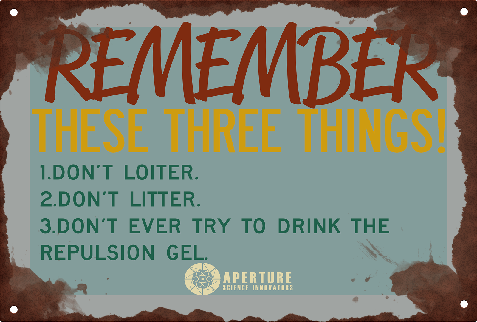
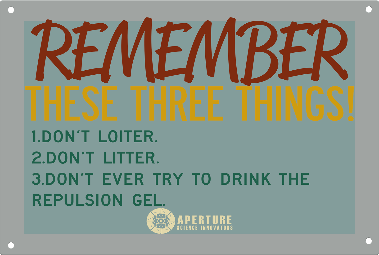
Thanks. Doesn't seem to quite be a retro color scheme, and even so, the first one is especially hard to read due to the lack of contrast with the background with some text. The colors don't work together very nicely. As well, maybe try not to use 4 different fonts in one poster -- and choose the fonts you do use more appropriately. For example, Reklame Script is used sort of badly in the first one and shouldn't be all caps. The second one is all over the place stylistically due to all the different fonts. Lastly, maybe try and rethink the content of each poster. The wording isn't very "Aperture" and doesn't make a lot of sense. Aperture wouldn't explicitly call it "goo", and having a big "WAIT" there is sort of out of place and doesn't compliment the body text. Try and reword #3 on the first poster. Also, try and give the posters a bit more texture -- they're pretty flat colored which makes them hard to believe as real.
Sorry, I meant to write this as a reply to your comment. ModDB kept resetting what I was writing and it ended up as a standalone comment when I finally finished it.
it's fine, I appreciate the criticism though. the texture is mostly me being lazy, and I just looked up vintage color schemes so that's probably why it doesn't fit.
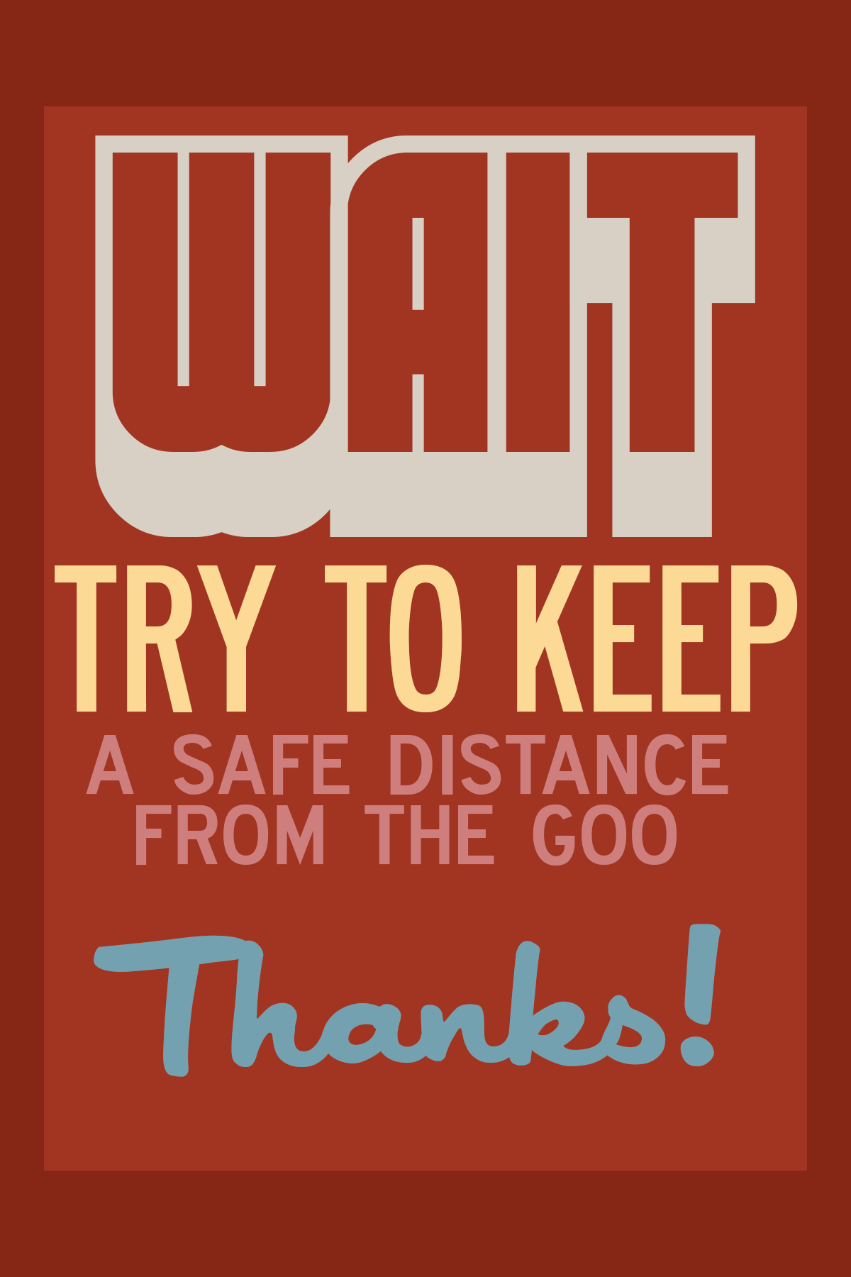
What are these color schemes even? Also this is font abuse smh
I tried to go with a more retro art scheme. also, I want to let you know I love your stuff dude.
Thanks. Doesn't seem to quite be a retro color scheme, and even so, the first one is especially hard to read due to the lack of contrast with the background with some text. The colors don't work together very nicely. As well, maybe try not to use 4 different fonts in one poster -- and choose the fonts you do use more appropriately. For example, Reklame Script is used sort of badly in the first one and shouldn't be all caps. The second one is all over the place stylistically due to all the different fonts. Lastly, maybe try and rethink the content of each poster. The wording isn't very "Aperture" and doesn't make a lot of sense. Aperture wouldn't explicitly call it "goo", and having a big "WAIT" there is sort of out of place and doesn't compliment the body text. Try and reword #3 on the first poster. Also, try and give the posters a bit more texture -- they're pretty flat colored which makes them hard to believe as real.
Sorry, I meant to write this as a reply to your comment. ModDB kept resetting what I was writing and it ended up as a standalone comment when I finally finished it.
it's fine, I appreciate the criticism though. the texture is mostly me being lazy, and I just looked up vintage color schemes so that's probably why it doesn't fit.
I think a gradient on the metal could help it look more metally....
Also thats a fake Aperture logo. Use the official one