Lost Alpha is a new episode of the S.T.A.L.K.E.R. series made by dezowave group for free!
"the original you always wanted brought to life"
Mod of the Year 2014 I Player's Choice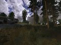
Lost Alpha
(view original)

Post a comment
Description
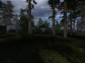
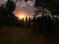
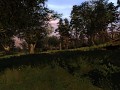
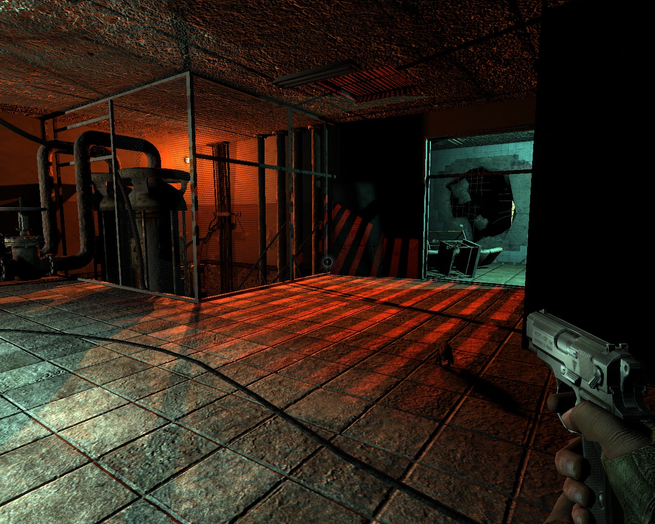
going back to the uni today, so i decided to upload 1-2 screens :)
maybe the level became too bright, what do you think? should we reduce the lights' brightness?
Yes! reduce the lights brightness, undergrounds shouldnt be that well lit.
You should lower it a little bit yes
Yea, it should be a bit darker. :)
i'd say yes, i should have to use my flashlight alot underground
maybe some sections that are well lit that are more peaceful than the rest
not the full level is as bright as this room, but im also thinking on reducing it a bit to make it more mysterious...
Yes, well lit places. To safely change one's pants :D
It looks great! Don't change a thing :)
hm on second glance, the contrast is a bit high on this one too, aside from that it looks awesome
Sweeeeeeeet!!!
please reduce lightning, seems nobody has been there in ages no ??
so it should look like the place is running with minimal power going on.
:)
Yeah make it a little darker but I love the colors, if that red was against a darker background I would thoroughly shat a brick :D
Keep this R2 stuff comin, I'm lovin it!
I think it should be very dark underground. I still wonder how these areas still have power after 30 years of neglect. Are stalkers down there changing lightbulbs?
most of the generators in those labs can last more than 40-50yrs even after they dont have more supplies. just remember the fact that ppl created atomic shelters too :) if we remove the lights, the map looks real ugly, believe me, so theyre needed.
In my opinion an abadoned laboratorie should be dark and scary..no one went down there since many years so normaly electricity wouldnt exist there anymore..make it more darker :)
x18 will be the same as in vanilla Soc? or is it somehow changed?
not the same, mixture of old, and final version.
Cool, I hope its gonna be huge, by old you mean from 1935 right? There was completely different x18 in build 1475 have you used it too?
i checked the old 2003 version is sdk, to be honest, its 95% the same as the 2004 version, the only difference is, they edited shape of 1-2 rooms, and they removed the ability to walk in the vent system, which is actually not necessary, the level is huge already. :)
thanks for answer
vents ! avp anyone? and make a more more darker undergrounds.
Walk in vent? Add this! Add this! 8D
I love vents! (Do you remember Half-Life?) It's really NICE!
Hmmm... Looks like X-18... So even SoC with r2 is mostly "Vanilla Stalker" (more good) lighting than on THIS screenshot ><.
Nice lighting! =)
I think it looks great, but you should make some totally dark undergrond areas, where you could see only with flashlight.
there are areas on each ug, which are very dark, almost pitchblack :) but some rooms has nice lightnings otherwise not necessary to compile on max quality, since lightmaps are not needed. believe me, it looks real nice, and both is needed (but since we aim to r1 mostly, we compile all our locations on max settings). the darkness for scaryness, and nice lights for eyecandy, and to test if your vga can handle it :)
That sounds great, i hope it will look ok on r2 as well. Not like i didnt like r1, it just looks too cs 1.6-is (along with the default guns...)
wow!
Lab rat, can you spot it? xD
BTW it would be nice to see this scene in DX8 too for comparison.
sure, here it is: Img.gameru.net
an 2 bonus img also on r1:
Img.gameru.net
Img.gameru.net
the imgs were made on my laptop with 1024x768, medium quality settings.
Damn those look awesome, like in the builds.
Could be darker I think.
The darkness of R1 is perfect i think.
It looks great, but yeah, like everyone here... darker :D!
Cheers!
very cool, do not change .... lighting, both builds ...)
this is what I wanted to see in r2)))
nice colors
pure awesomnes! thats all i can say..
keep the lights and the colour they look really good it just needs more darker areas on it like in the middle i reckon it should be darker there i like the colours used to
i like what i see. Don't think that there need to be done some changes
the orange red light is good but the normal light is to much