Insurgency: Redeployment is being created with the 1.0c source code from the original Insurgency. It features new maps, m203 smoke grenades, additional realism to weapons and more.
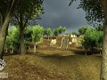
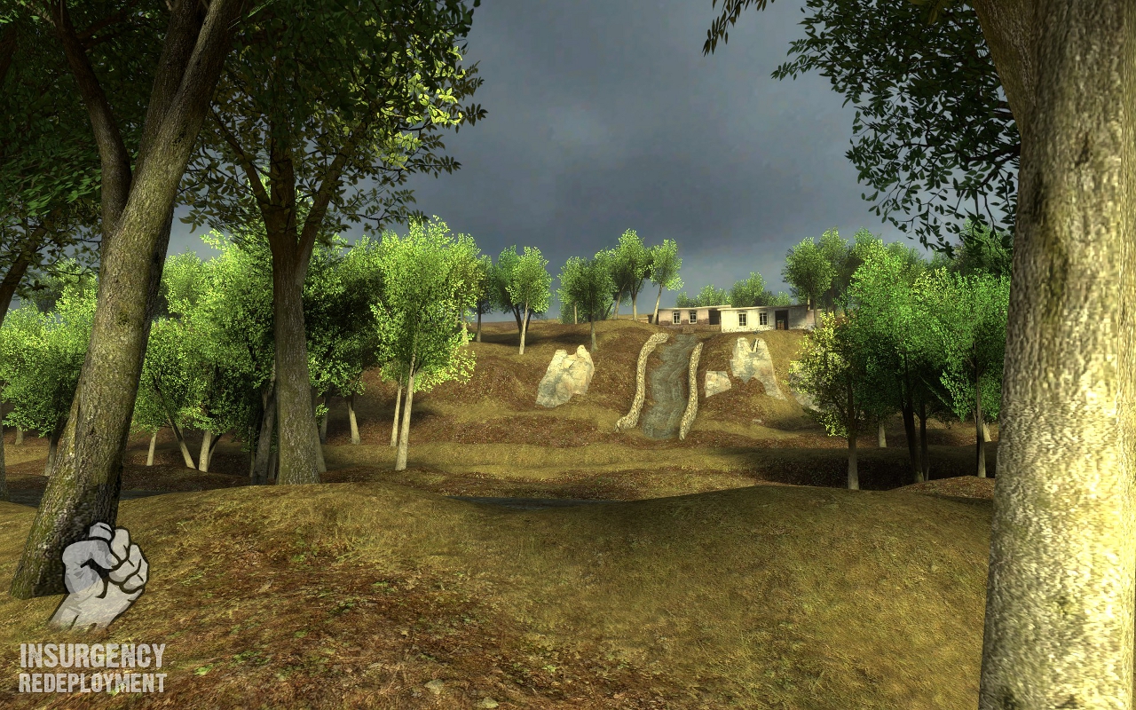
korengal WIP
(view original)

Post a comment
Description
Map by hypno toad
nice
Looks good!
sweet shes coming together :P
Looks a bit too empty. It would be cool to have bushes, grass and maybe a little destroyed wall for some cover. I know its work in progress but this are only some suggestions.
Nice. Looking forward to have a playable version soon. :D
This isn't being built like the older urban insurgency maps. It's quite large and non-linear by comparison; being as such there's no good reason to put too much detail into the less important places. Quantity has a quality all of it's own and Im trying to get the visuals as good as possible while not overcrowding the map or hampering performance.
Once more pictures are shown you'll be able to get an idea of the style and gameplay flow of the map, and it will put this small shot in perspective ;)
Mmmmhhh... dont like that, but O.K. Your Choice. I think with so empty landscape with no cover or details you have no chance to push forward ingame because of sniper etc. etc. And its too easy to see enemy troops because they cant mask in the "wilderness".
As much as I value input under normal circumstances, the only thing you have to go off of at this point is a shot of 1/25 of the map's space. Save your judgments and opinions until you see more, because as of this point you have only seen an image of the maps basic scenery, not it's layout or gameplay design.
I agree with L34D about the fact that it looks empty. You can easily optimize the map in many ways to allow detail to be shown. Not going on gameplay (as I am sure the openness works for the type of gameplay you are going for) but on looks I believe there are many ways you can make this screenshot of this area look better. Finally if this area is less important then why would you use this area to show. Just some of my thoughts, not trolling or anything. :)
ALL GLORY TO THE HYPNOTOAD!
I hope the OB engine will sustain the large maps, anyway keep the good work ;)
Try to match the lightning so it fits the sky color. The sky is dark and cloudy and the light is bright and warm - that doesnt make any sense. If youre using a stock HL2 sky you can look up the light settings here: Developer.valvesoftware.com
And why dont you put some bushes or broken walls in like one of the posters wrote? Some prop_statics dont cost performance really and a good performance is archieved through good optimizing and not through bland landscapes.
Korengal valley isn't exactly a landscape of blending colors. It has a lot of contrast. The trees are intensely green, yet the ground is fairly dry and dark.
Unfortunately, getting it to look right requires a lot of tweaking of texture colors and lighting values..