Afternoon ladies and gentleman....Who am I kidding? Afternoon Gentleman, hope we are all following the mod, that way you can tell me what is going on better than me, because I honestly thought I was the first Dev. Blogger for the Guard Duty mod. I would like to first point something out, there is a mod that is called Black Mesa: Shift, their motto is “ Get ready for a long Shift!”. This would of course be fine if not for Guard Duty’s motto is “Get ready for a long shift.”. Admittedly we do not have an exclamation mark at the end, so I put it to you (the community) to never utter than motto unless you are talking about the true bastion of mod godliness that is Guard Duty.
Ok, rant over, now to the true content of this blog. I am a texture artist as stated in the opening media update written by yours truly. I am effectively everyone on the mods bitch, it is hard sometimes to have so little creative input. I am requested to make something or RE-make something; it is in the vision of the mapper. At first I did not care, eventually it was an issue and now the issue has subsided, partly because I understand that this is a team effort and the mappers are important to making the mod great. I can make a great texture on its own, and maybe some of you will make it your desktop wallpaper, however, that texture would look shit in a room that has been crafted by the mapper for the past few months with a vision of having red concrete (not the pink leather I think is awesome). Also, I have been in the mod, people know me and a few times I have snapped or done something that means that everyone is very considerate. So in this case I get asked by out new mapper Spycrabz, this is what he said.
“I need a sign, using this design (hurr), for the entrance to the portal room. The sign should read "All personnel are to stay at least 3m from the geometric center of this room unless system is fully deactivated", And the diagram should show a stick-figure man being sucked into a portal.
Oh, and it should be an overlay.
Please.”
That please at the end is from when I had a little forum-based shout about politeness and etiquette. So ask me to do something for free, say please lads. Courtesy. That aside, I made a video of me making it, it’s a screen-capture, time-lapse, all very exciting, I chose the music and I understand that it is to most people’s distaste but I cannot make everyone happy, enjoy! Please
Stay tuned for more news from us ;).
"...I chose the music and I understand that it is to most people’s distaste but I cannot make everyone happy..."
No. Wrong. Kill yourself. The strokes are awesome. Everyone likes them. Anyone who doesn't is a terrorist.
Indeed, however indie is not the most popular genre. I personally prefer it, although mainstream pop is the dominant force and tends to be a pile of ****.
i'm not a fan of indie, but the song wasn't bad indeed :) (my preference goes to death metal :p which has a even smaller fanbase then indie these days xD)
sign looked ok, not to sure about the black border with the text in it tho :p
+ you should have shown us how it looked ingame xD
nice work tho, timelapses are cool :D
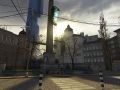
Ahah that is yet to be done, and with our development process that would be a while. However, this is just me clarifying the design, I have since begun adding grunge, peeling away at the edges. This is going to go in the leap of faith chapter.
The Strokes are mainstream pop. As is Indie. It doesn't mean what it used to really.
'Indie' genre means jack ****.
It can be just as pop as anything else, they're just exploiting a new (what was an) underground culture before it's unfashionable again.
But hey, the Strokes are great.
yea, the strokes are really good.
OMG IM A TERRORIST!? D:
Yes.
Etiquette ftw.
That song is actually pretty catchy. Also the guitar rift reminds me of EP2.
awesome music^^
The creation of the box was uneccessary difficult
Indeed, there were a few things that I could have done to make it easier. The original border for example, but I like to do things my way, there is a tool where you can toggle the radius to make the edges more rounded, but I wanted perfect circles.
When you put the speed lines behind the man to signiify he was falling, should they not have gone in front of him for moving backwards? (I know they were not in the final version but it's always nice to say somthing)
Well yes that is indeed true, and this really shows my development process. The point is that I do nothing perfectly, as long as the final product is what I want. The lines would be on the other side and that is part of the reason I took them out. However, I can add them in in the final game or keep them out.
The vid was awesome but it was weird how the portal was green :S unless its my pc or my eyes :|
No, it was rly green... ;)
Portal has stolen blue and orange, green is what xen portals look like. So why not?
Awesome :)
Liked the Music Too :)
Why on earth did you use Circles to make a Rectangle? There is already a tool in Photoshop to do that. I laughed so hard when I saw that, not at you just at the sure fact I can see why people think some of their work is amazing when complete, when it really isn't. It's because they do silly methods in Photoshop that take longer and allumes their mind with false truth of it being awesome because you spent time on it.
Not that I'm saying your work isn't good....
Thanks I guess, as I said I do some stuff on the hoof like that. I could have used the rounded rectangle tool. But that would be too easy and I hate fiddling with the radius to get perfect circles. But still I understand where you are coming from.
Zstar Electronics Co., Ltd. is registered in Hong Kong, with production base in the financial center of Shenzhen. We are a professional memory storage devices manufacturer integrating development and international trade. Our main products are memory cards, flash drives, MP3/MP4 players, and phone cards.
That sign is actually pretty cool.
yes I have an wallpaper on my desktop it is this :D
Moddb.com