This is Guard Duty. Put your feet in the shoes of Barney Calhoun, a security guard at the Black Mesa Research Facility who has no idea that the next few hours are going to change his life forever. Re-live the exciting adventure of Blue Shift, now re-created in the award winning Source engine.
Duty calls- November update
(view original)

Post a comment
Description
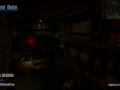
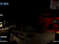
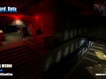
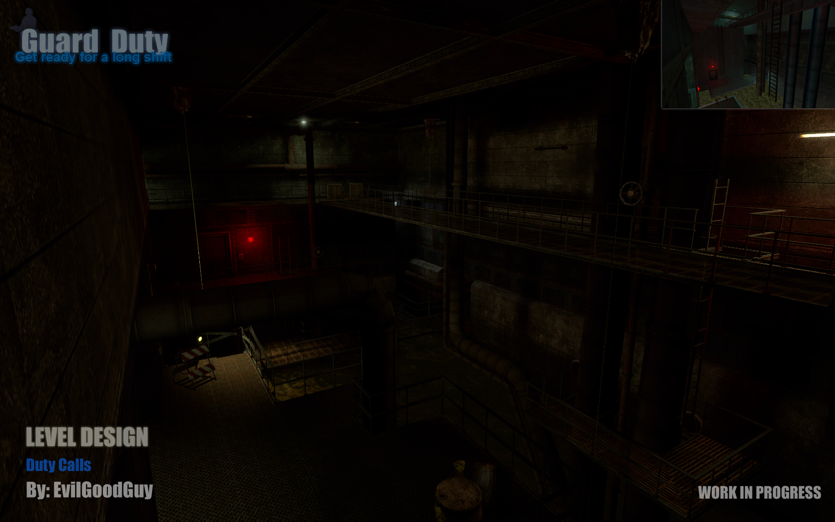
Duty calls by EvilGoodGuy.
This area is cool. Just.. lighting looking bad :/
If you could state why its bad, that would appreciated. It's supposed to be dark.
(buried)
Scale texture in the floor need improvement.
Shadows.. and the red light is not very nice with actualy parameters :/
In north, the env_sprite need to change !
I fail to see what you are pointing out. Even in the massive picture I have access to I cant see any problems with the floor texture scale.
The shadows look fine, and even really nice in some areas although they will probably improve even more as we progress.
The red light is a cage light which is just a bulb in a glass case and therefore projects light in every direction for a short distance.
Im not sure how you can criticise such things without seeing them close up or ingame. These screens are to give everyone an update on how our maps are progressing. Regardless, thanks for the feedback.
You can't just bash the work because it looks to dark in a screenie man. You have to consider the intended atmosphere and mood of the game-play ( and why should anyone need this explained ). It's not the mall, it has to be a darker environment.
very well put, good sir
(buried)
Lol.. Man, if you don't like critisim comments its not my problem, good luck with this project
I believe what freredarme is saying is that the floor texture looks a little redundant in the screenshot, although that's probably just a side effect from the border you guys added on. Anyways, the level design looks incredible, I couldn't help but notice that the floor is a little bare. I know it's an early version, but I'd put a couple of stain decals or some non-colliding garbage props on the floor. After all, it is a maintenance/storage area.
Anyways, good job with the level. You nailed the darker lighting. I turned the lights off and took a good look at it without the screen glare, and I have to say, you managed to provide visibility without making the level super bright.
Keep up the good work!
Thanks Crysis2222. The metal floor does indeed look a bit repetitive from that view, but I assure you in-game it looks much better to the eye, as does the lighting in the entire chapter.
A 2D screenshot just can't do dark areas enough justice.
More stain/rust decals and small trash props are going to be added for sure, since it's a maintenance/sewage area :)