The Battle for Middle-earth has just begun! The Edain Mod returns to the classic gameplay of the first Battle for Middle-earth, reimagined with countless new heroes, units and abilities. Journey deeper into Tolkien's world than ever before, relive the movies through meticulously crafted visuals and forge your path to victory in epic strategic battles. Follow your destiny... Middle-earth awaits.
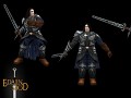
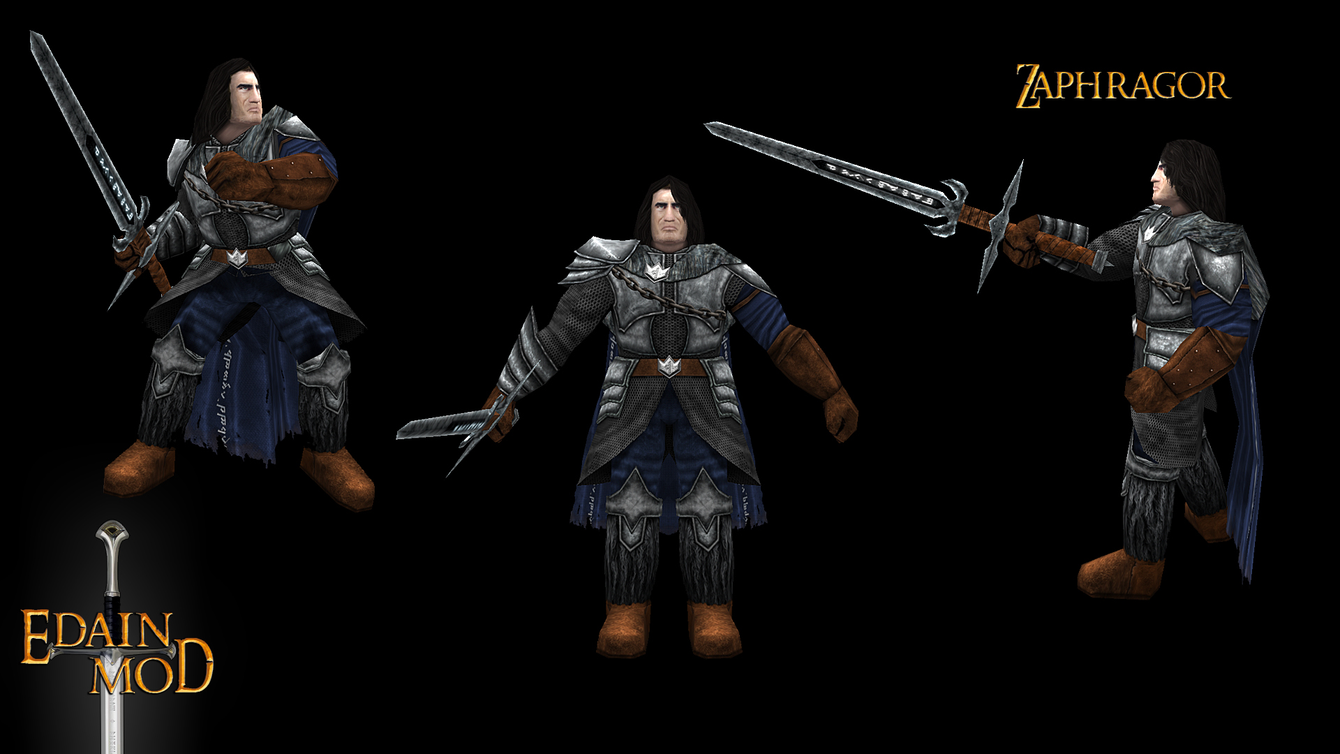
Zaphragor, First Blade of the Witch-king
(view original)

Post a comment
Description
Tales in Arnor tell of a man who has given his life and soul to the Witch-king, becoming a monster without equal on the battlefield...
Frostmourne hungers!
Please make a special edition of him with Arthases skin and make Dain look like Muradin :D.
There is, or at least there used to be, a Lich-king easter egg. You could buy him while using Angmar, if you knew where to look.
mmm I think quite the warcraft style is not the style of lord of the rings
Why is that face so familiar? he looks excellent btw if any thing i'd say he's a bit too warcrafty; size wise.
We did want him to look massive and imposing - he's supposed to be a warrior who stands out on the battlefield. However, I don't think that goes against the Lord of the Rings style. Beorningers, for example, are also very large and muscular in our mod and I think that suits them well.
the face reminds of Severus Snape... :P
THATS IT!
That's just the hair. :P
The problem that makes this character look WoW-ish is the proportions of the hands and feet. People with lots of muscle don't have bigger hands and feet. In this model, those parts are way too big in proportion with the rest of the body in a way that the contrast between the general body mass and the size of the hands and feet is nullified. Also, because everything is big, the head looks tiny. the resulting effect of the two problems is that it looks cartoony instead of muscular. Also, the chest is too short if you look at how wide it is, a little neanderthal-like!
Beorningers, in the other hand, are really well made if we look at the proportions.
Moddb.com
Read this in a positive and friendly way, just wanting to help
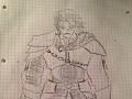
Not that he is not good but maybe you guys should have stocked more to the original drawing, he deserves that dark aura given by years of practicing the dark arts, agandaur style. Just imho
Either way thanks for the work and hope the feedback helps!
What part of the drawing do you miss? I think Adamin stuck very closely to my concept art :) The armor is almost exactly the same, for example.
Hello! Mmmm concerning the armor i agree its pretty cool and my ''complains'' compared to the drawing are the physique/build is more like a lumberjack old strong 50s man in the model when in the drawing it looks lighter and you could say ''sharper'; more of a strong young adult model. Also the blue of the cape makes it more ''good'' than he should, it could be darker, the whole model really could be darker but cape mainly.
That being said I think the biggest thing I miss is on the face; the lighter young hair,thin factions, and most importantly bitter ****** up by dark magic face (reflected on the dark things you draw around the eyes). Something like this with Agandaur as you can see his kind of scared skin around the eyes too and some close the mouth Static.giantbomb.com
Some nitpicking could be the removal of fur from the cape and the round boots, I think iron sharper boots would fit better.
So to sum up, sharper (like when sharks show teeth), younger and dark magic drugged/scared face :p
All of this I say it from my own opinion and always looking to make justice to your own work and mod :)
To be honest I agree with Sr_Dark. Sort of.
I think the body is just perfect, but the head can use some sharpness at the chin. In the concept art of yours his sharp chin does indeed give him a more youthful and energetic face. In the model, however, it looks more rounded which adds a lot to his years, and yes make his head a little awkward with respect to the body.
The Beorningers have a lot of hair around their head which makes it blend nicely with the huge buddy. Here however, it's a bit different as he's a "Man" numenorian nonetheless who were known to be the fairest of all men (The sharp face of Aragorn for example).
Zaphragor has nearly the same proprtions like Aragorn. Except that Zaphragor is wearing a more voluminous armour and much bigger boots.
I'm not not talking about the proportions, but the sharpness of the chin features.
I just checked back the models of Boromir, Mornamarth and Aragorn. They all have sharper faces if you know what I mean. Less rounded, and just feels more natural.
That is only the texture. Zaphragors face is formed exactly like Aragorns and is as round as that as well.
Then I'll have to give it a closer look ingame ;)
Yeah I think the main problem is that he looks like 50s adult when he could and according to his biography he is in his 25s so should look much younger. As I said I think its partly on the body, maybe the waist could be thinner but mainly in the face that should be sharp and more over, maybe it is sharp as you are saying but its hard to distinguish because of his round hair. As I suggested I think it could use more of that lighter hair style from the concept art and ofc, the darker look, regarding this his bio says '' He can go to the point that even the skin peels off his arms or continue to act his magic.'' he surely should have scars from his training and dealings with dark sorcery, and also misses the ''deep black eyes that madness, malice and a terrible past shine'', a lot of this portrayed in the Agandaur image i put below and those traits would fit perfectly on Zaphragor.
Well and the boots... i believe something more like your angmar witchking foot wear would be excellent for him :)
Excellent details on the armor btw! Cheers!
His armour is magnificent! And his face as it should be... Bitter. Great attention to detail team, now his design truly does justice to his awesome gameplay! :D
right on!
Where can i view the backstory?
There does exist only a German version of it: Forum.modding-union.com
There will be an update with his abilities and story available soon, it's awaiting authorization at the moment.
Thanks guys, good thing there is google translate.
Awesome work but i hope we see kash very soon
Thank you, I thought I was the only one :)
OUtstanding as always! To see him made by Scratch and to ahve such a cool apearance,he is awesome,as always perfect job ET! :)
Fasinating creepy and beautiful creepy at the same time...
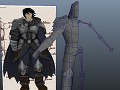
A great combination of the concept art of Lord_of_Mordor and Adamin's modeling skill! :)
Very nice model, Zaphragor will probably be my favorite Angmar hero :)
He's fat. :(
Of muscles... :P
Model and all is nice but too cartoonish and out-of-place art style, too much cliche fantasy
Why do you think so?
I think its because game just adopted design after movies and they tried quite hard in movies to make armors and weapons functional and practical, thats why this, even if it is really nice model, looks out of place with some kind of two hander in one hand, metal plates around his body and really broad body
When fighting he uses both hands to hold the sword.
I really like his design, but I agree it looks a bit too warcrafty. The problem lies in the size of his hands and forearms; they have a very unrealistic size. Just google "strongmen" and you will see what the proportions are of the strongest people in the world. If you make the hands and forearms just a little bit less bulky you will see that he will look more realistic.
Btw I love the fact that you gave him a zweihander :D!
His concept and background is awesome and he will probably end up as my favorite hero from Angmar, but I think his design misses the elegance and functionality of movie-style concepts (stuffs from Nick Keller, Daniel Falconer etc...) and reminds more the style of modern fantasies mentioned in other comments. But still, I look forward to play with him :P
I really like the concept and story you guys have created for this guy! That said, I don't know how his proportions look in game, but he looks a little heavy in his stomach area. It might be more imposing to have broader shoulders and hips than the rest of his body.
To be fair, finding the right middle ground between warcraft style and LotR style on a character like Zaphragor is not easy at all, and you did quite a good job. Nevertheless, I have to agree with the guys ; his face is kinda weird ... inappropriate if you will, and he could use some darker theme.
(by the way, his abilities are awesome)
I understand that the Team means for Zaphragor to be an imposing figure, but personally I think that maybe he should be a tall character, but not as broad as he is now, with a more... lean body. Particularly I like to think of gish characters (that is, warrior sorcerers) to be generally less rough and overly muscular, but still deadly. Less like a greatsword and more like a bastard sword or longsword, muscular and strong, but not too broad and big.
Another aspect of him: his face, in the original concept art he has a more "phantasmagorical" or spectral face, in that drawing he looks more "beautiful" and yet gives you the chilling impression of being someone or something a bit less than human, as if that loss of humanity was a price for his sorcery. That is very interesting, his final model, however, looks a bit too human in his facial features. Looking at the face alone, that model reminds me of a hardened middle-aged warrior veteran that you could find in any other large town. An interesting face but nonetheless one not befitting a mighty sorcerer hungering for power that slowly gives up his own mortality for it. Anyhow, I like more the face in the drawing, which would go well with a longer hair.
Since I saw the original Zaphragor's 3.8.1 avatar I've always thought of him like a bloodthirsty vampire (NOT saying he should be an actual vampire).
I must add that I quite like his other features though, the chain across his chest, the runes, and his assymetrical armor are all great additions.
Much better than his older model
I love the sword. I pictured claymores in the hands of the northern hill- and mountain-men.
However, the overall aesthetic feels rather cartoon-y and belonging more in WOW or LoL than in Middle-earth. It just seems kind of... off.
he looks like Dolf Lundgren... :)
You're completely right, Dolph was the basis for his face. ^^
can't wait for the Expendables update.
LOL did you google his face?! it's so accurate :P
I agree with some people that it looks a bit like Alan Rickman, personally I would have suggested some sort of a helmet or a crown to signify his position above the rest. I also agree that the armor looks a little "cartoony", not that it isn't well done but it does seem like something out of World of Warcraft... Perhaps replace the blue on the armor with black (since the LOTR "bad guys" thing is blackness), darken the brown a little and leave just the cape blue, as a symbol of Angmar. Great work regardless, just my two cents :)
I do however appreciate how the model turned out compared to the drawing, which looks a bit like a young anime character - no offense to the artist, but I feel like someone who has given their soul to the Witch-King would be a bit more worn and weathered.
Arthas + Dolf Lundgren, but with black hair xD.