OUTDATED! There is no longer a HUD!
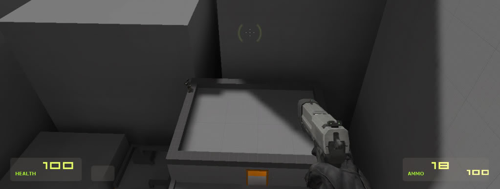
I have change the colour of the HUD to green and changed the number font to HISCORE. I hope you like the change. I've also hidden the Suit display becuase I'm going to disable the Suit, and I'll try to disable the limit on the sprint as well. Unlimited sprint :)
The menu music is the Puzzle song from the level 'The Shard' from Mirror's Edge. AND I've made a startup vid like the Valve one on Half Life 2. Progress :D

I don't really like the hud the numbers look bad with them really high and not near the health etc it looks terrible i would say move them down to normal positions.
Agree, too high
What I would do is move the health to be above the number, like a superscript.
If you don't know what I mean by superscript I mean this: Tinyurl.com
You'd also need to move the actual number a little to the left.
Agreed. Its position denotes logic. Why would they position numbers like that? There is no point to it. Look at most HUDs in games. they all are logically placed.
Then I come to my opinion that this isn't that much of a HUD change. I would of hoped for something a little bit more substantial than a color and font change. It doesn't reckon a news post.
I have to dis-agree with limagic, i think it looks freaking awesome
you should wait until you have something a bit more before you post news, dont get me wrong, its good work, its just pretty base stuff.
I think it's good. Gives a feel of height.
Delete 'Health' 'suit' 'ammo' and more character and change the hud police ^^
how about removing the health bar completely.....you could then show the health by reddening the screen or by some other physical signs..
Look : "Valve_Hud_HEALTH" "Health" in valve_english.txt (line 245) and don't forget to modify all valve_'language'.txt for make a correct HUD for all if you modify.
who cares about hud when you're trying to land after a hard jump ?
I think it's ok.
There is a mirrors edge Source.
BTW one of the aspects of Mirrors edge is Immersion, aka no HUD, full first person model with realistic shadows. The free running was only 1 part of a huge picture.
Also, make your own music if you do this. It will just look like a blatant cheesy Mirror's Edge ripoff if you use the same menu music and background scrolling as the original game did.
I agree with you 100%.
Yah i agree with AlCool because you get attacked by copyright. Try be unquie instead of stealing ideas which have been out for ages.
Change the crosshair to a black dot and get rid of the helpers or get out now.
cl_crosshair 1 is good ^^
Not good enough.
IT S GOOD ! Or modify script file for delete crosshair :)
And hud_quickinfo 0 , quickinfo is bad for all mods.
Hmmm... Black Dot Crosshair huh?... Kinda reminds me of the game "Black" on PS2! lolz.
Anyway yea, The HUD looks nice but the positioning of the Health and Ammo status looks a little weird being raised that much!
It's look Half-Life 2, it's look bad.
mmmm i dont mind it
Seems fine / good to me :s
You'd think I would flame you for this, but no. I actually like this, yes shocking!
One point, remove the base panels from behind the values and move the labels closer to the numbers and you'll have a nice vector HUD.
Changing the HUD now.
I have an idea.
I could get rid of the HUD and just leave the quickinfo on the crosshair!
I haven't seen that, but as I imagine it, I don't like it.
It has been done and I think it looks a lot better!
I like it personally.
What font is it?
and yes, a hudless view would be nice.