Blue Portals is a unique Portal mod that has players traverse through new test chambers using only the single portal device and many new test elements.
Updated The Older Look.
(view original)
Post a comment
Description
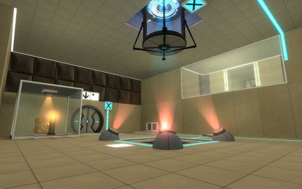
Since late 2008, the textures that where included in the mappack version did not change. Well, me and a few other people thought we should replace those pixelated textures with a texture that Colossal made. However, I edited his texture to make it the right color and hue as the old ones. I also updated the ceiling so its not as bland. What do you guys think?


it doesnt look right. all the light glows dont add up to more light in the room. the box deposit chute should be really lit up with redness and the glass box on the left should have more actual yellow light inside it...
again, those light glows dont look right unless theres also some actual light shining on the walls and props.
I agree, but the textures look great. :D
I just played the old version, and I agree with the above two posts. The original version looked a bit dark, but this one is just overdoing the glow. And honestly, I found the glows on the buttons a little unnecessary. I couldn't figure out why the pauses prior to their use were necessary.
The push magnets look really nice in that shot, but I also agree that the catcher should go back to being red lit, its more obvious that it's a receptacle (not that it isn't obvious in that shot, but red just seems like a better color, and as long as you don't let it leak out into the room too much, it shouldn't clash with the magnets).
Even though I got more feed back on the maps appearance then the textures, thanks. :P
There is a main reason why the main color of The Box Catcher is blue. It glows red when you place junk into it. I'll do a video about the BP devices soon. Glows on the buttons serve a purpose as some buttons can't be pressed right away.
Currently, the textures are a tiny bit brighter then the old ones so when I'm done with 06, we will go into 'down time mode' in where we update older maps. Tonemapping needs changing now, the maps appear annoyingly bright.
We are aware of these issues and confusions that you all might have. We are working on it, don't worry. :)
I like it though...
like the lightflashes
Wow, I like the new wall textures. Nice job colossal.
Much better. The old ones definitely looked like a repeating pattern, these don't. The old ones looked more like polised slate or lenolium, which I think looked better though. So to make the new ones even better, perhapse you could add some sort of layer on top of the texture to simulate linolium or not quite perfectly smoothe slate rock?
Of course, now the floor and ceiling looks off, because they don't have the rocklike grainyness of the walls. Hehe, just more work eh?
The lighting, on the other hand, looks much worse than before, but thats not your job is it?
The textures screw up the original lighting. Adjusting the Tonemap should fix it. Glad you like it as much as we do! :D
That's a very calming atmosphere. Very different from the original sterilized look of Portal. I like it.
These are the same IMO.
They give thwe same mood, although they are less "warm" than the previous ones.
Please don't make the chambers to dark though
05 is a bit of a darker map. (This room in general.)
As I said before, we will work on it, we just wanted to show you progress. ;)