UI Concepts for W:ET
Playing a few modern shooters recently brought me to the realization that the UI of W:ET could also benefit from some adjustments. The following concepts are just some theoratical ideas and there are no plans (yet) to realize them since they are not related to any project (yet). Having previously worked only on textures I wanted to broaden my view in the field of a 2D-Artist, so these are my very first concepts in this segment.
I also plan on giving the Limbo menu, Profile menu, and Main menu a go in the future. One point that has to be mentioned is that these concepts also include in my opinion minor gameplay changes.
Map Loading Screen
Let's start this series with an easy one, the map loading screen. The vanilla loading screen consists of the camp_map and the camp_side. The camp_map includes a preview levelshot and a pin that shows the location of the map. The camp_side includes information about the gametype, mapname and -objective as well as server info and server settings info.
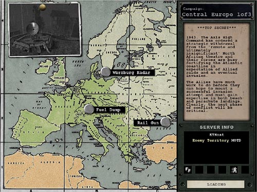
- As you can see on this image, the location pins of these maps as well as ~80% of all custom maps are either false or imaginary because the map isn't based on a real-life location/event. Because of that I decided to remove the location pin system completely.
- The server setting info (e.g. here 'Friendly Fire' & 'Dial Up Modem Players allowed (Antilag)') are a great way of filtering the global serverlist for servers that suit the player's needs and wishes. However once the server has been chosen from either the ingame server browser or an external one (e.g. Trackbase or Splatterladder) this information is no longer required. Since they are only taking up space, I decided to remove the server settings icons as well.
I wanted to keep all the other information, but create a more friendly and inviting look, which is why I decided to replace the small preview levelshot with a fullscreen level wallpaper showing the map the player is about to enter. The gametype, mapname and mapstory have been moved to the upper left corner and kept in a simple white to create a cleaner look. The server info has been centered in a banner in the lower part of the screen with the loading bar alligned underneath. In the lower right corner I decided to put both the mod and game version, since I consider that important information which is also helpful with trouble-shooting should there be any problems during the loading stage.

Player HUD
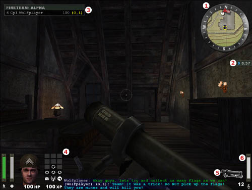
Having the easiest out of the way, I decided to move on to the most important one. The ingame HUD the player constantly sees while playing.
Let's start with the lower left corner, here we have the stamina and health bar, both with respective icons underneath. Next to that we have the player's head with animations showing the rank, state of health, whether or not the player is still wearing his helmet and linked to this whether or not you are still wearing disguise as a cvops. Underneath that we have a third indicator of the player's health, this time in form of HP in numbers. Next we have the level grid for the 3 currently progressing levels (usually Battlesense, Light-weapons and the class level) and below that the XP in numbers.
In the lower center we have the chat window with both team-, global- and quickchat.
In the lower right corner we have the icon of the weapon that is currently equipped, the remaining ammo count and the charge bar.
In the upper right corner we the compass showing the minimap, directions as well as the position and state of teammates. Also placed here we have the timer with remaining mission time and next respawn wave. Depending on the mod, there are also various additional information snippets that can be placed underneath the timer such as FPS rate, K/D, Lag-o-meter,...
The upper left corner contains the fireteam window in case the player joined a fireteam for improved teamplay.
- To remove the level grid and XP display was the first thing I decided to do, simply because this information is perfectly visible in the Limbo menu and therefore unnecessarily affecting the player's FoV.
- I also decided to remove the numeric HP display, because in my opinion the health bar is perfectly sufficient. Also removing as much redundant information as possible keeps the FoV clean and makes the more important things stand out.
- The weapon icon has been removed, because in my opinion it takes up too much space, but honestly primarily because I don't support the attitude of 'hardcore' gamers that remove the weapon model. The remaining magazine ammo has been enlarged.
- The compass has been moved to the lower left corner to have everything important on one eye level. Also the compass border has been simplified, however atmittedly I'm not entirely happy with it because it presents quite a big loss of ww2/old-school atmosphere.
- The animated player head has been kept because of the amount of information it grants the player, however it has been moved to the lower right corner along with the health and stamina bar. The remaining ammo count is displayed underneath.
- In the prologue I mentioned that the UI changes aren't purely cosmetic, but also present a 'minor' gameplay change. Please continue reading below at 'ability cooldown' for further information.
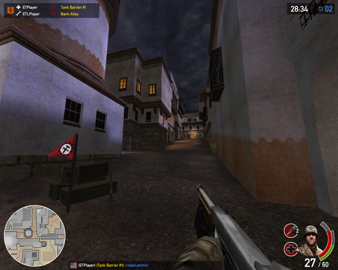
Ability cooldown:
Left of the player HUD I implemented ability cooldown icons. These represent the primary ability availability and replace the universal charge bar. Having these gives the player immediate input on his ability status, which simplifies team coordination significantly and enables a well-timed push against the enemy lines. For example an engineer directly knows if or when his dynamite is ready and can time the objective rush accordingly.
In the example HUD we have a medic. Each cooldown cycle would restore one syringe to a max of 3 and the second cooldown cycle would restore one medpack each to a max of 5.
Shared charge for all abilities is something I would encourage to abolish, because it enables smoother composition between the different abilities. Frankly it also requires less coordination and strengthens the teamrole of the player significantly, since a Field ops can provide ammo packs for his teammates without having to cut back on the airstrike, that will take out the approaching enemy tank.
Globally shared charge for airsupport and artillery is still kept! When a different Field ops is using his airstrike your airstrike ability icon is immediately greyed out and cooldown initiated. Having these cooldown timers seperately for airsupport and artillery simplifies gameflow, since the player doesn't have to decipher a white,yellow or red lightning bolt which somehow is supposed to represent both abilities. Or even test-fire his Artillery at the chance to initiate it in a not so ideal spot.
This concludes my first attempt in the field of UI design. Please let me know what you think. I'm especially curious about the feedback on the ability cooldown feature. If I'm still motivated and have the time I will try the Limbo menu next.
Cheers
These are really nice ideas. I may be of some of help if you also plan to remake crosshairs.
Thank you, mate. I will keep it in mind.