So they've been a few changes to the site which you may have seen lately. Firstly if you missed the news games, mods can now be labelled as early access. This is to help content show up in the release section and allow reviews, whilst also highlighting the fact that their work is not yet complete. It's step 1 in our release functionality overhaul.
I've also added the ability to embed tweets directly into posts and comments. To do it just put your tweets URL into a new line (with no spaces or punctuation around it). If people like this change i'm contemplating allowing images, videos from our sites + youtube to be embedded in the same way.
Twitter.com
Finally and the reason for this post is the change we've done to descriptions on profiles where you must now click "read more" to see it fully. It seems a lot of developers and power users are unhappy with the change which is entirely understandable. The problem we have however is description consistency. Some descriptions are ultra long, whilst others are short. This leads to confusion for new users who aren't aware that to get to the pages content (gallery, downloads, comments etc) they need to scroll through the description. The read more change allows us to address this by keeping the description there but hidden, which makes profile pages far more consistent. But we want everyone to like the change so I wanted to discuss the options available:
- Keep descriptions the way they were, long and inconsistent
- The new change is good, clicking read more
- The new change is good, but if I click "read more" the site should remember that and do it on every page I visit
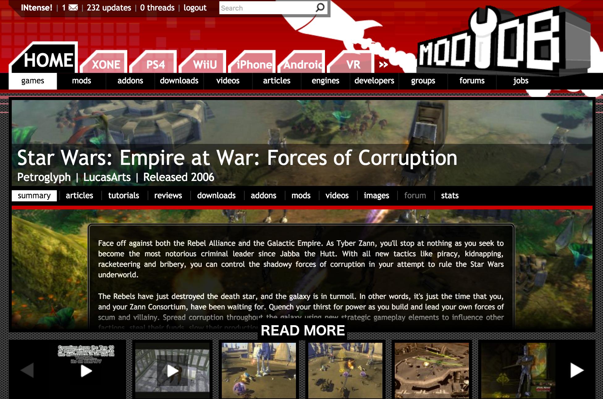
- Move the description so that it is on the left, and doesn't push down the entire page, demo:
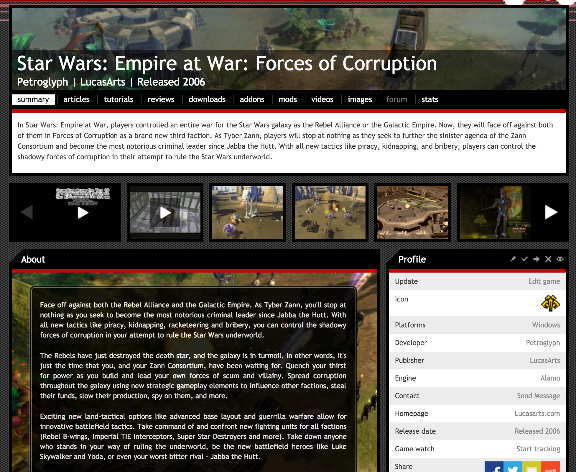
- Make it so the first 400px of the description is shown (so short ones still fit), then there is a read more button, demo:
Tell me which options you like best and why? Also worth noting our Github features / bugfixes board is public for all to contribute to.
Well the front page is supposed to big and cluttered to fully explain the mod and provide a nice visual style. First impressions are important, perhaps more so than accessibility to new users. Most people would agree with that and also I think most people will be resistant to even the smallest visual change even if it makes sense given the functionality. I would not change the location of the description as that would ruin the visual appeal entirely and I wouldn't keep it as it is either.
3 and 5 could both be implemented fit what your going for since it would mean we get a sense of the pages style and not be too inconvenient to users used to the site when they are forming their first impressions for various games and mods while browsing since you'd only have to click read more once on the first page you visit per login. Although I'm not sure if thats foolproof (ie if it would require cookies enabled or could function on HTTPS).
The site is primarily a way to attract people, the way it is currently does not do that and it makes it a chore to browse (an extra click adds up after awhile).
As I said its not just a description but part of a game/mods personality.
...and the sites 'overall experience'. So for now I'd revert the change, and focus on implementing HTTPS, and community enhancing functionality. We'll see if it can be done well.
I do agree with keeping description where it is.
But yeah, I can see the issue with it being deemed long and inconsistent.
My beef is like when one makes a really long, epic looking description for one to read around. With images, lots of good info, etc. I guess, (now I do so this a bit hesitant cause I'm still resistant to the change) I could live with option 5 if not 1. At least to let the HTML coding apply. Cause now for the HTML to take effect I have to click read more which kinda ruins all the work I put into groups I made and other pages I like on this site.
I like getting hit with its majesty as soon as the page loads.
You get what I mean.
Main problem is that the descriptions are so inconsistent. Some developers do incredibly good informative descriptions, while others don't get HTML formatting and they are incredibly confusing.
Thank you! ♥_♥
Hard to say what is best when there are so many good choices and why. For someone like me who have been here a long time, will it be best to relate with the old one.
But many people hate to scroll all the way down to the comments section, every time to look if someone have commented or not.
"Move the description so that it is on the left, and doesn't push down the entire page" I can say no right away, as you see the image will be splits into two parts. If they become too much between rooms, it will just look silly out with the image it self.
(But it was also a very good idea)
But I will go for the last part, I like that one best. It's like the old version and you can still see some of the image or the text, but to see the rest you must press the "Read more" which is fine for me.
But I would have done "read more" slightly smaller and put it to the right part of the image. With an arrow showing down side of the "Read more" so people will understand that, when they press it the list will continue down. Instead of that they may believe that this is a link that will take them to a new site.
My question is that, if one use code to create background image to a group. So will it not come up until you press read more. Will this happen in the new part too?
An example here: I.imgur.com
There are very many different codes that one can use, but it looks like this for my group now. So my choice is to relate to the old one, or the last part.
Continue the good work with the website, and thank you for sharing some of your idea.
I see my background images in fan groups are gone! Is this because of this change? Everybody should have a choice if they want a big or small description. First you removed the video and now shrinking the description field every hardcore fan gives his page a special look now you are making them more boring to look at. If a first timer sees a cool made page he will like it much better as a dull short page or not??
We shall be making it so that the background image and customizations show up by default
Phew...many thanks!
Now that's beautiful, look at this.
Link part 01: I.imgur.com
Link part 02: I.imgur.com
This is the first update, I like a lot.
Thanks, if you shorten your description just a tad to 450px then the entire thing will display by default
Personally like option 5 the best I guess. It helps users still get that glimpse of "the front page" while not forcing them to scroll all the way down the whole time (A few of my own modpages have frontpages which exceep 3000 pixels in length). Having a 'read more' like that (instead of the text variant we have now) is a much better alternative.
Seems this is the go, working on it now.
My sentiments exactly. I've never had a huge problem with the consistency of pages, myself. I feel like the quality and content of a page's homepage goes far in displaying how a developer carries and presents their project. *But* I can recognize how annoying or jarring that inconsistency can be, so if it's a problem that needs addressing, I'd like the sort of middle ground Option 5 provides.
We will also save a users preference, so if you always expand "descriptions" then we will save that so it is auto done for you each page load
Well within the options available in the post I'd choose either 1 or 4. I don't like the change with this little
unaesthetic character that you need to click in order to expand your nice looking description.
Please remove the weird button whatever you do. (Or at least make it a real button that looks nice :/ )
I'd go with #4 seems best for me.
I agree with what TheUnbeholden said. The summary is a mod's cover, the way of (creatively) showing people what the mod is all about. And that's what a 'summary' actually is: it summarizes the mod's story, features and all the other stuff the developers are implementing into it, so one knows what the mod is about and doesn't necessarily need to go through news articles, images and videos to figure it out. If the summary remains as it is right now, many won't even bother to open it. Their eye will go straight to the images and they will start commenting stuff like "nice mod but what's the story?", like they do with image descriptions. They simply miss them/don't pay attention to them.
If I had to choose, my choice would be number 5, but I have another suggestion: make it so that every summary is fully expanded at first, but when you revisit the mod, the summary will look like in option n5, or even as it is right now. And for those who want the summary to be always expanded, there will be a "always keep expanded" option. Otherwise, after the first visit, the summary will get small by default.
Option 5 looks cool, but in any way you should change the mechanic or at least make the read more visible and noticable (not a single person i know that viewed my game didn't knew they could expand the description before i personally told them)
I didn't even notice myself there was a read more button, let alone the people who visit my page. The average attention span of an internet user is less than half a second. If anything takes longer than that to find out they usually discard their efforts. So it's best to show the information right away. Already are people overlooking obvious information I put on the main description in plain sight.
You don't see billboard advertisements that you need to pull out of a wall in real life either. It's all about that first impression within that split second of viewing. Text sometimes even neglected by viewers due to fine eye-catching imagery.
Besides, doesn't anyone want to have people notice the effort put into a fine page? If a description of a high quality project looks just as bland as another spur of the moment weekend job because it's hidden behind plain text, it's not only confusing, it's also a shame since a lot of people won't "read more".
Just my 2 cents.
It would be a shame to lose custom descriptions and themes, I would prefer the changes be reverted because losing appearance for consistency is hardly a improvement at all, many projects have both already so I don't see this as being a step in the right direction.
I am not a big fan of the collapsed summary screen.
A lot of work goes into making it look just right to engage and interest potential players. I feel that with it collapsed to just a few sentences (that most people would just skim over), it loses almost all of it's purpose.
Instead, most players will scroll down and see the Article section, as it's allowed so much space on a mod's page (even more depending on length). The reason why this can be a problem is that article in question may not be the first impression you want to give the player (such as a development update).
So instead of seeing an about section tailored designed to interest a new player and provide useful links and information, there's a chance they'll simply be unable to find what they're looking for.
I've noticed that since the new collapsed section has been implemented, there have been a number of comments on my mod's page (and in the comments of the download section) where 'feature x' went, which was once linked in our description.
You say that the change was made to help new users find the content they're looking for across multiple mods (articles, downloads, videos, etc.). While I imagine many users of ModDB arrive to look at or download just one mod, this is a valid reason for the change. I say that if a developer wants their viewers to focus on these sections more than they already are, they are more than capable at direct attention in a fashion that matches the aesthetic of the page while still being useful to the players.
For example, my mod has a few articles in the tutorial section which aren't too relevant anymore, as they're either for outdated versions or no longer needed. Because there's little reason for a viewer of my page to go there, I don't point that section out. Instead, I give space to the other features that I want them to have a look at.
It really feels like collapsing the about section is a step backward in a year where ModDB has done nothing but move forward. If it is a feature that stays around once voting closes, I would appreciate it as an optional feature that can be enabled in the back end. This would allow more customization to developers while also allowing the site to look cleaner as a whole.
It was primarily a feature to help with voting, and we are working on a change now. Want to make something which agrees with everyone. Challenge is balancing the needs of a user like you that respects and puts a ton of effort into the description, vs. the norm which generally isn't of the same standard
Understandable, I put a lot of work into the presentation of my projects because that's the level of quality I want to reflect to potential players when they first see the page.
I've found that while browsing ModDB, that first impression is a very good representation of the care and quality that a developer puts to their work. Incredible mods like Star Trek: Armada 3 and Mass Effect Reborn are good examples of this.
Meanwhile, other users slap their page together in a few minutes and let it sit there, giving it even less attention than their community built around it. We have all seen examples of what this looks like, and it can be a good look at the quality of their projects.
If a developer wants to put in the extra few seconds to really set their mod/game apart, I would say let them do just that. It helps those users deliver content to people browsing ModDB while showing what their mod is about.
Out of the options provided in the original post, I would have to suggest going with number five. It gives the about section enough space to draw attention, makes navigation quicker to the content below, and gives incentive for users to customize their about section to make it look nicer (as shown in the example).
I hope you guys can find a nice balance in the future, and thank you for reaching out to the community about this update.
I know that some games/mods make unnecessarily long summaries (which kind of breaks the meaning of 'summary'), but I think that hiding them behind something is a bad idea.
Summaries should be just that: summaries.
Now, the main reason some are too big is that the devs put too much information there (sometimes information that isn't even needed for a first impression, and should be somewhere else).
Devs that want to put more information (for example: factions overview, in-depth backstory, etc.) could put them in an article (in Features), and put links/buttons in the summary taking people there.
Tiberian Odyssey is a great example of good usage of Features: Moddb.com If they create a fancy summary, they could put buttons there taking people to these Features, which contain well-organized, in-depth information on the mod.
We should find a way to better convey to the devs how to use everything the site offers. This way they will have an efficient summary, keep their followers updated through 'News', have all important information (like lore, FAQs, etc.) in the 'Features' (and keep them updated as development goes), etc.
I hope I explained that in an understandable way (If not, let me know and I'll try to reword it.)
Totally agree that would be ideal. The summary should summarize the features and provide a few key links. The gallery / news / features / downloads should be used for the actual content. Conveying this to users is however virtually impossible
Hey guys,
We have re-added the descriptions by default on profile pages. If your description is less than 450 in height it will load per normal, however if this height limit is exceeded your description will still show but we have now added a "Read More" button which will drop-down the remaining content.
We have had to change some positioning settings to accommodate for this feature so if you notice any serious issues regarding the layout of yours or anyone else's description please let us know.
Keen to hear everyone's feedback on this latest change and hopefully it's a step in the right direction for accommodating for the different types of descriptions across the sites.
There's also a discussion going on the forums which you view and join in on here:
Moddb.com
I think it looks great, but welcome community feedback as always.
The change looks a lot better. I still have some concerns though with the amount of information that's still being hidden behind the read more button. You'll be surprised how oblivious people can be to needing to click a "read more" button to find the information they want.
What worries me is that already on one of my mods' summaries the two most commonly asked questions are shown in plain sight; When the mod releases and what is left to be done. Already some people are missing this information even though there is a huge progress chart shown.
If this remains hidden behind a read more button, I'll be spending lots of time explaining to people to unfold the summary to find their answer, and where this read more button is located. (Yes, some people refuse to find this out themselves despite how obvious it may be placed). This defeats the whole point of adding this information in the summary since I'll still end up explaining the same stuff to people when the summary is supposed to do that for me.
To give you an idea, I had people ask what the name of a song was in a Youtube video where the title of said song was included in the video's name, description, credits and comment section...
Hi guys,
I know this is well meaning, but what is happening in reality is:
If you have lazily slapped something up in a couple of minutes then the site works as it should
BUT
if you have taken time, effort and pride in your presentation to make sure you impress first time visitors to your game, we will penalize you with a read more button that most people will miss.
This is still a big deal :(
Think about it guys - if you had some important information that was vitally important for everybody to see, would you wall it off behind a read more button?
Sorry to come over as a cry baby, I'm just passionate about my game and it's presentation & IndieDB is the best site out there to tell the world about it.
Cheers
Lupus
You have made a beautiful profile page and we have added a read more button. Challenge is balancing consistency, with good pages that use the feature correctly. I will see if we can add an option so you can turn it off as we appreciate you utilizing indiedb to showcase your work and want to serve our developers the best we can!
Awesome news! Bundaberg's are on me! ;)
That sounds like a really good idea. I think offering the ability to disable the read more button can also separate the higher quality mods better from the low effort ones since their descriptions will stand out even more when instantly expanded opposed to all the other mod pages that are collapsed.
O_O I read this on my phone and totally missed option 5, I love this idea!!
Looks great too!
Thanks, pleased you like it.
Option 5 looks good however its bugged for Stargate EaW:
Moddb.com
Does somebody got a hint what's wrong with it?
we are updating the code so pages with custom styles have it disabled by default. But i'm guessing "overflow hidden" might be the culprit? You should be able to get that kind of description working.
I would say Option 5, but I think we need more than 400 px of the preview. I'm for 700~800 px...
And I think an option to turn the preview off would work best for everyone.
Hi Guys,
Any movement on making the 'Read More' optional?
Cheers
Lupus