By Brandon "EvilGoodGuy" Smith
Playing the role of "Senior" Level Designer offers and demands that I have a deep knowledge of level design and the tools that our team works with, that I am available to assist and teach other level designers in a constructive way whenever possible, and that I can lead by example with my designs; while still being realistic as to what degree of fidelity can be achieved in a reasonable time frame.
In most scenarios where I provide feedback to the other level designers on the team I will generally, in addition to regular old textual input, go through their maps and take screenshots which I will then overlay with graphic illustrations and text for possible ways to improve upon the maps design.
One of the other ways that I give feedback is to go through another level designers map and make actual changes myself, which the original author can then continue to work off of to finish the map, then I write a lengthy post detailing what changes I made and most importantly why I made them. Sometimes the changes are very minor, but sometimes they are extremely extensive.
For lack of a better term, I've just come to call this feedback technique "Revamping". This is generally done at the request of a level designer who is either struggling with a map, has "mappers-block", or who is near the end of development for a map. Although sometimes I will insist I revamp parts of the map because I feel the quality is not high enough for the overall standard we are trying to achieve.
In this blog I will be illustrating my most recent revamp, which is for the OBM map "of2a1" at the request of my friend (and level designer in charge of the map) – Oliver "FRAG" Curtis.
Other than myself, FRAG is one of the more senior members of the team. Seeing as he has been on the team for quite some time, he has fairly extensive knowledge of Source mapping (he even demos his mapping on his youtube channel sometimes) and has a fairly good design sense. So in comparison to some of the revamps I have done in the past for some other level designers, his map was quite a pleasure to work on. Not to say that any of the other level designers are terrible... love you guys 
I will show you what I believe are some of the most attractive before and after screenshots and explain briefly for each what the major changes were and why I made them. Hopefully by the end of this you will have a better understanding of how our maps evolve and the amount of work that we put into them; as well as some tasty screenshots 
For the sake of keeping this somewhat brief I'm not going to detail all the optimization changes I made, such as resizing brushwork, relocating brushwork to be more aligned with a grid size of 8units, adding hint brushes, area portals, etc.
Area 1
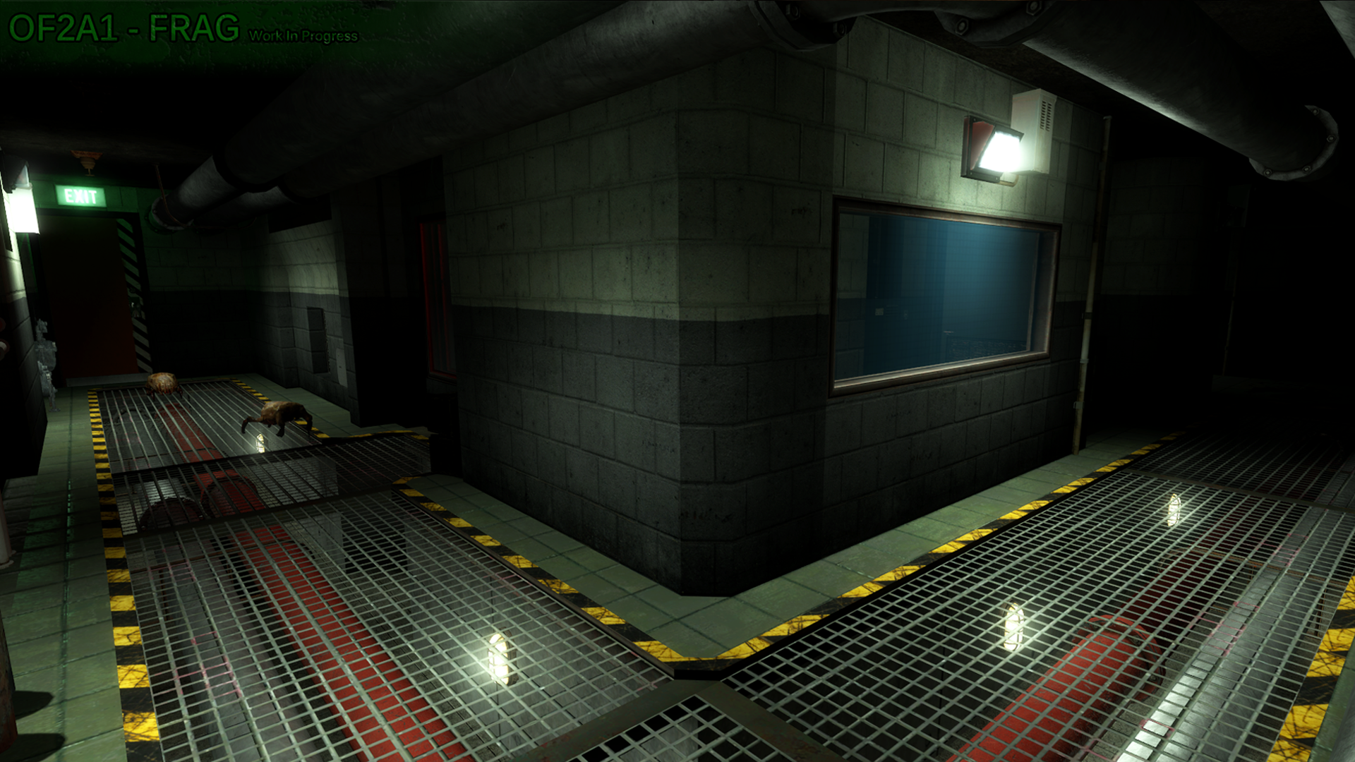

Things that I was immediately fond of about this area is the major brushwork and the large grating used for the majority of the floor. So my first course of action was merely to improve upon those.
I first started by reducing the length of the hallway to keep it short and sweet and to immediately provide the player with a visual of where he needs to travel to after dropping out of the vent. Then I smoothed the corners of the walls, re-arranged some minor geometry to give the room behind the windows a better sense of purpose, changed the texture scheme to use higher fidelity textures and styles that I feel represent a maintenance/industrial corridor more effectively.
Then it was all about re-working the lighting and making the most out of those floor grates by converting them to models and using textureshadows to cast high definition shadows onto the walls and ceilings. Generally when working with industrial type areas I like to use a mostly orange-ish lighting setup with cool white accent lighting.
Area 2
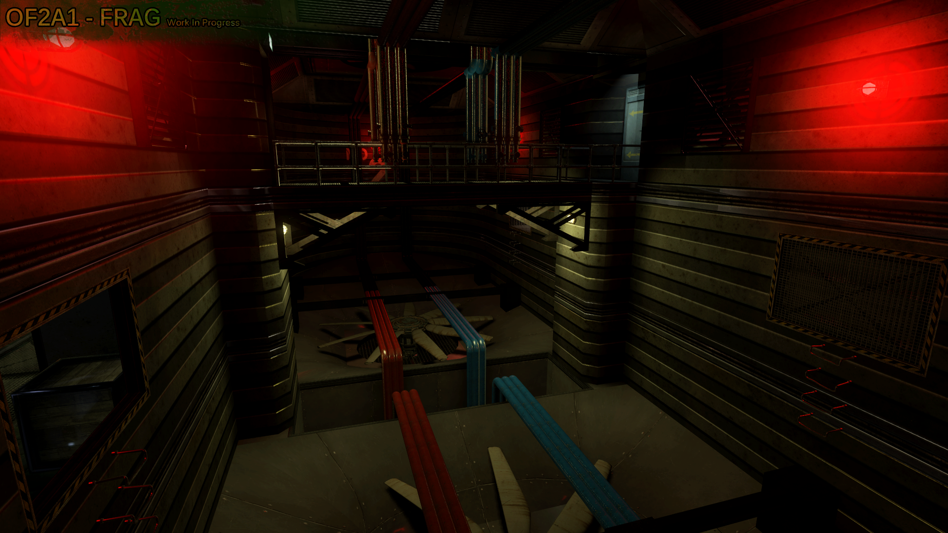
This is that weird giant fan ventilation room in the original that the player has to traverse without falling into the fans and getting chopped into bits.
Redesigning this room to have it make sense from a somewhat realistic stand point was quite the challenge. Frag had put in a lot of work (more than I probably would haha) into trying to figure out how to make it seem plausible without straying too far from the original.
The initial frame work, the center catwalk, and use of pipes for traversing the room, were all things I really liked about his design. So working off of those I decided to simply increase the depth of the room to add more verticality and a extra sense of danger for the player when traversing over the large deadly fans.
In addition to many custom grates I ended up creating more complex brushwork for the fan housings which I then converted to models to save on performance and also for the fact that Source does not handle complex sloped and curved geometry well at all.
The next step was dealing with the entrances/exits to the area. From my perspective it does not make sense to have these openings in the walls that personnel would simply climb through that basically just lead right into the large fans haha. So I removed the "fake" openings, replaced the exit with a vent that the player breaks into, and converted the entrance into a more legit and plausible opening. To make it more plausible I increased the size of the opening a bit and added a catwalk that leads to a ladder to gain access to the center catwalk.
Then I re-worked the piping system to be less-intrusive, appear to not obstruct the airflow as much, which also increases the feeling of empty space around the player.
The final step was to re-work the lighting. I decided to go with a mostly cool white coverage because it accents the already grey-ish texture scheme and aids in the appearance of a smooth and mostly clean ventilation system. Some red lighting was kept to help define the shape of the room and also for nostalgic reasons.
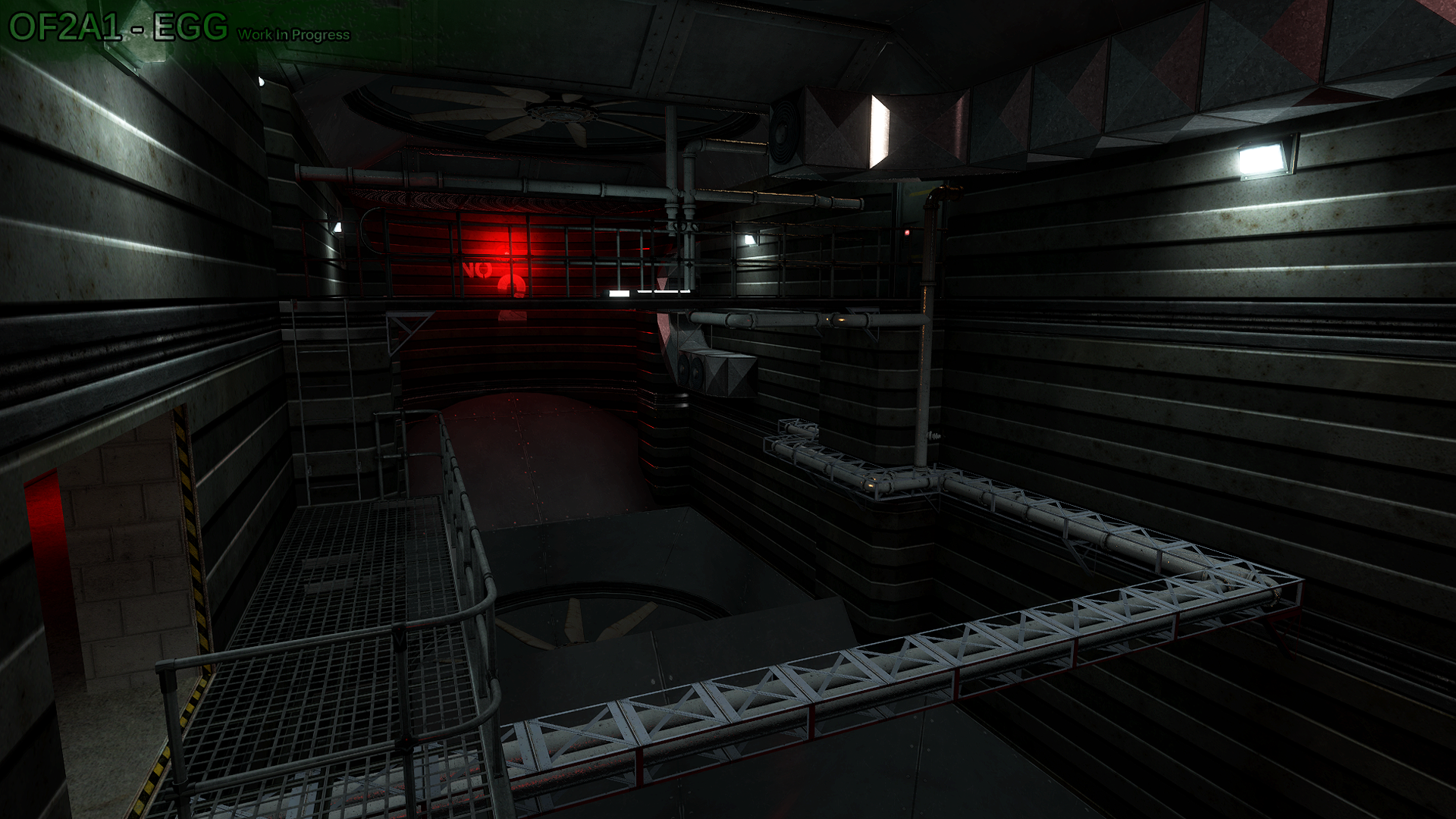
Area 3
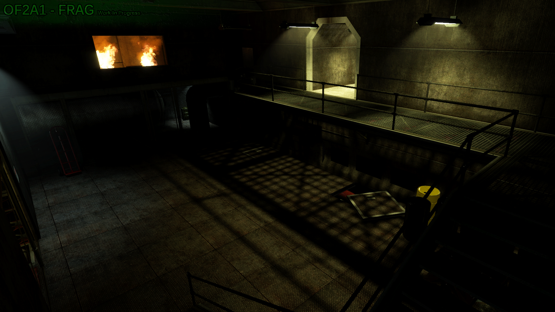

Trying guessing which area this is. I bet you can't
No but seriously, I know you can't, because it's a new area created to ease the transition from one room to another that was very abrupt in the original game.
Not being familiar yet with modeling, Frag went total beast mode with the blocklight dev texture brushes to create that grated shadow. Although it looked good and I'm sure took a while, I had to replace it with a model to properly cast textureshadows, which are more accurate and detailed than what can be achieved by using blocklight brushes.
Other than improving the shadows from the grates, the railings, and the chainlink fence, I also completely re-worked the lighting in this room to match the lighting in the previous sections of the map. Just a fyi, the room that's on fire is extremely early WIP still, so pay no mind to it 
I decided to shorten the overall length of the room as well. It seemed a bit large for having no real reason to be as large as it was. I also connected the grated catwalk to the room that is on fire, to give the appearance of it being an official entrance/exit.
I liked the texture scheme he had going on, so I only resized and re-aligned most of it. To show off the textures better I increased overall visibility in the room by increasing the light coverage to get rid of any pitch-black shadow spots.
To give some perspective on the revamp, it took me about a solid month to finish. This was mostly due to being busy with other personal things and also because I had been playing a lot of Ghost Recon Wildlands hahaha. So normally it wouldn't take quite that long.
The areas shown in this blog are just 3 out of 27, not including the map overview screenshots showing pathway and room layout changes. So I'm sure that after the mod is released I will post a follow up blog to detail more of the changes. I'm sure if he feels like it Frag will also chime in with his thoughts in designing parts of the map.
So that's it for the blog, guys! I hope it gives you a bit of insight into one of the design processes that we, myself in particular, go through to improve and aid in finalizing a maps design.
