Jacbil Gobbet Update #4
Game Funding Update
Funding is a completely different aspect of indie development than programming or art. It is very interesting looking into it. Even crowd funding in itself has so many different aspects to consider. For our kickstarter, specifically, we decided to raise the asking amount. A few friends told us that the money was too low and it looked like we did not have faith in the project. Therefore, we are now upping the kickstarter to $1,000 for a total project budget of $2,500.
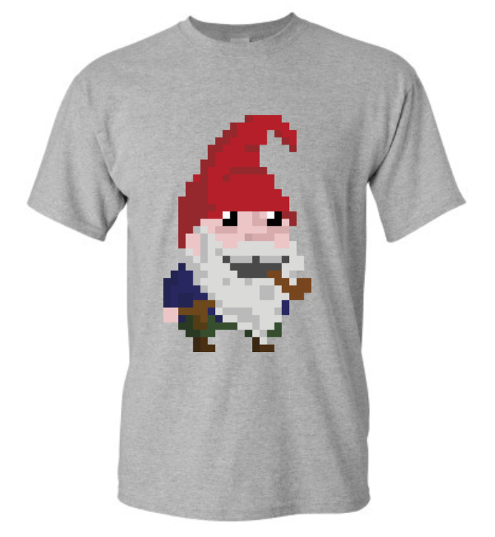
Another possible avenue for funding is angel investors. Now, I have not looked into investors in much detail since I already have one offering $500. However, we might look into it more once the kickstarter is over. A third avenue for generating revenue is physical items. Many people like receiving physical items as rewards in a crowd funding campaign. But that would mean collecting addresses and shipping out product. A couple of people have told me about direct-to-shipping companies. If I made a deal, the company would handle all transactions and then give me a percentage of the profit. I MUST have one of these shirts (depicted below). So I believe, one way or another, we will be making Jacbil t-shirts.
Menu system
One problem that we have faced from the beginning was the crafting/inventory system. In the prototype, we just have everything on the screen because the number of items is relatively small - 12 collectibles, ~20 crafts, and 8 placeable pieces. However, we have plans for 100's of items in the initial release with 100's more from alternate dimensions.
So how do we optimize 100's of items so that players are not lost in the menu?
Quite literally, we have been addressing this question since day 1. I had a dream a few days ago where the menu of Jacbil Gobbet looked like Windows 95/98/XP. I created a quick mockup of what that might look like.
We ultimately decided against that ideas for two reasons: 1. The inventory would be reduced to lists of words. and 2. Players would not necessarily know what each category would lead to. The good thing that came out of it was a serious discussion of the UI. My main goals for UI are:
- Player should have quick access to menu items and be able to get in and out in 1 second for something that is needed quickly.
- The screen should be visible at all times so that the player can move, craft, fight, examine inventory, avoid enemies, or any combination without having to pause the game.
- Any inspection of inventory or crafts should be accomplished in less than 10 seconds.
- The menu should have easy access for keyboard, mouse, gamepads and mobile devices.
- This one is Matt's goal - the screen space should be optimized to show as much information as possible.
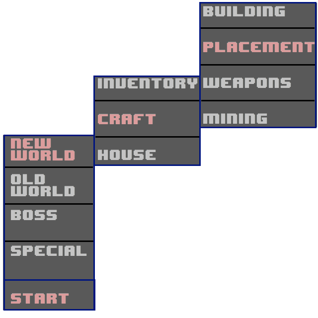
With those in mind, here is what I came up with...
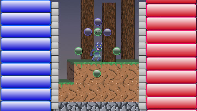
The blue on the left would be craftable items. The red on the right would be inventory items. The silver buttons are for sorting the button lists. Surrounding the player are quick menu buttons. This menu might hit all of my goals for an UI. We'll have to see how things go.
"3D" effects update
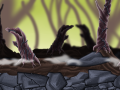
We have been hard at work on the graphics for the game. In the picture below, you can see some of our current progression. The first three are edited effects on the screengrab that we presented in the last update. I added texture to the background for the first picture. The second picture shows the same scene with more of a 3D cube look to the platforms. And the third picture combines both.
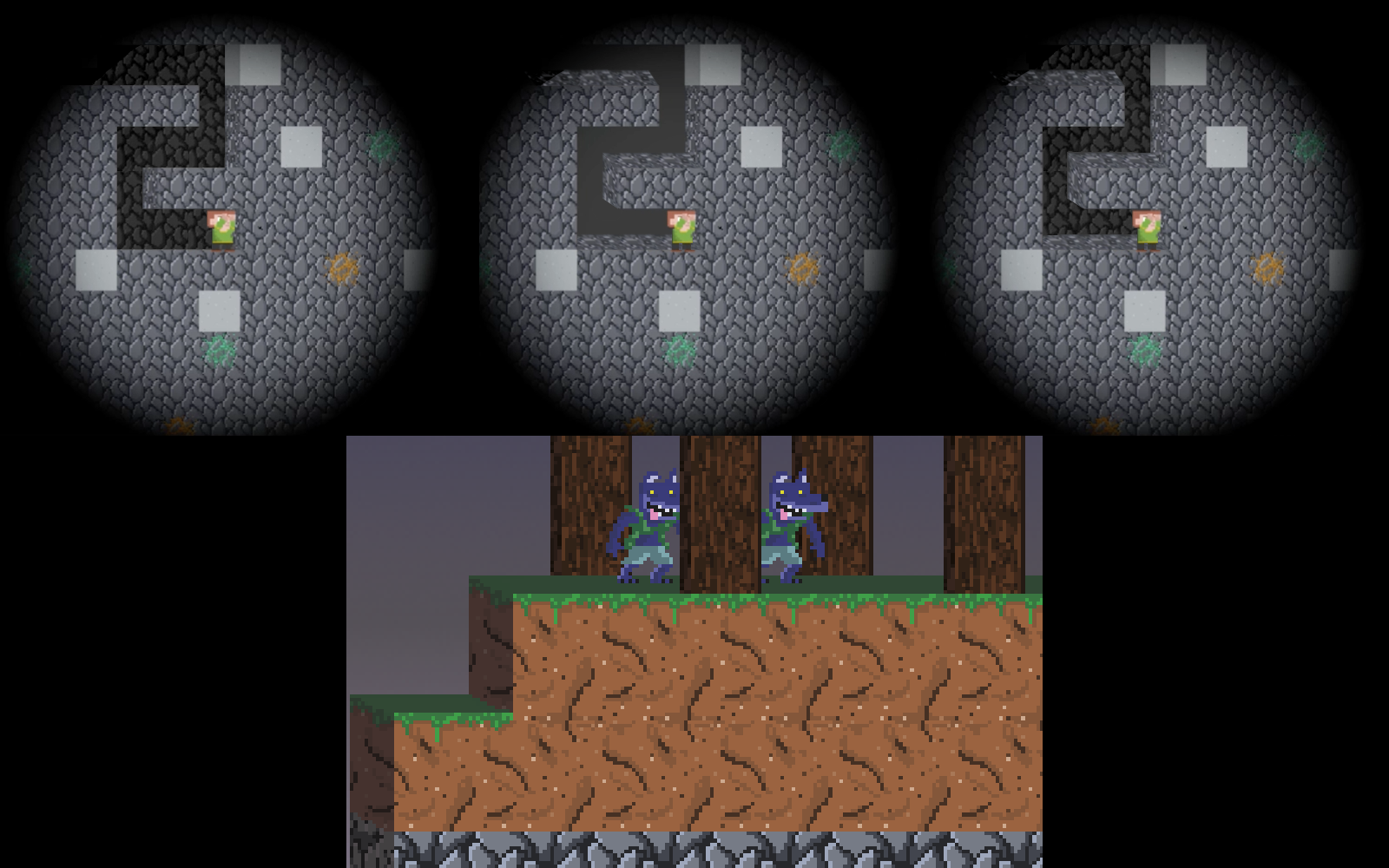
Matt advised me against having a straight cube line. He said that from a graphical stand point, the vanishing line looks like it goes on forever. Matt then created a better mockup for our graphical direction in the bottom picture (above). The ground definitely looks better in his mockup. Another neat feature will be offset trees - the ones in the foreground starting "lower" on the screen than those in the background.
I hope you enjoyed the article. Please leave comments or feedback.