There has been a lot of change going on in the simulation management world of Gym Empire. The immediately noticeable change is to the logo.
![]()
But before we get to that lets provide a bit of the back story.
Where Has Gym Empire Been?
The last update here on IndieDB was back in March. This was to announce the updated trailer to the tycoon game Gym Empire and to provide a status on the alpha demo build. The build system, character behaviour and user interface for Gym Empire had all been updated. Therefore an updated trailer was required to show the new look and feel of the simulation management game.
But there was still a lot of work left to do for the alpha demo release.
The save game system, the mechanics for moving to new environments, the UI graphs and the game play loop all needed completing. The save game system was a massive undertaking and took a lot of time but was completed first. The next task was to introduce the gameplay loop. Effectively planning out how the first 30 minutes of gameplay would evolve for the player. Moving form Start Menu, to buying equipment, training clients and then eventually on to moving to a new premises. These first 30 minutes in a tycoon game are hugely important. They effectively form the tutorial of any good simulation management game but also set the tone for whether this is a great tycoon game or not.
Time For User Interface Updates
With the gameplay loop mostly complete it was clear that there were not enough visual triggers to indicate to the player what was going in the game. This kind of feedback is essential in a simulation management game. To solve this issue the focus was put back onto the user interface.
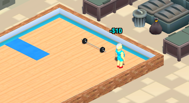
We added in popup indications as to what the gym clients are doing and feeling, as well as making the graphs functional. All of these components were added in using prototype graphics. Functionally they perform the job but from a gameplay aesthetic perspective they didn’t add the feel to the game it needs. It was at this point we decided that it was the time to fully focus on and lockdown the user interface for Gym Empire.
To date the HUD, the panels all the user interface were designed in a prototype fashion. However as the alpha demo is going to be the first time anyone gets to play Gym Empire. From that point on Gym Empire needs to have a consistent look and feel for all future marketing.
First Attempt - Not Good
The first area to be tackled was the HUD. Over the months the HUD has taken a lot of criticism for giving the game a dated look and being too similar to The Sims aesthetic. The HUD was inspired by The Sims. But the colour pallet and style of the HUD do not match the aesthetic of the Gym Empire logo. With the logo being the leading image of Gym Empire it is essential that the look and feel of the game fit the aesthetic of the logo.
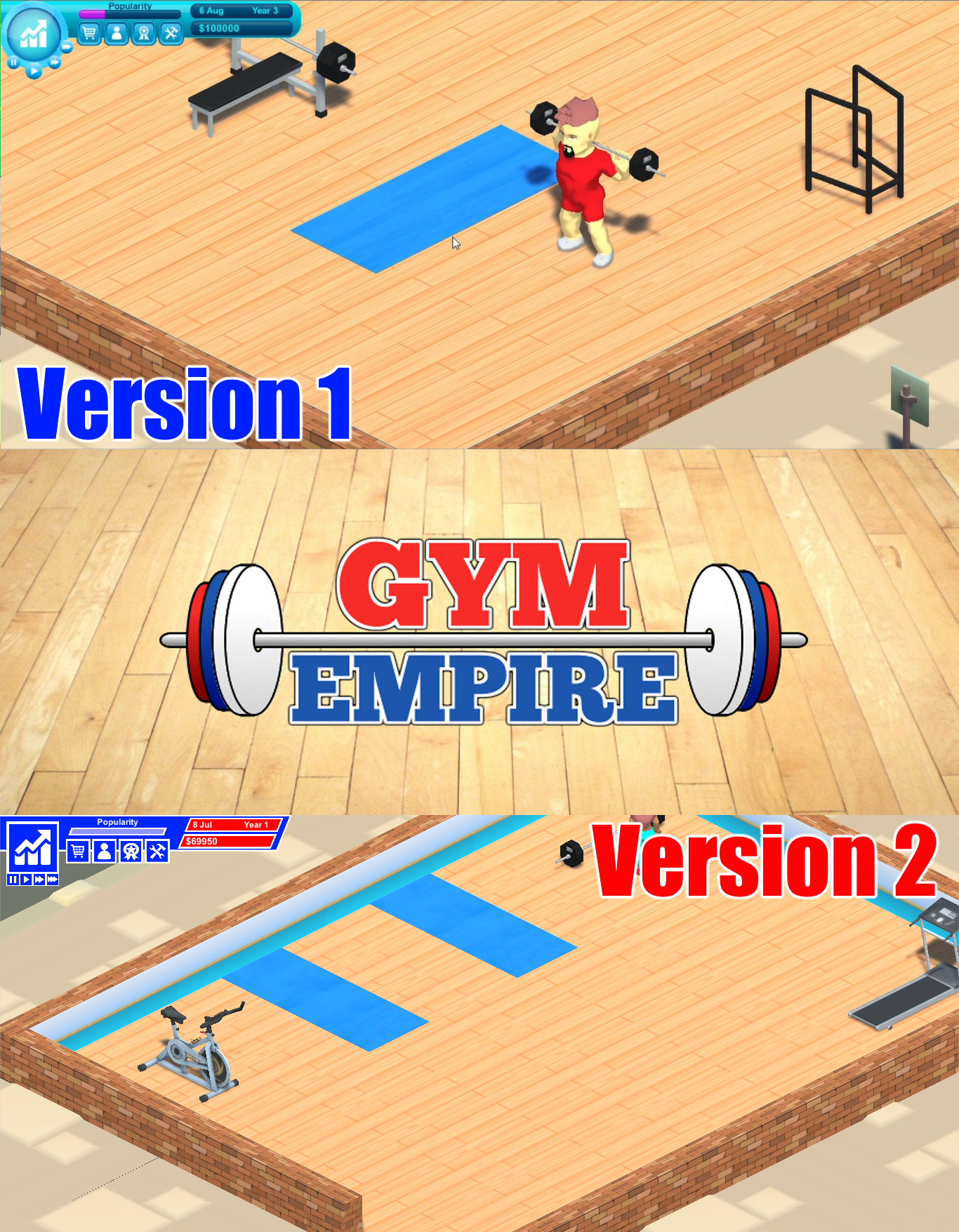
Work began on updating the UI to be in line with the logo and Start Menu… but it became quickly apparent this was not going to work. The mix of the bold blue and red colours looked garish and the new prototype HUD took a lot of flak from the very supportive and helpful Reddit tycoon community.
Keeping A Matching Aesthetic
The HUD had to match the logo, but the Gym Empire logo just wasn’t helping. It was at this point it was clear the logo needed a redesign. After a week of researching gym logo styles and colour pallets that work a new logo was created.
![]()
This new logo tells the exact story of Gym Empire in one image. The barbell represents the gym, the Spartan helmet represents the battle you will face to become number one (and Chronik Spartan of course), the gold represents the empire you will build and the slight cartoonish look represents the light-hearted and fun side of this tycoon game. Plus I think the logo will look pretty sweet on a t-shirt!
With the new logo in hand we were then prepared to go ahead and build the new user interface.
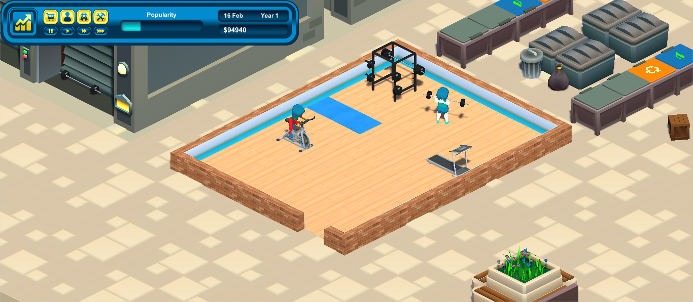
Updating The HUD
Using a combination of the tactile look of the original user interface, which fits well with the game graphics. Along with the new colour pallet from the logo we were able to create a user interface that is functional and sits perfectly with the aesthetic of Gym Empire.

This is where we are today. With the start of the new UI we will continue to compete the rest of the UI artefacts. Such as popup info, context menus and, panels and graphs. Once the UI is complete the next step will be to complete the mechanics for moving to a new premises. At that point we will be fantastically close to releasing the alpha demo.
Stay tuned with progress in the Chronik Spartan Discord, YouTube Channel and website.