Few things (well, more than few, but these are among the star ones) can make or break a game as easily as the quality of its UIs. Whereas a smart, clean and good looking UI, easy to use and intuitive (and with the proper amount of tooltips and info) can make any boarding and following gaming experience pleasant, the opposite is even more true for badly made UIs.
Overwhelm the gamer with heavy-to-read UIs with ugly visuals and clogged layouts, and the chance that he will be quitting pretty soon the game is very high. And it’s almost sure it will happen if the game is a strategy game.

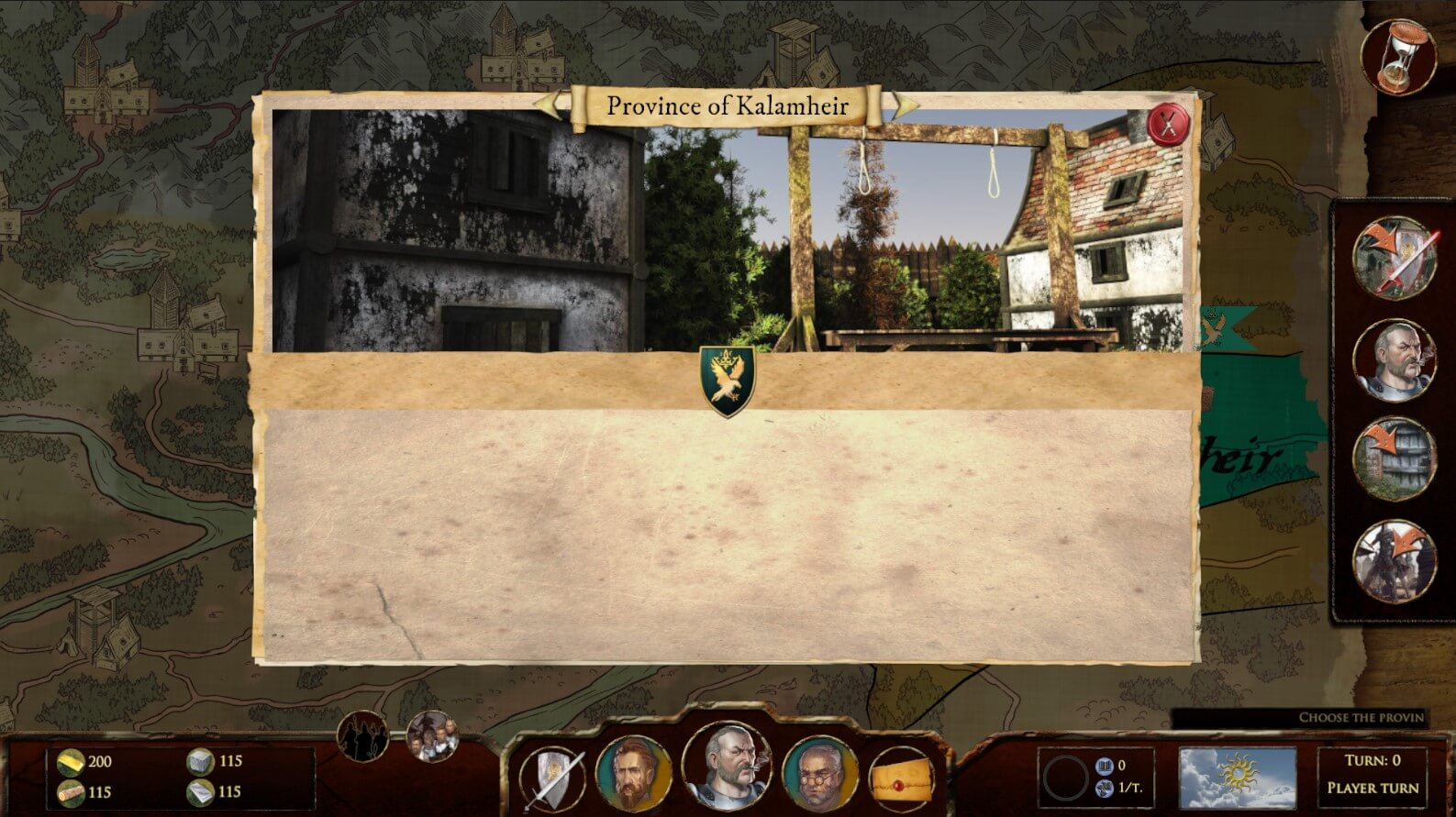
While other genres can get away with not-so-good UIs, strategy games definitely can’t. Our very early UIs in Empires were of the ugly kind, even worst if that is possible.
At development time, unless you have a UX/UI designer integrated in the team since the beginning, it’s very hard to produce good UIs on the first attempt. The temptation is usually to provide as much information as possible to the player, never realizing that this ends up flooding the information layers and rendering them all uselessly anonymous. Less is more, that is a hard rule to nail for programmers mostly.
So now, with the help of a friend that did sketch for us the new layouts, we’re onto remaking the UIs. A few rules of thumb we are adopting in doing that:
- Less is more
- Readable fonts, sharp contrasts
- Well distinguisheable icons/buttons
- Use shapes and styles to let the player familiarize with elements
- Wider breath in the layouts and elements distribution
- Use a coherent style even while having several different elements styles
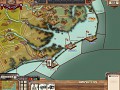
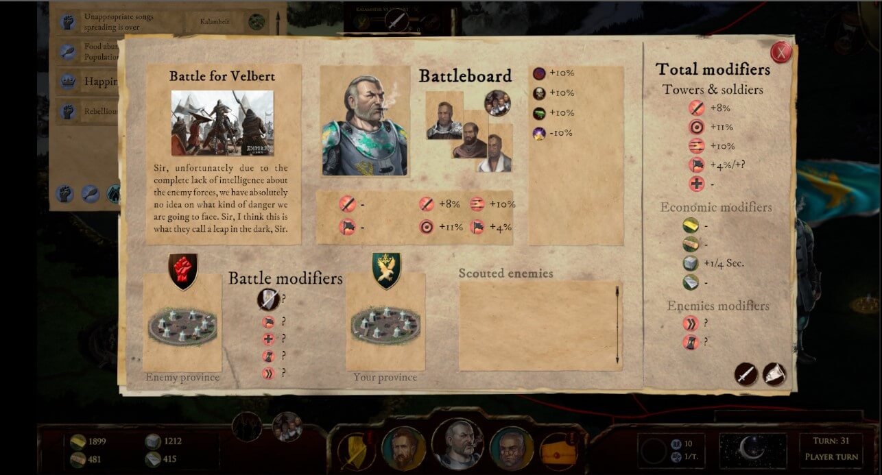
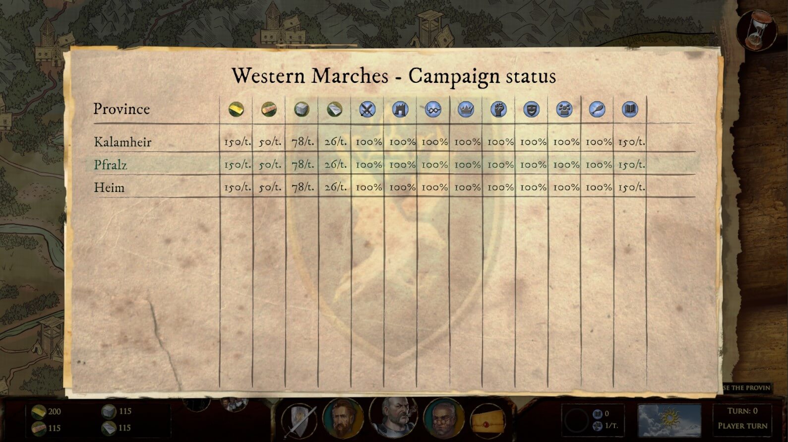
In the gallery above you can see some WIPs of the new UIs, we will not show the old ones out of shame though. One last thing worth mentioning though, it’s the approach we are taking to the battle maps UIs.
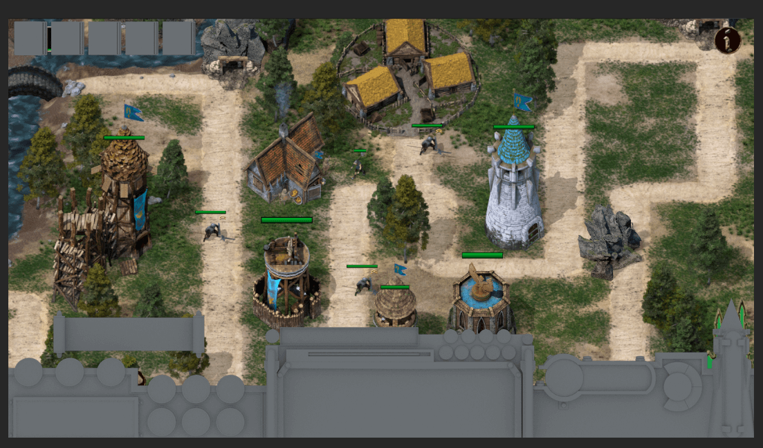
Following the whole EiR approach to visuals (pre-rendered 3D to 2D sprites), we are going the same why for the UIs of the battle map. That is, our of the sketches we are modeling 3D UIs, once modeled and ready, we render them out back to 2D textures and use them as such. The last picture above shows a very early example of that, and it shouldn’t take too long before we manage to show you the real deal.
Until then, have a blast guys,
Cheers,
Emiliano, @DokHgn, Lead Dev