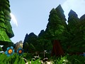
Crash Bandicoot Returns is a sequel to the trilogy developed by the studio Naughty Dog. The project will be developed with the Unreal Engine 4 and will be offered in demo in 2017. For the official release, no date is yet planned.
Crash "Smooth"
(view original)

Post a comment
Description
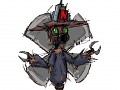
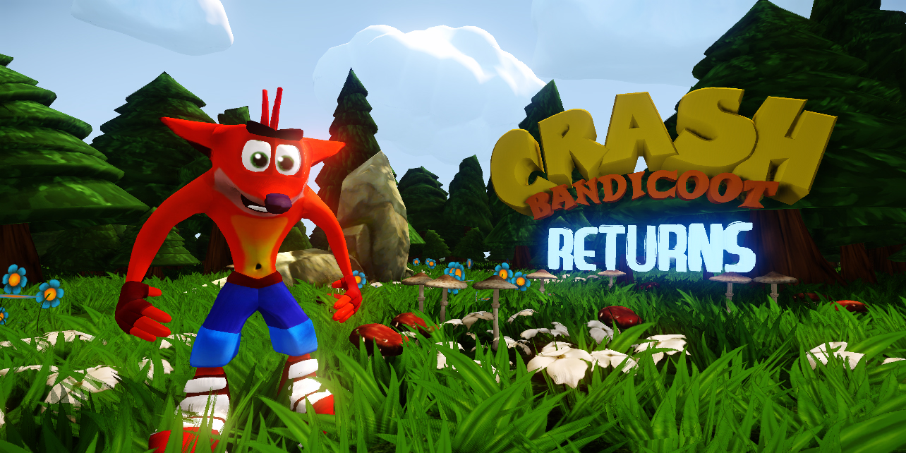
Crash "Smooth"
He looks younger again, remember his look in twinsanity, the bauge chest and cheeks, orangy skin, taller look, and of course bluer pants?
uh ? The actual model is exactly the same to the original series, just with a smooth for adding an HD touch.
Not really the same - his eyebrows are too small, his hair is completely different, and his eyes are too square. In my opinion, though, you shouldn't stick to the original exactly - if I were you, I'd actually make it more HD, while keeping the same origin. Put more detail, maybe flesh out the elbows, which seem too smooth, fix up the shoes a bit, and make his mouth bigger, with clearer teeth. But, clearly, this topic is up to a lot of debate. Personally, I believe in making things more detailed, almost like what Black Mesa did with a lot of Half-Life, instead of completely changing it. Not a good example, but you understand. I understand the appeal of this look to a lot of people, but this is the crash I know: 4.bp.blogspot.com He looks a lot more devious in that picture. Maybe that's because I like 2 and 3 more than I do Crash 1, but I still think that you should change it. Or, maybe, put multiple models, like they did in Arkham City, and the player can choose. The environment, on the other hand, is spot on, excluding the trees, which, I believe, need clearer leaves. Just make the layers flat, with a transparent cut-off at the ends.
I chose this version of Crash, it is because I am a huge fan of the series and I do not want to tarnish the image of the license. Unlike all the other studios who tried in vain to create their own version of Crash.
From my point of view, it is a direct sequel to which we make the most of the first three episodes, while adding a touch of modernity. But there is no question of making it too HD.
Be said in passing, if I had to listen to the opinion of everyone, the project would have been canceled. This game will not appeal to everyone, only to fans of the franchise and that is the real objective.
lookin better, but are you planning on adding some textures? Like some fur maybe, or just detail in his pants?
I prefer to keep the original style of the series. But why not. I'll think about it ;)
looks amazing really....thumbs up! cant wait for this to be finished!
This Crash is so much better. I am seriously impressed. :D
He looks kind of innocent, he needs a more "aggressive" look if u know what i mean, also a lot of face expressions, but good job so far nonetheless.
Yup: simple and efficient.
Yes, this one is more like the original Crash, good job!