Name: Sam Ireland
Age: 23
Location: Australia
Position: Concept Artist
What are you playing right now: Crackdown 2, Red Dead Redemption.
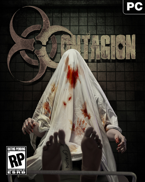
Hey there, I’m Sam, the character concept artist for Monochrome. This is the first blog entry as far as I’m aware, so you’ll have to bare with me. I’ve been working for Monochrome the past few months and created and designed nearly all the characters that’ll be seen in game, with the exception of a few. But that’s not all I do, I also work on promotional art, and that’s what I’ll be discussing today, and giving you a little tutorial to how the image was created. I hope you enjoy!
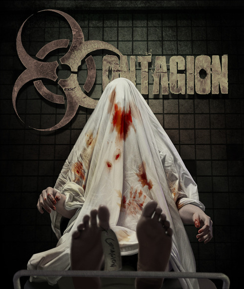
The above image came to me and was inspired recently when I played Batman Arkham. There’s a particular morgue scene where you see a lot of flapping doors. I immediately wondered about the roots of zombie uprisings, and the first few that awaken. The lone dead corpse tucked away in a hospital corridor or morgue. And wanted to design an image that was simple, but at the same time sent a very clear and odd vibe. The idea of a body sitting up by itself is immediately wrong and abnormal. You really need very little blood or gore in order for that to be strange. Concealing the face means the body has no identity, so again, it adds to the overarching theme of the image.So how did I create the image?
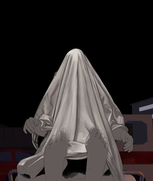
Folds of this nature are incredibly difficult to free-style without reference. Any artist who denies himself reference, is an artist not reaching his full potential. For this particular image, my girlfriend posed with a sheet over her head for 10 minutes or so, allowing me to get the bulk of the folds down and basically build some basic line-art. With that done I placed down a block color, to dictate the mood and warmth of all the colors going on top. Essentially a stony cold grey in this case.Some of you may notice the background isn’t the same as the finished product. Essentially I went through a few ideas of what to have in the background, and the original was a crowded street with ambulance lights providing a sickly neon red glow to the left side of the sheets. But. As I began to work, I realized that the simpler the background, the more focus would be put on the corpse, and furthermore, realized that a red glow on the sheet would detract from any blood stains.3D backgrounds are becoming extremely common in digital painting. Especially where speed is the essence. I’m trained in 3Dsmax and tend to put those skills to good use in a lot of my paintings.
At this point, detail is really starting to take shape. I spent a great deal of time sharpening and painting folds, working from right to left across the image. (The corpses right and left). There’s not much to say about this part of the process. It’s long and tedious. I tend to zone out and mindlessly paint without concentrating much when it comes to actions like this. One tip I can give however, is that if you’re working on something that’s subject to changing and tweaking, or if it’s ultra high detail, work in as few colors as possible. The more colors you add in, the more complicated you’re making it, at a stage where it doesn’t need to be complicated. Some artists I follow, work purely in grayscale and then color in using overlay layers. Which is similar to what I did for the folds. In order to add color later on, I simply brushed lightly over certain areas with a brown or reddish overlay, adding a smidge of color here and there.
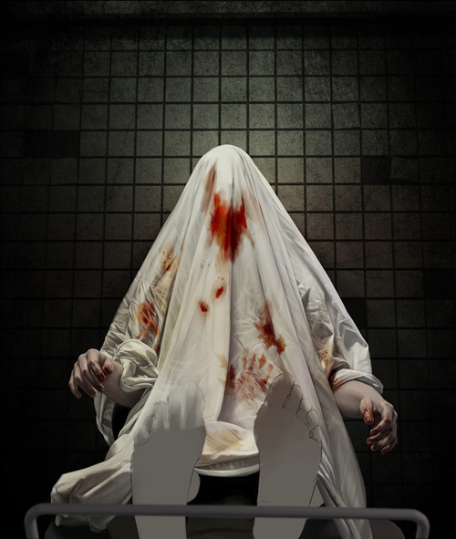
As you can see, the majority of the painting is nearing completion by this point. I’ve probably spent roughly 10 hours on it at this moment. The hands are painted in, and you’ll notice just how much that base layer of stony grey has affected their hue. The blood has been added. To add the blood, I created 6-7 overlay layers of differing opacities with varying levels of redness. The reason for this, is that the folds needed to stay visible. Overlay layers tend to preserve whatever is behind them, while allowing for the addition of color. To start with, I created a big patch of peach, and smudged it around. This is the thinner part of the blood separating and spreading across the sheet’s inner weave. If you’ve ever had a nosebleed on a pillowcase, you’ll know what I’m talking about. It’s all too easy just to add red, but you also need to be aware of how blood /really/ affects materials if you want a realistic finish.
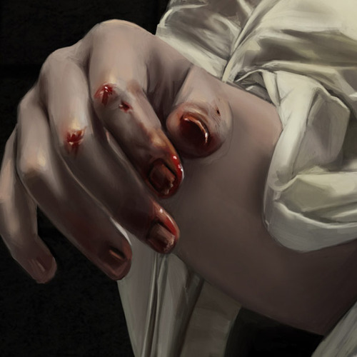
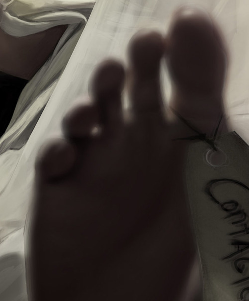
The feet were painted in full focus and then blurred manually. Gaussian blur is a filter in Photoshop, and I’ll be the first to admit I’ve used it to death in the past. But for this particular painting, I needed a blur I had far more control over. After painting the feet fully in focus, I duplicated the layer containing only the feet 4 times. I think shifted each layer 4-5 pixels, north south east and west respectively, and changed their opacities to 25%. The reason for this, is that the left foot was shifted further left, and the right foot had it’s right most layer shifted further right. (There’s no better way of explaining this, so hold onto your hats). What this did, was push the feet apart using depth blur. It’s a minimal effect and would’ve have had a huge effect, but I felt it’s a tip worth mentioning if you’re ever using a blur and find it’s not working out as intended.The blood on the fingers was also done in a similar way, except merged down and re-painted in a matte layer. Funnily enough, I still have the PSD with the blood on separate layers. If this art were to be used in Germany or places that prohibit the display of blood, I could easily just hide the blood layers. This is important to keep in mind when producing games. You never know where it will show up.You may notice the background has been swapped in for another, as I mentioned earlier. This one was simple, spooky and most importantly, bland. Meaning it allowed all attention to be on the corpse, and allowed space for the project logo.
And that’s that! I applied a grain effect using noise-spatter and shifted the logo into place. Overall the image was done in 12 hours over a week long period in several sessions. This tutorial has probably been a tad more technical than I intended, and assumed many of you understood painting functions. For those that have understood it, I hope it was insightful, and for those that didn’t, I hope it didn’t bore you to death! I wish I could show you more in progress shots, and it feels like there’s a big leap, but sadly I didn’t know I’d be asked to make a tutorial, so I had to use the progress shots I had taken anyway.
It’s been emotional.
For more Contagion Developer Blogs -Click Here-
![]()


xD Nice! I play RDR too! It rocks!
Wow. What great work. It really paid off for a convincing mod cover. Great work.