Hello, so Arvind and I are testing a different way of posting news articles. I´ll discuss about the visual department, and he goes into coding and game-design. That way our readers will have more fun stuff to read, rather than just "here´s screenshots, wow at us.". Eh, I hope at least. So, let´s start then, shall we?
Part 1. Leon´s stuff
Alright so as you might remember from the last news item, I jumped into Arvind´s RPG project to take care of the graphics-design. I´ve wanted to work on indie games AND 2d-graphics for soooo long, and Arvind I know from before, so this seemed like a really good project to jump on. I´ll get plenty of exercise in building a game from thin air (as opposed to modding - customizing something that already exists) and I also get to work on smaller 2d visuals, so this is pure joy for me.
Workflow
The way we do this is, Arvind has the base build, and I have some sort of a messy build that I test my graphics on, and there I just change the images, paint over them, see what works and what doesn't, and when there´s something decent enough to show, I upload it on our DropBox folder (its a ftp-like thing for sharing files) and then it goes into the actual build of the game.

Example 1.) So I grab the graphics
straight off from the game´s gfx
folders, then paint over them in
Photoshop. Naturally, its quite a
good idea to keep everything in
layers, since there´s bound to be
some changes after any gameplay-
testing.
Visual style
Since I don't have that much experience in 2d graphics in actual games, I decided to stick to a style that I'm really familiar with. Cartoony and bright. I doubt that many people know this, but I draw´n publish my own comics, so cartoony and lighthearted visuals are way closer to my heart than the grittier and horror-oriented stuff I throw into ModDB.

Example 2.) Damn its hard to align these pictures into the article.. well anyways, this picture here shows you how I design the sprites and the backgrounds. I work A.Typical RPG´s graphics first on paper, in small parts, and then I scan that stuff away and cut and paste together in Photoshop. Keeping the layers intact. I constructed the whole football field and the player character and most of the new buttons purely with this scanned image.
Characters
I've heard its best to leave the hero´s character sheet for the last, and first design all the other npcs, but I couldn't resist using the sprite sheet on the hero himself. Atleast we can test the character sheets properly, since the player´s character has to be the most interactive of the bunch. I took the idea out of Legend of Zelda: A Link to the Past, one of my all-time fave games, where Link has purple hair, fitting enough for a epic hero. Whaddaya think? Does this look good, or just stupid?
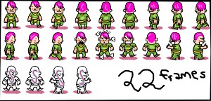
Example 3.) The purple/green hero! Also, the animation frames. I requested proper animations according to action ´n direction, so right now we´re running at 22 animation frames per character. In the football-match alone, there are 6 characters, so that counts into something like 130 images I gotta draw. But that´s how it goes.. and practice makes perfect.
OK that's all from me then. Do leave comments on what I´ve done. Nothing´s final right now, so if you have any bright ideas, let us laugh at them hear them! Oh and I´d love to hear any tips anyone has on 2d graphics / hi-res sprite-design..
´till later
-Henri
Part 2. Arvind´s stuff
Okay fellas, so that's our super artist right there. Now, my part of the post focuses more on the gameplay, since I'm glad I don't have to draw any more sprites (and I'm sure you guys are glad as well).
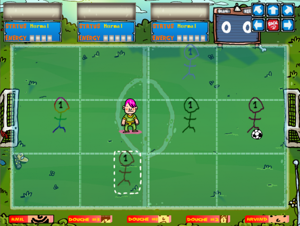
Let's start off with how our WORK-IN-PROGRESS playground looks like now :
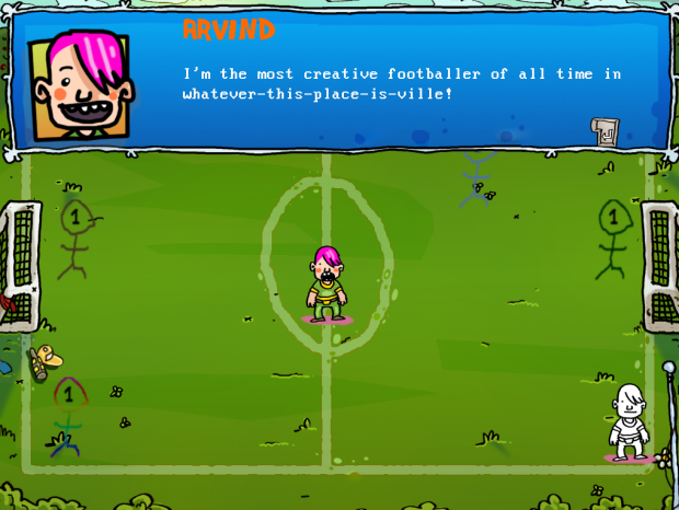
Big improvement, eh? A lot of my recent work has been behind the scenes - cleaning up code, adding new functionality - but the changes most visible are only a few. One of the most visible changes is :
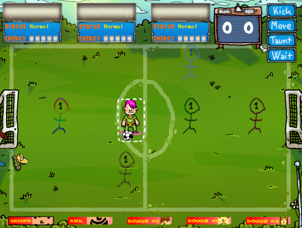
UI Repositioning
I received a lot of mixed feedback from the UI elements last time around. A lot of the negative views were based on how the command menu kept changing locations, and often covered the character or the nearby sprites. In order to address those complaints, the command menu now stays at the top right corner of the field - so the action is never obscured in any way.
Also, in order to avoid confusion on exactly which character did the commands refer to, we included a neat little selection box that show you which character currently has focus.
Field Grid
Another important concern while playing the game was to give the players an idea of where they were positioned, and also the resultant position of their moves. This issue was solved by the hastily brilliantly named element, the field grid.
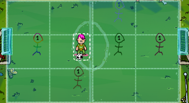
This grid gives you a clear idea of the location of your character, as well as the surrounding characters - and is used in every action where character position(s) are relevant. Here's what it looks like when selecting where to move a character :
In Conclusion
Apart from this, I have coded almost the entire battle system. We hope we can soon move from work-in-progress-rough-unfinished-stuff to some sweet real gameplay footage. What remains is animation and scripting the battle for the most A.Typical football match you have ever seen.
Expect more awesome news from me and Henri pretty soon!
Signing off,
Arvind


That's great stuff :)
Thanks!
Looks awesome.
I think the simple style and colours are best in the first pic (dialogue scene). Try keep those kind of colours, and perhaps the wonky borders etc, for as much of the game as possible?
We may experiment with different stuff in later scenarios, but yes, we'll keep things simple for most of the time :)
Yup will do, thanks. I enjoy the wonky edges myself too. Hand-drawn. =D
I like the art a lot. It's pretty distinct!
It does look like a soccer game, however...
Well, we have other scenarios planned, this is just the first.