HUD interface always is a delicate balance between too much information and too little. Some times less is more, for instance 2aw uses range-rings to tell you how far the ships can fire, icons when you zoom out, grid stems to show you the height of the ships relative to the grid, and the grid itself. On one hand this info tells you a lot about the game, an interface that tells you a lot requires you to memorize less.
In RTS games that don't have extensive or informational UIs you are guessing at what many of the stats really are. To become good at the game you have to memorize those stats. Extensive UIs requires you to memorize less, so you can advance at being a better player faster.
Look at this Starcraft interface:
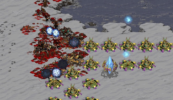
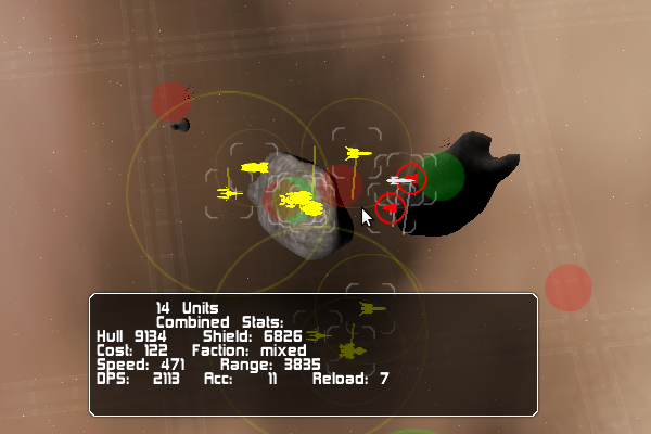
Not even basic UI niceties. You have to develop a feel for range and speed. And now look at this my quick mock up of what "2awfied" Starcraft interface would look like: I have drawn the range rings and icons over Starcraft units:
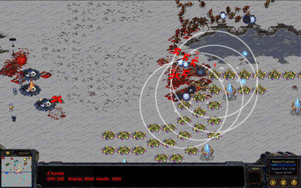
My diagram features:
- Full zoom
- Icons when zoomed out
- Range rings
- Aggregate group readout
But having all that super cool UI comes at a cost. It becomes less like one is playing with spaceships and more like one is playing with icons, circles and lines. That makes the game less immersive. Less time is spent admiring the graphics and more time is spent at looking simple icons and lines.
I would not say Starcarft with my UI added to it would be better. it would just play different. With better UI Starcaft might have shifted the focus from being a micro heavy game to a macro game. Would it be better? I do not think so, but it would have been different.
I think 2aw deserves to be a game that uses more UI, it is set in space too. Also its important to tone down the use of UI as much as possible to bring back the immersion you have with the game.

Well that's a cool UI, simple yet complex enough to where it's not just "Attack-Click."
Correct me if I'm wrong, but it seems like a Supreme Commander/Homeworld 2 kind of thing, while also retaining originality. All good things.
Yes those are some games that use more UI then less.
I grown with classic Warcraft/Starcraft huds but got used and love huds like Men of War and Nexus. With a lot of micro.
But neet idea, just seen implemented to fully understand how it really work.
Fascinating blog post, community member.
sins of solare hase a nice feuter wehn you press shift you see the rings for the atack range i like it that way you only see them when you want/need them
i missed something like that in hw2
We thought about this before. For some reason it did not work as well but i don't remmber. Maybe I should try it again.
Thanks!
starcraft is awesome! by drawin' your "rings" and crud over it, it makes it harder to focus, because if you mass cannons like in that pic it makes it hard to see!
and niceties? wtf?? if you like starcraft things like those rings become an annoyance not a nicety!